Timeline: The Discovery Channel
In an age of mindless reality entertainment and personalities as programming, the Discovery Channel has found a balance between its original mission and the demands of modern television. Its branding has been recently updated to inspire viewers to examine and engage with the world and with topics of science, nature, culture and history. Becoming a media giant in its own right, Discovery, Inc. has grown through expansion and daring. How has its brand developed since 1985?
1985-1987
Launched in 1985 as a 12 hours per day network that catered to ‘lifelong learners,’ the Discovery Channel’s founder, John Hendricks, told the New York Times that the network would serve “people who maintain a curiosity about the world, and who want to come away from a program enriched as well as amused.’’ Its origins were somewhat inconspicuous, with a simple ident and icon.
1987-1995
The network’s longest-lived logo, the 1987 rebrand introduced the Aurora typeface that would stick with the brand through 2008. The Discovery Channel made a name for itself with unique content focusing on wildlife documentaries, scientific and historical programming and cultural exchanges. 1988 saw the introduction of the event now synonymous with the brand – Shark Week.

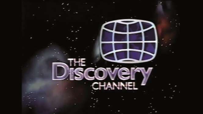
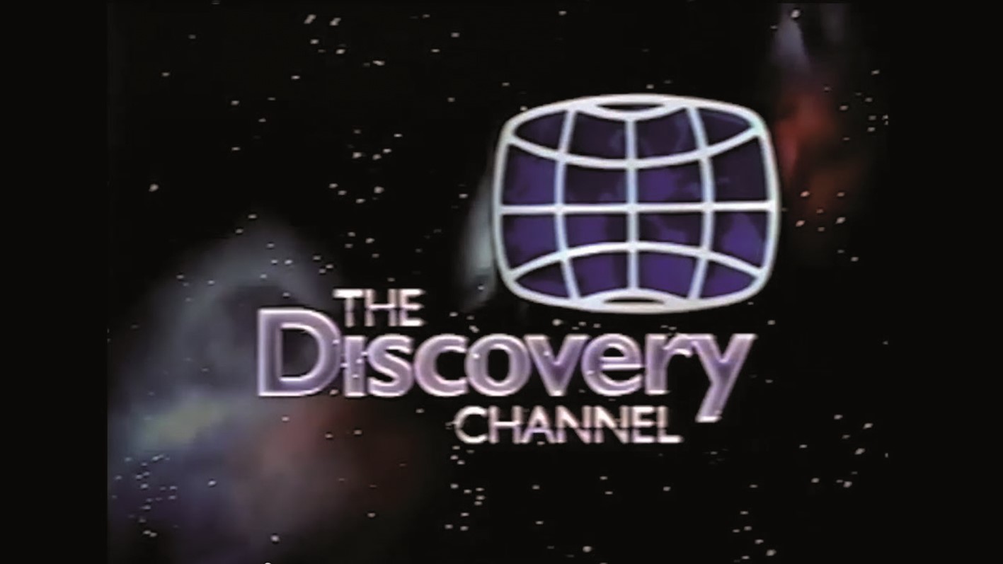
1995-2001
The 1990s were a period of growth and expansion for the Discovery Channel. Introducing a brand that, in retrospect, is very ‘90s, it began using a vivid, coloured version of the earth for the first time. The purple and blue wordmark was later ditched, but the globe has been a stalwart through the years. In 1996, Discovery, Inc. launched spin-offs Animal Planet, Discovery Kids and the Science Channel, using Discovery’s brand assets.
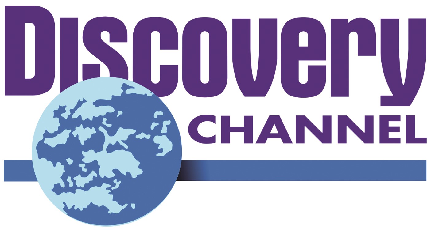
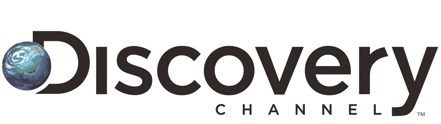
2001-2008
A growing professionalism enters the Discovery Channel branding. It cleans up the wordmark, putting the word ‘Channel’ in an underline device. It spins the globe around to focus on the Pacific Ocean, emphasising the brand’s global nature. This was the era of the reality show and the Discovery Channel was not immune. Much of its programming turned to reality, resulting in a ratings dip.
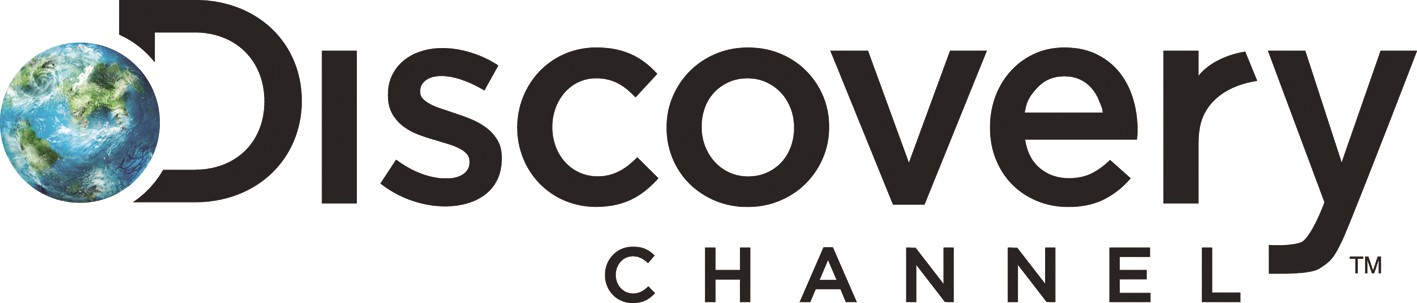
2008-2009
Its first major change to the logo since 1987, the Discovery Channel introduces a corporate feel. Viewpoint Creative, a Boston-based brand agency, crafted a new wordmark in Gotham. It also introduced a digital-ready design element that has stuck with the network to to this day: a ‘D’ and globe icon.
2009-2013
The Discovery Channel worked with Los Angeles agency Royale to introduce a system that could change and adapt, supporting programming in a dynamic way. The logo was streamlined, but included unfolding graphic elements overlaid with imagery.

2013-2016
The Discovery Channel phased out its long and unwieldy wordmark in favour of an abbreviated logo featuring the ‘D’ and globe, supporting the digital needs of the brand.
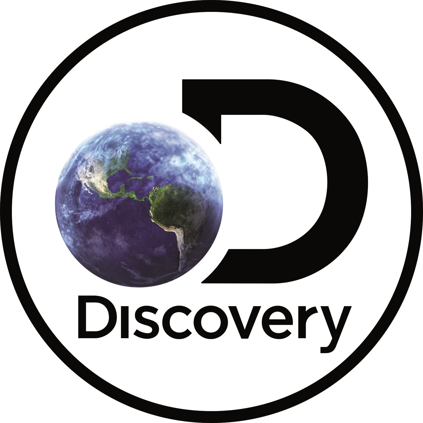
2016-2019
Supporting the launch of a streaming service, the Discovery Channel refreshed its logo again in 2016. It emboldened the D and added the Discovery name back into the wordmark. It’s a busier treatment than the 2013 iteration, but opened the door for a 2019 rebrand.

2019
The Discovery Channel unveiled a global rebrand, supported by new brand positioning: ’The world is ours.’ It retains the ‘globe and D’ device, but modernises it, going one step further on social by almost eliminating the globe entirely.


