Rebranding a people-oriented law firm
With an existing identity unable to capture the dynamism of its services, law firm Bristows needed a people-oriented brand to reposition and remain relevant in the field. Its new identity aimed to leverage the power of people and bring them to the fore of the brand voice
Bristows unveiled its new brand identity in October, modernised to appeal to an evolving market. With the company operating in the technology, branding and IP sectors, the old brand featured visual cues inspired by science fiction, similar to competitors such as London-based VWV. However, according to strategy director at brand consultancy Frank, Bright & Abel, Nick Thomson, it was a clichéd and obsolete way of looking at the Bristows brand. “Bristows used to talk about itself, not necessarily about its clients and certainly not about its clients’ business,” Thomson says. “The identity in place was out of date and too static for the dynamic environment and sectors in which Bristows now operates.”
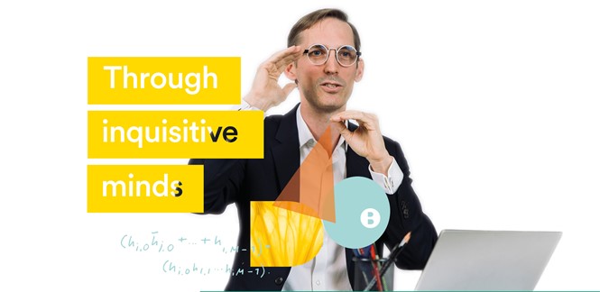
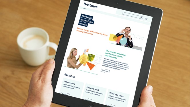
The agency talked to Bristows employees, customers and partners to establish what made the law firm fundamentally different and unique. The answer was a people-oriented mindset. From there, the agency brought people to the fore of the brand and into the core of Bristows’ visual identity.
“We worked with typography and design to help the brand stand out. We wanted to bring people on the floor with animations and videos to give a sense of who Bristows is,” Thomson adds. “We opened a window to the firm’s life for everyone to look through.”
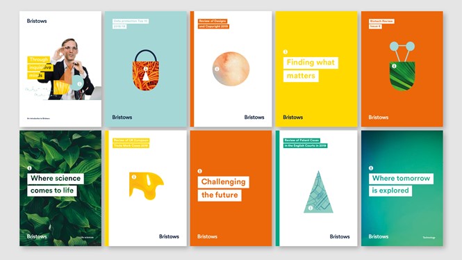
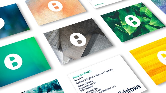
Frank, Bright & Abel demonstrated that Bristows is more than a firm solely focused on IP, as was the perception. In order to communicate the variety of the law firm’s portfolio, the agency worked predominantly with brand narrative, literature, audio solutions and brand voice, which were all reworked to fit the new brand and messaging. Variety in imagery and combinations of visuals came together to create a bigger picture, one that was then applied throughout Bristows’ services and sectors.
The new identity was described by the agency as bolder and more dynamic than the pre-existing brand, able to capture the dynamism of Bristows’ clients with tangible visual results. It may still be too early to share comprehensive data about the results of the brand, but both employees and clients were positive about the change, according to Thomson.
Bristows’ case proofs how it can be dangerous to cling on to existing brands in an effort to delay change. The old brand was well regarded amid Bristows employees, which created more challenges in the rebranding process. However, it had stopped reflecting the nature of the company, as the business and its people began evolving alongside the market. Frank, Bright & Abel worked to amend the concept in place, introducing a twist on the existing brand to reflect Bristows' identity and personality. And when the agency showed the new brand to other law firms during an event, Bristows' competitors were positively impressed by the result.
"What makes Bristows fundamentally different is the mindset and the brand's focus on people," Thomson adds. "We wanted to communicate the values of the company by making the brand more unique. We raised Bristows' potential to the core, allowing more personality to come through the brand. Employees and clients loved it."


