Perfection Fresh ‘seals’ the past up in new rebrand

Sometimes brands need to leave something behind to refresh their identity. This is what family-owned produce farmer Perfection Fresh is trying to achieve, with a new logo that feels like a new start.
Since its establishment in 1978, Perfection Fresh has placed the freshness and quality of its products at the core of the brand’s identity, a passion somewhat reflected by the crisp, lively colours in their logo. If passion never grows old, however, brands may sometimes need new youth, and the family-run Australian company has recently revealed a new rebrand designed by Interbrand.
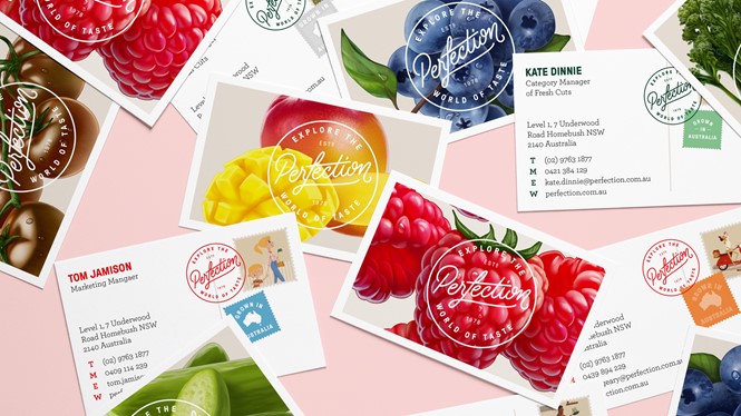
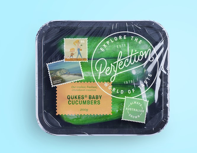
Leaving behind the yellow hook of the old logo, this new one is a ‘seal of perfection’ that strongly connects to the company’s values, although it could be seen as fairly confusing by most consumers. For the occasion, the company decided to drop the word ‘fresh’ from their logo, focusing on a much more straightforward ‘Perfection’ in the middle of the seal.
By dropping a word once tied to the company’s history, the risk of losing brand equity is not negligible, as consumers might not bother to tie this new logo back to the business they know. In spite of all doubts regarding this choice, however, Perfection’s new identity shows an illustrative approach to branding, building on the contrast between old and new, worldly and local, premium and affordable. An inspiring move for brands all across the world.
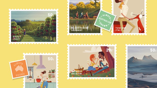
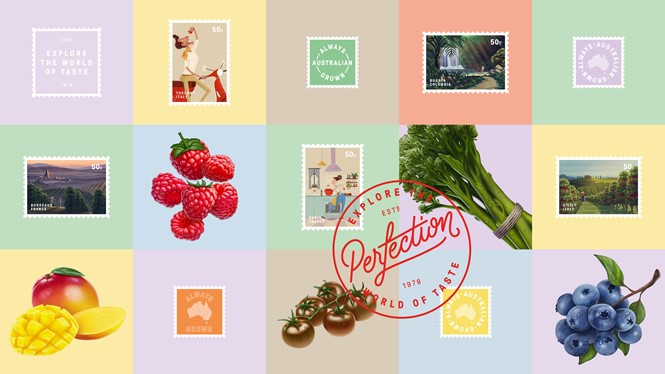
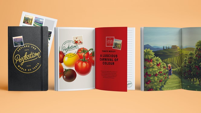
The script features an ‘f’ shooting out on the top and bottom, with a nice and curvy ‘n’. Round, soft lines and edges dominate the seal, reminiscent of postcards stamps and inviting Australians to ‘explore the world of taste.’
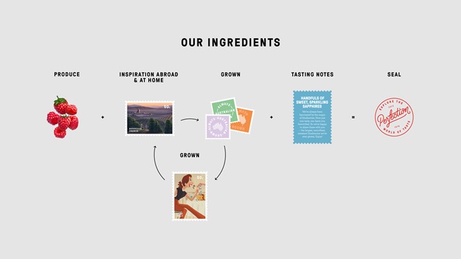
The new logo is accompanied by a set of illustrations, putting multiple ingredients together in a fun and loose way. Images are rich and saturated, hinting at an old, vintage-y style and featuring the stamp of perfection on the company’s most beloved ingredients and foods.
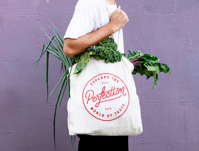
Last, the logo is repeated with transparent background on tote bags, packaging and accessories such as notebooks, with the postcard motif visible on most of the company’s assets.


