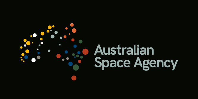
Australian Space Agency’s new logo draws on Australian skies to build brand identity

The new Australian Space Agency logo shows how great concepts can lead to good quality logos and strengthen a brand’s identity.
The Australian Space Agency wants us to know that it cares about Australia’s historical roots and culture. The company’s new logo replaces the old, anonymous writing, with colourful dots outlining Australia’s shape and tied closely to the country’s skies.
At first glance a satellite view of Australia, with the dots alluding to human activity and cities around the country, the logo actually shows several significant indigenous constellations that can be seen across Australian skies. This way, the logo encapsulates a meaningful and clever contradiction between looking at Australia from above but actually admiring the constellations from below.
“Indigenous Australians are our first scientists and astronomers,” the company says, “and their knowledge and contributions to Australian science are reflected through the new brand.”
It might be too abstract for most people to find the hidden meaning, but the story behind the logo shows how great concepts can lead to fascinating brands.


