Discovery Channel’s rebrand is a simple delight
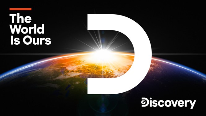
Discovery Channel has dropped its historic photorealistic globe in favour of a minimalistic, sans-serif typeface and a new tagline.
The renowned American television network has chosen a minimalistic path for its rebrand, reducing Discovery’s rendered globe to a 2D, black-and-white Earth enclosed within the letter ‘D.’ The new (in-house created?) identity and tagline, ‘The World is Ours,’ is part of a global refresh launched by the network in April.
Discovery’s refresh was conceived to emphasise the brand’s global reach and bring together all of its major properties from around the world.
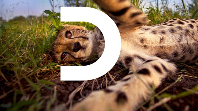
The static image of the globe in the logo shows every continent, reiterating the company’s global presence. In its animated version, the globe spins on its axis inside the letter ‘D’ and is occasionally dropped to frame several kinds of objects within the letter itself.
The rebrand comes with a promo showcasing major series and stars in the network, including ‘Deadliest Catch’ and ‘Expedition Unknown,’ all singing along the notes of Blue Swede’s ‘Hooked on a Feeling.’ The spot suggests a playful yet confident attitude surrounding the whole network and surely communicates the right vibe for Discovery’s rebrand.
For more from Transform magazine, sign up for the Transform newsletter here and follow us on Twitter @Transformsays.


