Blue tops list of most used colour in Fortune 500 logos

Every detail in a logo serves as part of the wider story brands try to convey to their audiences. But while consumers may not realise it, logo colour plays an important role in how they perceive and understand brands.
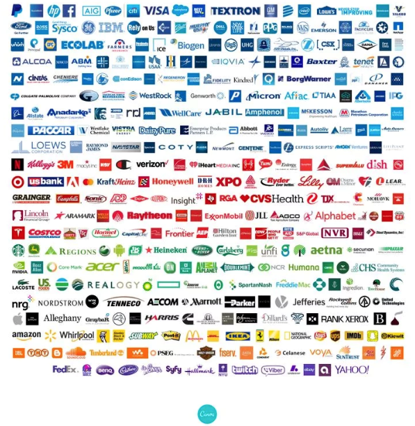
It makes sense that companies choose to represent themselves using specific colours to convey certain messages. Canva, a graphic design tool and website, looked at the logos of Fortune 500 companies in order to identify any existing trends in logo colours. They discovered that a staggering 43% of Fortune 500 company logos are blue. Blue is often associated with calm, safety and trust, and is thus a common choice for companies wanting to espouse those qualities. In particular, insurance, health, finance, and tech companies were the most likely to have blue logos, a logical choice given that companies in those sectors need to gain customers’ trust. However, it is possible that customer perceptions of colour could be subject to change. With Citibank’s involvement in the 2008 financial crisis and Facebook’s recent data breaches, it remains to be seen whether blue will continue to be associated with security and reliability.
Canva found that bold, powerful reds are the second most common choice, specifically in food and in retail industries, appealing to brands like Coca-Cola, Heinz, Oscar Mayer, Costco, CVS, and more. Again, red is a rational choice for these companies; red implies excitement, strength and activity. For customers browsing long grocery store aisles, an eye-catching red logo can be the difference between a purchase and a pass.
The other featured colours found are green, black, yellow, orange and purple. Unsurprisingly, pink is one of the few colours missing from Fortune 500 logos. Often associated with femininity and frivolity, pink has yet to break the glass ceiling in Fortune 500 branding.
Research published in Marketing Letters by researchers Lauren Labrecque and George Milne supports these prudent colour choices, revealing that, “colour carries intrinsic meaning that becomes central to a brand’s identity, enabling consumers to assess products and make decisions, and can communicate meanings such as brand personality.”
No colour associations can fully explain the success or failure of a company. However, choosing the right colour can help consumers quickly make sense of a logo, helping companies to attract their target customers and craft an appealing and relevant brand identity.