Weight Watchers loses the weight to become WW

Often, brands that begin as pioneers in their industries, that become the trendsetters and leading voices, fizzle out over time. If they fail to reinvent themselves or fail to adapt to new customer needs or simply, fail. But those that persist are those that take their founding premise and flex it, promoting their core brands, while simultaneously remaking their images for ever newer audiences.
That is the case for Weight Watchers, now WW Inc. Its approach to lifestyle change, healthy eating and exercise dates back to 1963 in Queens, New York. In the years since, it has become a watch-word for weight loss programmes. But, with an increased focus on the health and wellness category from new areas – including digital- and subscription-based businesses, lifestyle brands and influencers – Weight Watchers had to step it up.
Shifting the conversation from weight to wellness, the new brand features the strapline, ‘Wellness that works’ and embraces a community-centred approach that is more convenient for its users. The company’s success relies on people adhering to a fitness and lifestyle change, and the visual identity had to thus take into account the lifestyle cues people respond to now as well as the lifestyle decisions that impact health and wellness.
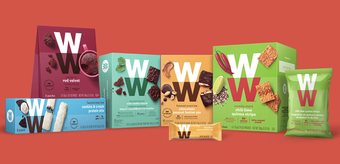
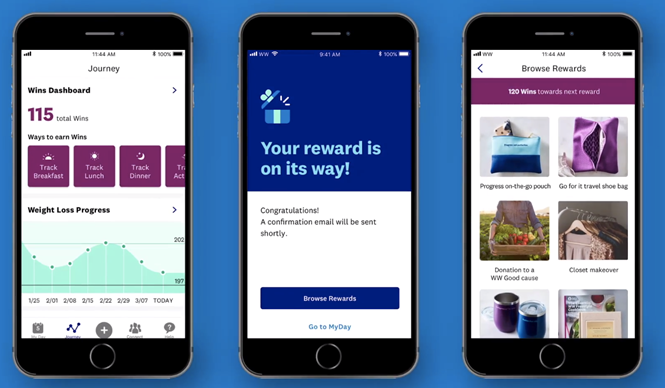
To accomplish that, WW has an app that’s easier to use and oriented around wellness, not weight loss. WW has also introduced a new packaging scheme that uses the WW motif in a modern way, alongside simple imagery of food and drinks and a rich colour palette. The packaging is simple, replacing a preexisting style that was more akin to the freezer aisle than a Whole Foods shelf. The imagery focuses on ingredients, while also aligning the brand with the stylistic approach preferred by modern health food brands.
The new approach also boosts the focus on community, harking back to the founding ethos of community support throughout the wellbeing and weight loss journey.
Similarly, the new name lessens the focus on weight. It’s an interesting decision for a heritage brand, as the Weight Watchers name carries a lot of awareness and influence. However, as WW’s brand page says, “The name WW reflects that we’re becoming the world’s partner in wellness. We will always be the global leader in weight loss, but now WW welcomes anyone who wants to build healthy habits.” Those that don’t change are left behind. And the new positioning, supported by a fresh visual identity, packaging scheme and approach to lifestyle change are part of WW’s bid to remain relevant, and succeed, in a new health and wellness marketplace.