#TransformTuesday: 4 December

Every week, Transform examines recent rebrands and updated visual identities. This week's picks are below. For more from #TransformTuesday, follow @Transformsays
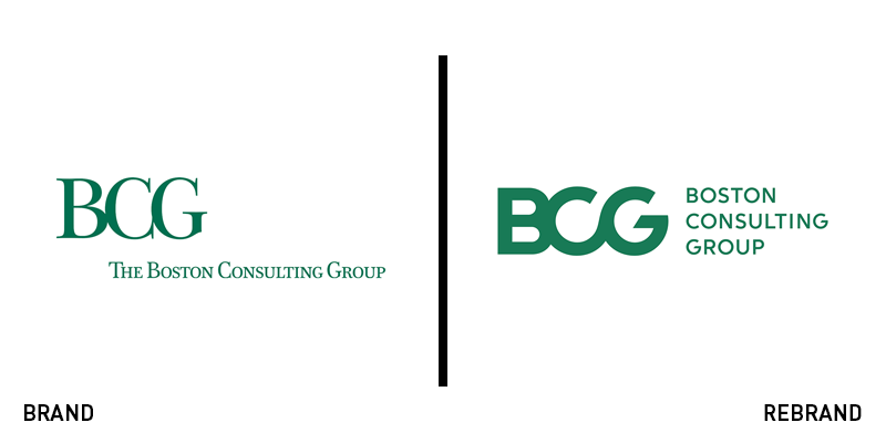
Boston Consulting Group
Global management consulting firm and advisor on business strategy, Boston Consulting Group (BCG), has revealed a new brand identity, incited from the brand’s progress and development. The new logo sports a bold, yet minimalist look that suits BCG’s core values and strategy. Without losing its international awareness, the new logo works both as a monogram and a symbol, representing the brand in a dynamic and accurate way, while offering optimum digital translation. Crafted by branding agency Carbone Smolan Agency (CSA), the new visual identity carries the heritage of the brand into the modern age in a clear and effective manner. CSA says, “The new logo firmly centres and unifies the refreshed BCG brand universe, and serves as a powerful reminder of the firm’s continuing heritage of restless innovation.”
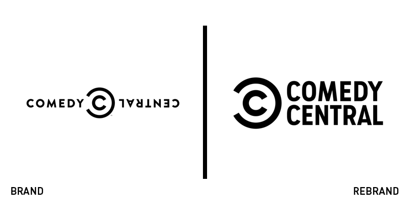
Comedy Central
At 27 years-old, and almost a decade after its last redesign, Comedy Central, the American cable television channel owned by Viacom Global Entertainment Group, has decided to update its brand, revealing a new visual identity designed by New York-based branding agency Loyalkaspar in collaboration with Comedy Central’s in-house team. The new logo has maintained the abstract ‘C’ symbol, changing the wordmark’s font, applying the newly designed Comedy Sans, which features a bolder and narrower look. The new typeface will also enhance the brand’s internal and external communications offering consistency and recognisability with ease. Furthermore, the colour of the logo features the standard monochrome choice, while the new brand has been designed to roll out across all of Comedy Central’s touchpoints.
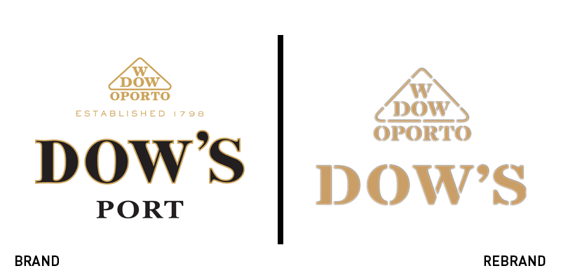
Dow’s
Port brand Dow’s has introduced a new visual identity for its range of aged tawnies. The new packaging, crafted by drinks design company Denomination, aims to reach the new generation of customers by transforming Dow’s into a modern, future-forward brand. Denomination was tasked with creating a visual identity to establish the brand among the premium on-trade market. The new identity created a correlation between the vintage and aged tawny variants by using Dow’s Vintage signature black glass across both. The triangular symbol is now more prominent, achieving instant recognisability and making the bottles stand out on the shelf. The negative space between Dow’s logo at the top of the bottle, and the label at the bottom, enhances the uniqueness and modern look of the bottle. The front label now contains product information about the origin of the grapes and the name of the range’s maker.
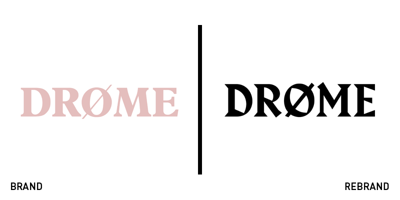
Drøme Magazine
Arts and culture title Drøme Magazine, has revealed a new visual identity for the release of its Volume III issue. The magazine is a platform for the stories of those overlooked or explicitly excluded from the art and media worlds, such as the LGBTQ+ community. The newly updated cover, logotype, masthead and titles were led by creative director William Richmond-Watson, founder of NYC-based creative consultancy Watson & Company. Richmond-Watson also led art direction as well as creative development, strategy, positioning and identity. “Drøme asked me to help them establish their voice as the alternative voice of a generation, and elevate their content and production value to put them on a level playing field with other publications representing the cultural zeitgeist,” Richmond-Watson said. “With the new design for Volume III, we set out to help Drøme find a clearer voice and better connect to their brilliant and extraordinary audience.”
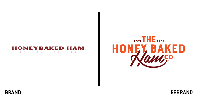
Honeybaked Ham Company
Carrying a 60-year heritage, food retailer Honey Baked Ham Company, has rolled out a refreshed brand identity, consisting of a new logo and updated menu offerings. The new logo has kept its signature burgundy colour palette, while adding to it a shade of warm orange. The wordmark sports a different font that looks less generic, bolder and has attention-grabbing elements, such as the word ‘ham’ written in calligraphy. In the context of the rebrand, Honey Baked Ham Company has also introduced new, more sustainable packaging, certified by the Sustainable Forest Initiative and the Forest Stewardship Council. JoAnn Herold, chief marketing officer at Honey Baked Ham Company, says, “Our new look is fun and contemporary, but it still pays tribute to our brand’s history. It includes a refreshed colour palette and a feel of craftsmanship and authenticity that will appeal to our loyal customers and engage a younger generation.”
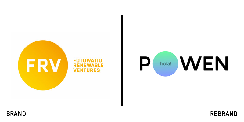
Powen
Spanish renewable energy firm, Fotowatio, has collaborated with global consultancy Saffron to design a new sub-brand with the objective to promote the use of solar energy in Spain and raise awareness in regard to energy consumption among its consumers. Together, they came up with Powen, a brand with a name that conveys the brand’s purpose and messaging, while exuding a sense of power and dynamic. The new logo resembles the control panels that the company provides to empower their customers’ usage. To further enhance Powen’s role as an educator, Saffron also came up with a set of flexible graphic illustrations to represent the ever-changing nature of energy. The overall visual identity comes to life with the implementation of a strong colour palette that draws inspiration from the plethora of changing colours of light throughout the day.


