Microsoft changes app icons to ‘get out of people’s way’


Microsoft has updated the design of its app icons to display more discrete and less disruptive images, allowing users to focus on each application’s use, not its branding.
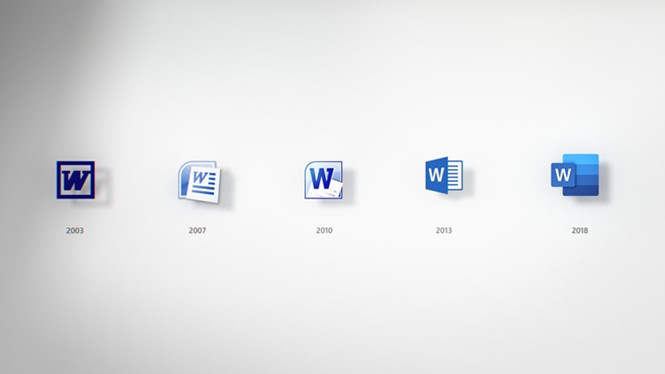
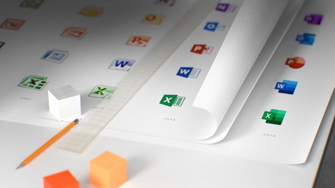
A task taken on by Microsoft’s in-house team, the new icons have been crafted to look 3D and more colourful, while their differentiating element is the initiating letter and the symbol of each app. The letters, such as ‘W’ for Word, are illustrated within a square, against the symbol that represents the program, while the variation of colours enhance the icon’s 3D feel.
Other changes include the now-rounded corners of the icons, and the right angle in which they are displayed.
The new visual identity has been designed to be user-friendly across all digital devices. That’s why, the letter attached to each app can be removed if the whole icon doesn’t fit the screen of a smaller device.
The symbols of the icons refer to the function of each app, with the PowerPoint icon being, for example, a pie chart, and the Word icon being a lined page. The border of the documents in Word, Excel and PowerPoint, were also removed, highlighting the content of the apps to convey Microsoft’s message of ‘getting out of people’s way’ and allowing them to concentrate on their work.
The new icons are in the context of an overall redesign for Microsoft, which has made changes to its user experience earlier in 2018. The app icon redesign will help optimising the apps for customer use by promoting collaboration and shifting the focus from the apps’ branding to their competencies.
For more from Transform magazine, follow us on Twitter @Transformsays