New logo and rebrand for TV series Doctor Who
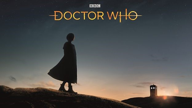
Since 1963, science fiction TV programme Doctor Who’s cross-generational appeal, plethora of acting talent and family-friendly yet dramatic story lines has cemented it as a flagship programme for the BBC. And the new series, airing late in 2018, sees welcome change to the show’s long-running male-dominated format with British actor Jodie Whittaker revealed as the first female Time Lord.
But the famous TARDIS time machine will house not just Whittaker as the new doctor. The show arrives on British screens complete with a new brand design and visual identity.
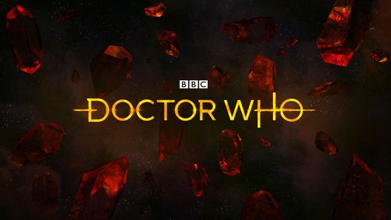
Designed by London-based creative brand agency LittleHawk, the Doctor Who rebrand sees the 13th doctor characterised by linear lettering and an ethereal colour palette. Working closely with Doctor Who showrunner Chris Chibnall and executive producer of the programme Matt Strevens, the elegant aesthetic is a stark departure from the bold blue lettering that characterised the programme since previous doctor Peter Capaldi took over the role in 2014.
For Rafaela Perera, BBC Worldwide executive creative director, creating a new brand for Doctor Who meant the show’s extensive history and iconography had to be recognised. “The Doctor Who logo and insignia are the quintessential signifier for the brand,” says Perera. “Our aim was to create modern and elegant designs that were anchored in the things that we love most about Doctor Who.”
And, as if to cement the historic relationship between the broadcaster and one of the UK’s longest-running television shows, the updated Doctor Who logo also features an update to the BBC insignia. Previously left-aligned to the blocky, bold logo, its latest iteration brings the parent company identity front and centre; the BBC identity is enlarged, with larger letters creating a starker contrast between the corporation’s black and white lettering. This is emblematic of the working relationship between LittleHawk and the BBC – the branding agency has previously worked with the BBC Worldwide Brands team to deliver an updated identity for global service BBC Worldwide.
The programme’s audio brand, consistently key to the unique atmosphere of Doctor Who, has also been updated. Created by British musician and producer Matthew Herbert, the show will launch with a 10 second animation featuring the doctor’s vessel the TARDIS blazing a trail through the new logo.
Unveiled by Whittaker in Liverpool last Tuesday, merchandise featuring the new Doctor Who brand is available in advance of the show’s first screening. A much-loved UK export, the rebranded television series enters a new era of aliens, other-worldly threats and companionship. Its sophisticated yet tension-building moniker, and genre-changing new doctor, will cement Doctor Who’s legacy as a flagship BBC programme with unique global appeal.
For more from Transform magazine, follow us on Twitter @Transformsays
Doctor Who logo


