Legendary forest brought into the modern age
Home of the legend of Robin Hood, Sherwood Forest is located in Nottinghamshire, England, which spread across a 420-hectare royal forest. Following the Royal Society for the Protection of Birds' (RSPB) management takeover and the opening of a new £5m visitor centre, the forest has revealed a new brand identity led by Sheffield, UK-based creative agency Cafeteria.
By managing Sherwood Forest, the RSPB, kept its promise to ‘making a home for nature,’ while at the same time it had the opportunity to expand its reach beyond its range of nature reserves. Cafeteria was tasked with the design of an all-encompassing identity for Sherwood and the RSPB, creating consistency and connecting the two organisations.
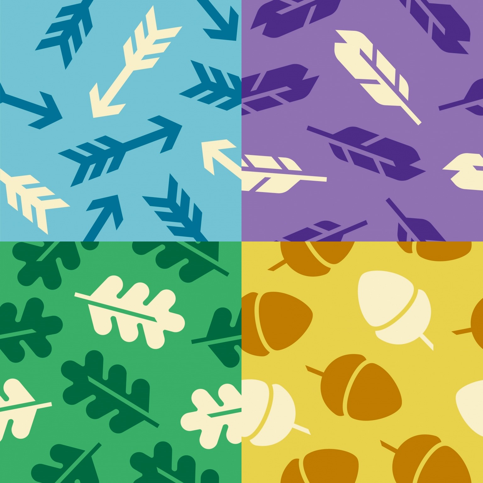
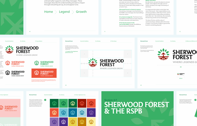
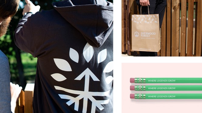
The new visual identity is lively and bright, yet familiar as it seeks to reach a younger audience without estranging its loyal following. The logo incorporates three key elements: a tree canopy with roots whose shapes reflect the arrowhead, a shaft and a fletching of an arrow. The new logo references the famous Major Oak, which, legend has it, was Robin Hood’s main retreat an estimated 900-1,000 years ago, combining two of the most significant of Sherwood’s selling points.
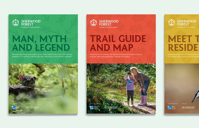
A bespoke slab serif typeface has also been developed for the logo, called Sherwood Sans. The wordmark is bold with wide kerning and, unlike many recent logos, in all caps, giving a powerful and proud look to the legendary forest. Sherwood Sans is used across all Sherwood’s touchpoints giving a distinctive element to its visual identity and creating consistency across its communications.
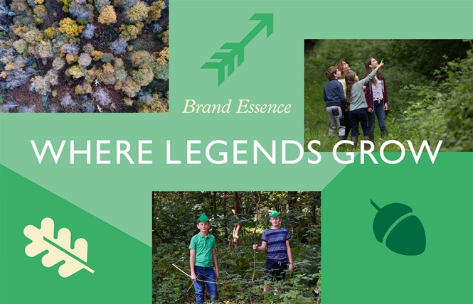
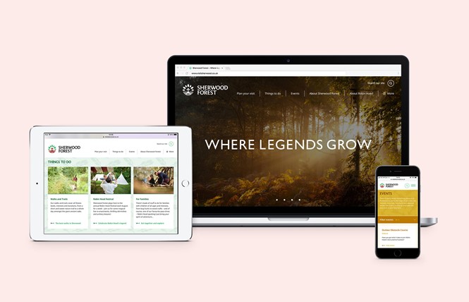
Along with the name, a new tagline that reads ‘Where legends grow’ has been added, bringing to life the mysterious and majestic side of the forest, inviting visitors to come and explore it.
Cafeteria came up with six themes that communicate the essence of the strapline ‘Where Legends Grow;’ nature, active, guardianship, togetherness, history and Robin Hood. With a clear picture of the brand’s values, Sherwood Forest has developed a structure that offers visitors the best experience possible.
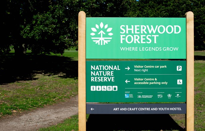
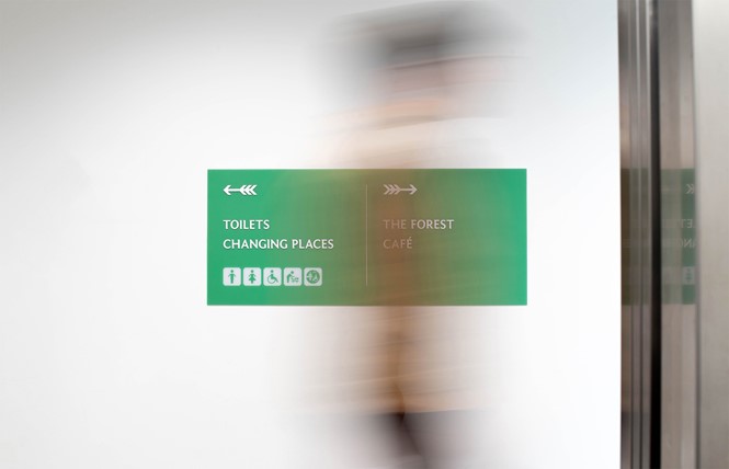
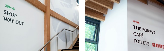
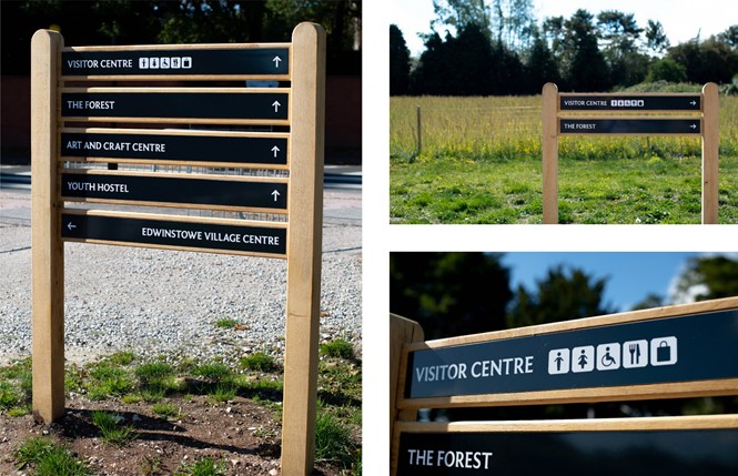
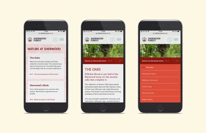
Along with the new brand identity, Cafeteria designed a new website, promotional print, a wayfinding scheme for the whole site and environmental graphics inside the visitor centre.
For more from Transform magazine, follow us on Twitter @Transformsays