#TransformTuesday: 7 February
Every week, Transform examines recent rebrands and updated visual identities. This week's selections are below. For more from #TransformTuesday, follow @Transformsays
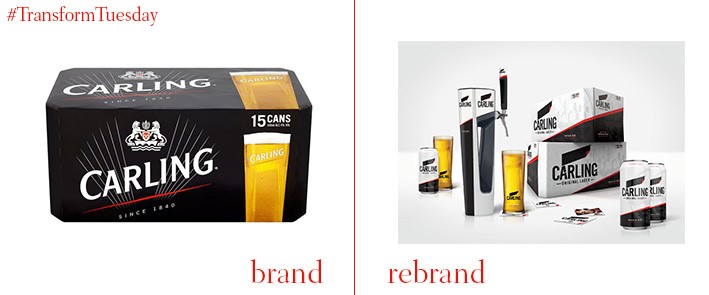
Carling
International design agency, BrandOpus, has rebranded leading beer and cider producer Carling in a bid to consolidate its position as the UK’s leading lager brand. Its visual update is part of a push to ensure Carling stays relevant, says brand director of Carling, Jim Shearer. It also coincides with Carling’s sponsorship of Premier League football. Nir Wegrzyn, BrandOpus chief executive and founder, says, “It was important for us that the new identity be instantly recognisable as Carling, but enough of a visual shift to move the brand perception forward to reinforce their number one status. We organised the brand in a much more consistent way that would appeal to new consumers and loyal drinkers alike.”
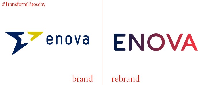
Enova
State-owned enterprise, Enova, is a Norwegian organisation with the goal of transitioning the country to environmentally sustainable energy usage. It has updated its previously quite generic logo with capitalised type and a strong gradient, harnessing a blue-to-pink colour palette to better reflect Enova’s mission. The blue is said to represent ‘knowledge, technology and business,’ while the pink shade reflects ‘energy, action and commitment.’ The associated Enova marketing materials are also modernised, as well as the company updating its suite of icons to further optimise the Enova brand for social media and digital platforms.
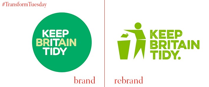
Keep Britain Tidy
Independent environmental charity, Keep Britain Tidy, was established in 1960 with the aim of reducing litter and promoting greener living across Britain. After retaining the same visual identity for a decade, Keep Britain Tidy has today unveiled its updated logo. Designed by London-based Conran Design Group, it reintroduces the iconic ‘Tidyman’ image for a modern, digital audience, optimising the charity’s visuals for social media. The updated Keep Britain Tidy identity also ties together the charity’s 11 associated organisations into one, more unified, entity. Conran Design Group CEO, Thom Newton, says, “The evolved brand and branding system will clearly signpost the organisational structure and remit and support more meaningful interaction with partners, supporters and the general public.”
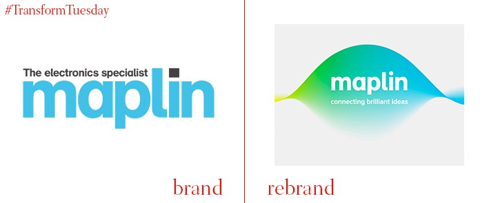
Maplin
Maplin, a UK- and Ireland-based store specialising in electronic retail goods, has been a mainstay of British high streets since the late 1970s. To establish a more universal appeal, ensure its product offering doesn’t alienate potential consumers and compete with the online electronic market, Maplin has unveiled a new identity. Designed by London-based branding studio, SomeOne, the new identity for Maplin is based on the notion of ‘connecting brilliant identities.’ The logo, which features a new wave-shaped design, aims to reflect the store’s continually changing and adapting product offering. the identity is expected to roll out over the next two years.
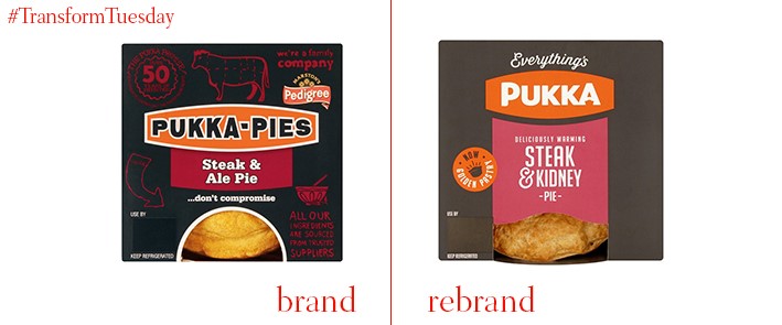
Pukka Pies
Historic bakery firm, Pukka Pies, has announced a rebrand and update of its visual identity and marketing materials. Nottingham, UK-based creative agency Together Agency led the digital aspects of the brand redesign, revamping its website and social media channels and positioning the pies as a convenience food, focusing the new campaign on ‘busy mums’. Its strapline is ‘Everything’s Pukka’, playing on the British slang for everything being alright. The relaunch also includes updated recipes for some of the pies. Speaking to the Nottingham Post, head of marketing at Pukka Pies, Lindsay Filmer, says, "With the brand relaunch marking our biggest-ever marketing investment, we're confident that we can build on our strong family heritage and cement our position as the nation's favourite hot pie brand."
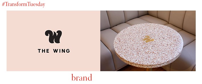
The Wing
The Wing is a women-only social club in New York, U.S. Purported to draw on suffrage graphics, its identity has been designed by an all-female team, led by Emily Oberman, from international branding agency Pentagram. Identities of famous outspoken women form a major visual cue. The Wing uses 30 separate iterations of the letter ‘W’ to form the basis of its identity, with pastel colours including pale pink used against secondary colours, such as yellow, grey and black. The overall identity is described as ‘scholarly, elegant and feminine’ while creating a welcoming atmosphere for the new space.


