#TransformTuesday: 2 May
Every week, Transform examines recent rebrands and updated visual identities. This week's picks are below. For more from #TransformTuesday, follow @Transformsays
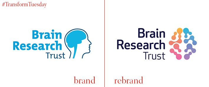
Brain Research Trust
London-based branding and communications agency, The Team, has refreshed the visual identity of a leading brain disease research charity. Since being founded in 1971, the bulk of the Brain Research Trust’s (BRT) donations have gone towards University College London’s Institute of Neurology to fund lifesaving work into neurological diseases such as Alzheimer’s and motor neurone disease. Having recently changed its charitable objectives, The Team develop a new story and purpose for BRT, with a more optimistic tone. Dan Dufour, brand strategy director at The Team, says, “When [the brain] breaks down, we break down. It doesn't have to be this way. We identified an opportunity for a brand with humanity, unity and positive energy; a brand to accelerate the growth of a great charity.”
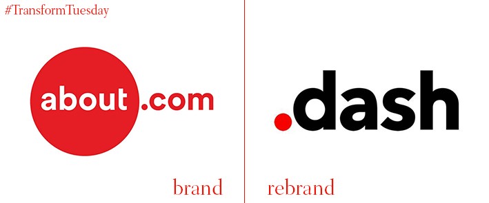
Dotdash
Global digital publisher, About.com, has today announced a thorough in-house rebrand and name change to Dotdash. The decision came after Dotdash’s internet holding company, IAC, decided that while the About.com name is well-recognised, the brand’s equity is not enough for consumers to view it as a specialist site. The name change also comes after the original site broke into five separate offerings, starting with its health output Verywell last spring. Dotdash hopes its rebrand will also refresh its agency and marketing relationships.
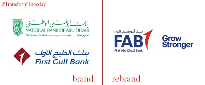
First Abu Dhabi Bank
After a successful merger between the National Bank of Abu Dhabi and First Gulf Bank, the new First Abu Dhabi Bank (FAB) brand has been unveiled. FAB’s brand identity reflects its positioning as the largest bank in the United Arab Emirates, and one of the largest in the Middle East and North Africa, particularly through the slogan ‘Grow stronger.’ Abdul Hamid Saeed, group chief executive officer of FAB, said in a statement, “[The reband] will also serve as a strong platform for FAB to support the prosperity of the UAE and its global network, as well as our strategic aims to grow locally and internationally, and build on our position as a financial services leader.”
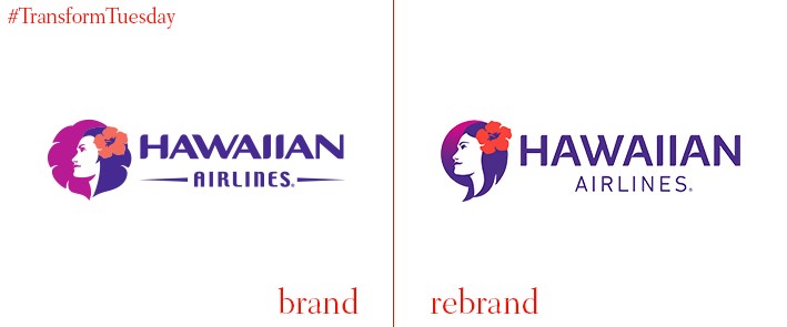
Hawaiian Airlines
Hawaiian Airlines, the largest airline operator in Hawaii and eighth largest commercial carrier in the US, has unveiled its latest livery after an in-house brand refresh. The updated design, which encompasses the entire fleet, is minimal but reflects the airline’s ongoing commitment to customer service and offering a modern flight experience. Main elements of the Hawaiian Airlines visual design update include an update to its iconic Pualani tail symbol and the addition of pakalana flowers, which now wrap around the fuselage of the aircraft. Hawaiian Airlines CEO, Mark Dunkerley, says, "Our new livery embodies a stronger, more contemporary representation of Hawaiian Airlines' culture of service and hospitality, which is the bedrock of our guest experience. It acknowledges our place as Hawaii's airline and underscores the commitment our employees make every day to provide our guests with a gracious and genuine island welcome."
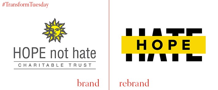
Hope Not Hate
Prolific anti-racism advocacy group Hope Not Hate has updated its brand identity to reflect a commitment to ‘striking out’ values of hatred, which it says are stirring across Europe and North America. US- and England-based digital agency Blue State Digital, also behind Barack Obama’s presidential campaigns and the Labour Party’s 2015 general election campaign, led the rebranding exercise. Given the current political mood, Blue State Digital created an identity and website flexible enough to be used by any grassroots groups to which Hope Not Hate’s message is relevant. Blue State Digital hopes that, by obscuring hateful words, their power and media impact will decrease.
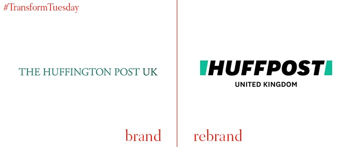
HuffPost
The 12-year old digital news outlet, the Huffington Post, has rebranded its name and visual identity in a bid to restore trust in the art of news gathering, which the publication says is at an all-time low. HuffPost’s mission, to amplify those voices not necessarily heard, is therefore reflected in a refreshed brand strategy. Its updated design, completed by New York-based creative partnership Work-Order, is a bold step toward better connection between the HuffPost brand and its audience. Given HuffPost’s digital heritage, its new icon – which includes designs reminiscent of a grammatical slash or an H – is stripped back and optimised for app or social network use. On its website, Work-Order says, “In motion, the H icon is the driving force behind all of the movement– it’s the bookends opening to reveal content.”
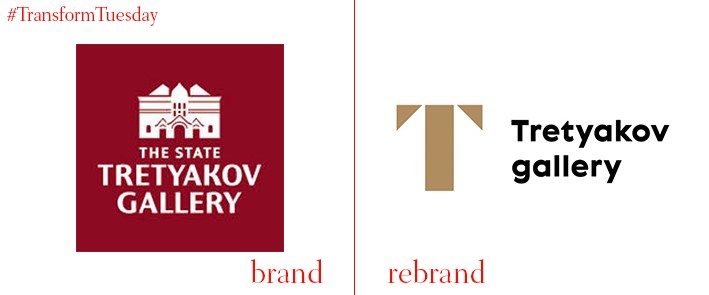
Tretyakov Gallery
Based in Moscow, Russia, the Tretyakov Gallery is home to the most comprehensive collection of Russian art in the world. Moscow-based design agency ONY recently renewed the gallery’s logo and brand purpose, reflecting the institute’s desire to unite the museum complex while offering its audiences the same cultural experience they have enjoyed since its opening in 1892. ONY’s logotype, led by a dominant ‘T,’ is designed to be both contemporary and classic. The ONY website says, “…a living letter ‘T’… blends into all kinds of images and objects and brings the focus onto the people. This new ‘T’ merges the tradition of Cyrillic alphabet with the aesthetics of Russian avant-garde. The latter naturally fits into modern digital space.”


