New beer brand reflects vibrant Angolan culture
Angola, situated in the south on Africa’s west coast, is one of the continent’s mysteries. Notoriously difficult for outsiders to access, the relative lack of knowledge about, and intrigue surrounding, Angola is attributable to the country’s turbulent social and political landscape, as well as its contentious Portuguese colonial history. The vibrancy of its 25.8 million people, landscape and culture, however, cements Angola as one of Africa’s emerging gems.
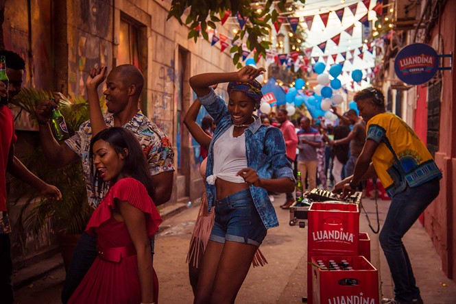
Along with a renewed sense of optimism and young population, the country’s forward-thinking attitude informs Angola’s newly-launched beer brand.
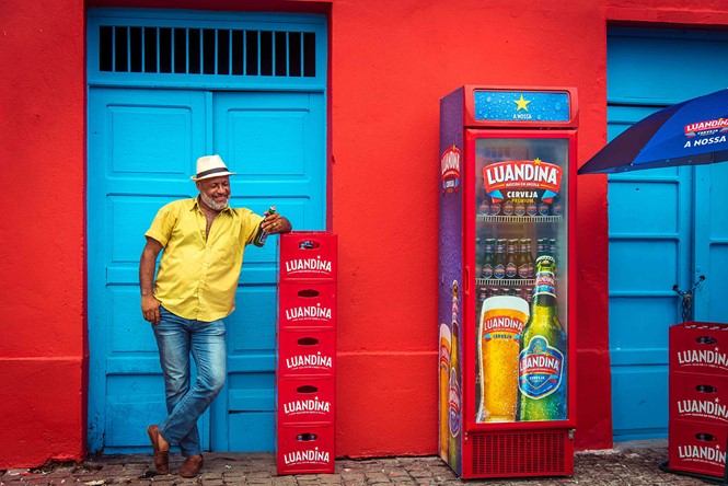
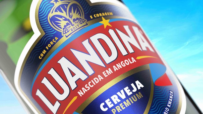
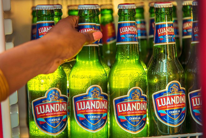
With its colourful, vibrant brand created by global brand consultancy Webb deVlam, Luandina is the country’s first 100% certified Angolan beer. Its brand name, a feminine take on the capital city Luanda, suggests the nation’s respect for female power and historic regard for mother nature, on which much of daily culture is based. A key part of the Luandina packaging is the inclusion of ‘2017’ on the product’s bottles and cans; indicative of Angola’s pride in its produce, the modern date represents a modern vision of Angola’s future.
Branding a beer for an emerging market was no easy task, however. The two-year project saw Webb deVlam research other Angolan beers on sale, a particularly vital consideration considering Cuca, a beer launched during the Portuguese colonial period, remains one of the country’s most popular beverages. Yet Luandina, brewed pilsner-style on the banks of the capital’s River Kwanza, has universal appeal in both product and design. Disregarding the red which leads the identity of Cuca, as well as many of the nation’s other beer offerings, Webb deVlam settled on a strong blue. Lending itself to product differentiation, the strong blue-led palette and the label’s wave motif emphasises the important of one of Angola’s most vital aspects – the River Kwanza.
While ostensibly a beer for Angola, however, Webb deVlam ensured Luandina’s local provenance is a pillar of the brand’s core visual identity. A yellow star on the Luandina label references the national flag. Inclusion of a crest on the packaging features both antler from the native sable antelope, and turrets from the famous fortress Fortaleza de São Miguel which, built in 1576, still overlooks Luanda. And, with year-round sunshine, a bright yellow sun reflects both the country’s climate and its positive future outlook.
For the creative director of Webb deVlam, JP Hunter, the relatively recent emergence of Angola into the modern FMCG sector presented a set of challenges unique to the country. But, says Hunter, Webb deVlam’s forward-thinking approach ensured the extensive project went smoothly. “It’s such a new market, so we had to carry out extensive research to understand the target consumer,” Hunter explains. “One of the reasons Webb deVlam was selected is because it has innovative ways of getting under the skin of consumers in emerging markets.”
Success of Luandina’s launch sees it sold in cans, bottles and multipacks from wholesalers, premium liquor stores, street sellers and corner shops, and it will soon be available on draft at bars. There are also plans to roll out this very Angolan beer across the wider continent – but not without communicating to other Africans exactly what this beer means to its country. “It was crucial that Luandina represented everyday Angolans and the country’s spontaneous, optimistic and confident spirit,” says Hunter. “At times, it felt like we were branding the nation.”
Luandina logotype


