A rebrand worth its Saxa salt
‘Pass the salt’ is perhaps one of the most common requests heard among a group of people enjoying a meal together. And, if the meal is taking place in the UK, chances are the salt being passed is Saxa. First established in 1907, the salt brand – along with Bisto, Hovis and McVities – has firmly earned its place in the annals of great British heritage food brands. Now, 110 years later, its iconic packaging design has been updated by Leeds-based brand design agency, Robot Food, to ensure it remains relevant in a highly competitive category.
Artisanal cookery, which often calls for salt varieties such as rock salt, sea salt or Himalayan salt, has seen a plethora of new and challenger brands affect the popularity of Saxa in the supermarket. This is besides affecting the brand’s visibility in an increasingly crowded category. Official health warnings about the dangers of salt consumption have too impacted the amount of salt consumed in the UK. Research published in 2017 by the University of Liverpool showed that, between 2001 and 2011, the mean salt consumption in the UK dropped to 8.1g each day – down from 9.5g.
Given the challenges affecting the salt market, then, Robot Food devised a strategy which emphasises Saxa’s longevity while targeting the product towards customer use of salt in cooking. Dave Timothy, client director at Robot Food, says, “Saxa is one of those brands we all grew up with and they’ve always done one thing very well. We love helping brands with self-esteem and Saxa can stand tall and proud in what’s now a hugely progressive category.”
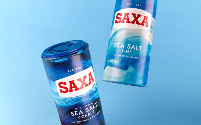
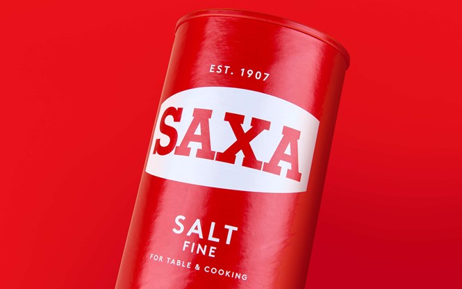
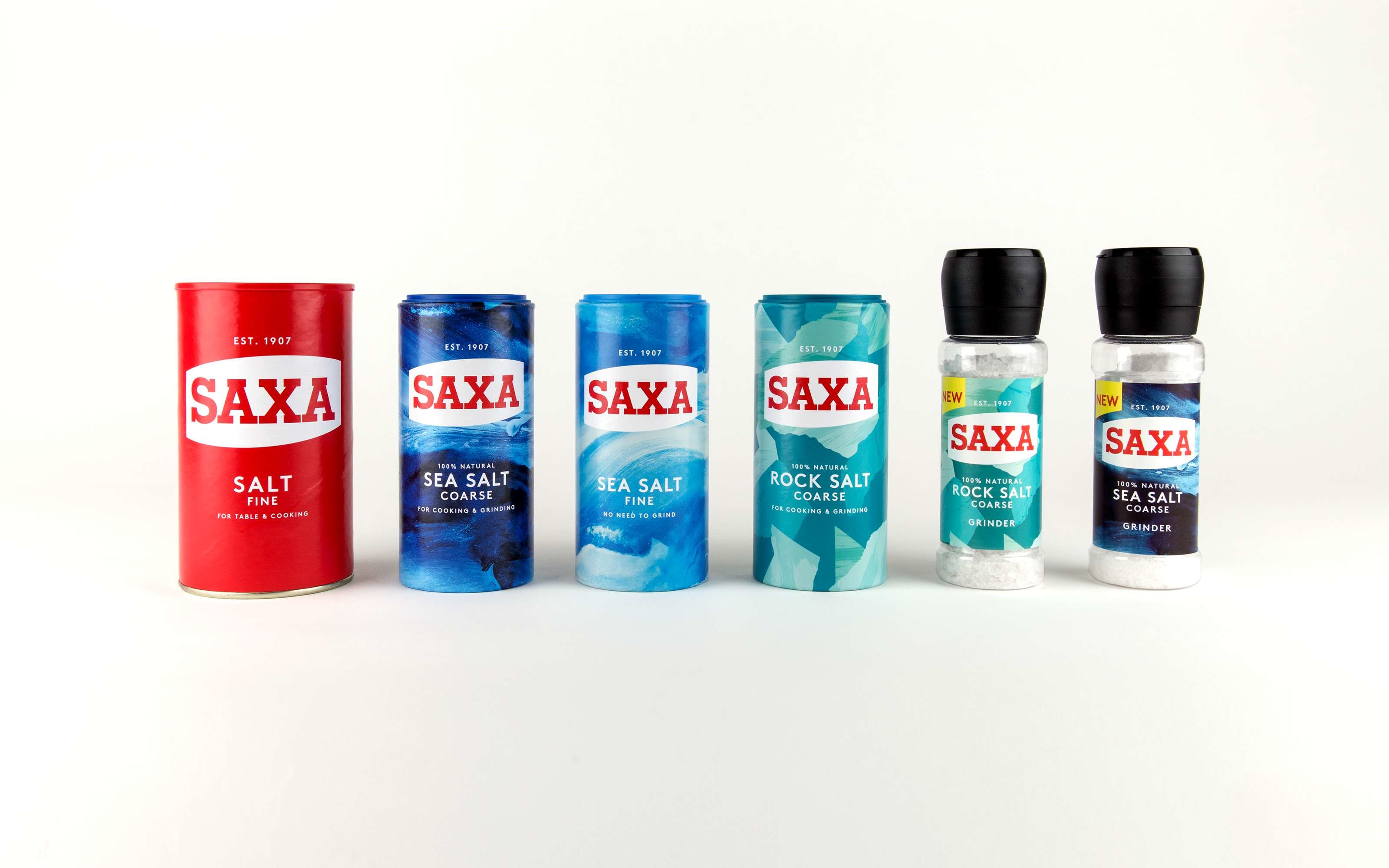
Refining and updating the well-known and loved Saxa logo, rather than changing it completely, sees it retain its iconic, strong identity. Robot Food has also ensured the ‘Est. 1907’ wordmark, an integral feature of the brand’s identity is made bolder and clearly visibly above Saxa’s logo. This remains led by its historic red-on-white colour palette. These features, along with the bold, red drum-shaped cylinder in which it is packaged, are Saxa's most valuable brand assets.
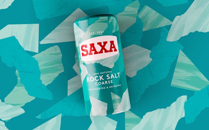
For Saxa’s other products, however, matching the packaging design cue to the style of salt found within lends a more invigorating and contemporary take to a brand which focuses on inspiring culinary adventure. Deserting the photographed images of food which led its previous packaging, Saxa sea salt sees design cues based on the sea and the rocks from which the salt is mined. The inner product’s coarseness, from fine to rock salt, is also indicated through natural illustrations which form the basis of Robot Food’s updated matte packaging.
Radka Sovsakova at Premier Foods, which took ownership of the Saxa brand in 2007, says, “We are delighted with the outcome. The rebrand demonstrates flair and credibility, and Saxa can continue to be a proud bearer of salt. This is a fantastic base on which to expand.”
Over a century since it first launched, Saxa remains synonymous with cookery and food consumption in the UK. For the first time ever, the brand also plans to launch its own salt and pepper grinders. Continued innovation, along with Robot Food’s subtle yet powerful brand updates, should ensure the brand is still being passed across the table in another 100 years.
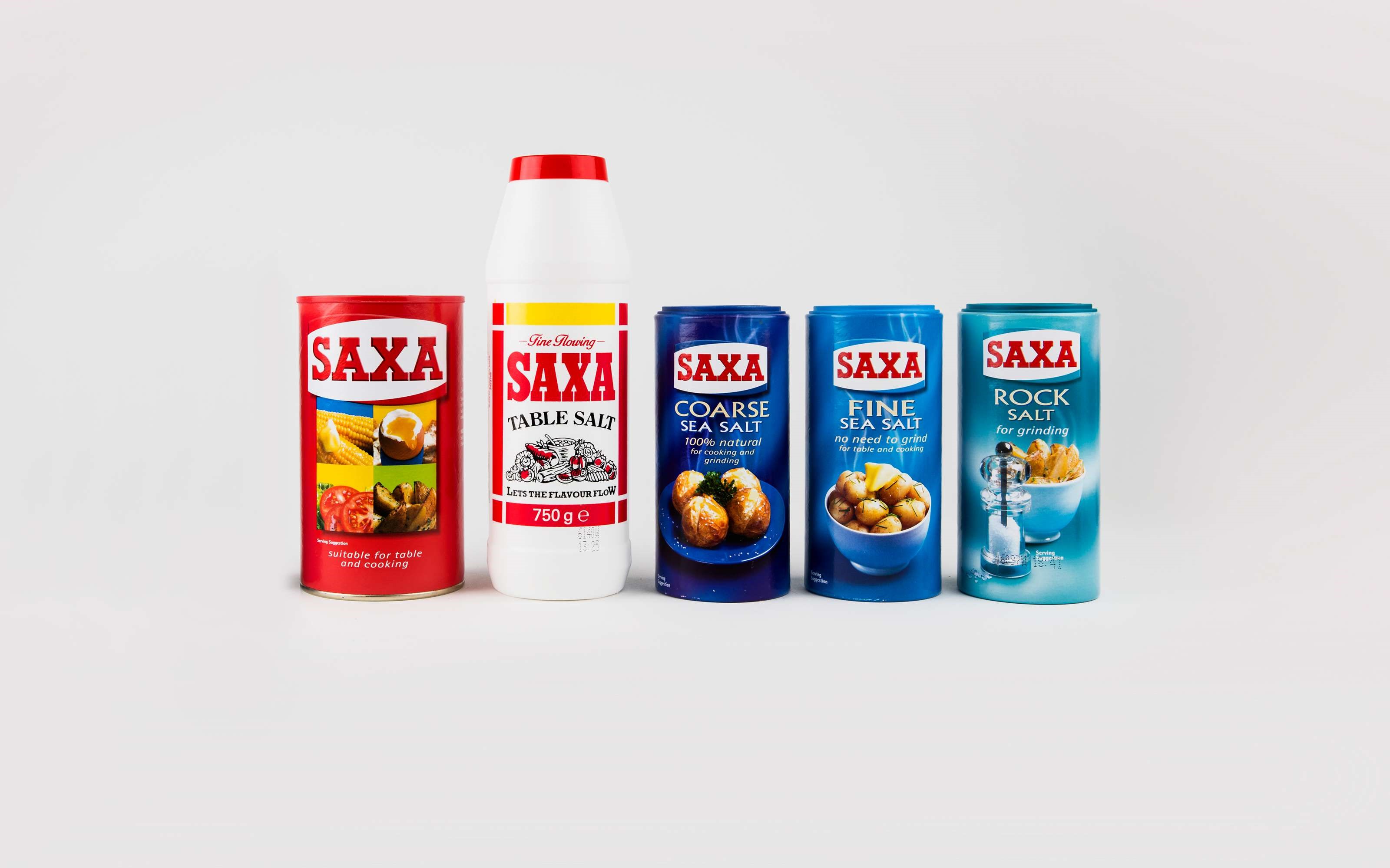
Saxa previous identity
Saxa new identity


