Spotlight on Konica Minolta
The future of the workplace will be a fluid, digitally-connected, adaptable space. But to facilitate that, IT services will have to change too. Konica Minolta, through Workplace Hub is taking the first steps into changing the way businesses operate and the way the workplace influences work. Brittany Golob reports on the new brand
In March 2015, it was just an idea. It lived in the minds of a small group of people at one of Konica Minolta’s Business Innovation Centers. Now, a year and some months later, it lives mostly in the cloud. But it is now an idea that is bringing to life a new way of working, and a new brand within the Konica Minolta family.
With the launch of Workplace Hub, a new approach to IT services and data management, Konica Minolta is embarking on a path that two years ago, might not have even been imagined. But the Business Innovation Centers (BIC) which have given birth to the Workplace Hub were established in 2014 to create innovative products and ideas that could change the way people interact with technology. Workplace Hub is one of those innovations.
It was conceived of as a way to make better use of the office printer. “Printers can be the unloved uncle in the room,” Stacy Sujeebun, director of marketing communications at Konica Minolta says. She worked within the BIC team on Workplace Hub throughout the development process and is currently supporting its launch, and Konica’s communications strategy, from the United States. “It was about transforming that one metre by one metre space. We’re trying to take that space and make that real estate much more useful to businesses.” Konica Minolta’s core business is in printing and imaging, but Workplace Hub soon grew beyond a means of making a printer more useful.
The team soon realised it would become not just a product, but a brand extension within the Konica Minolta family and a suite of products in its own right. To manage that brand development and communications process, London-based brand consultancy Frank, Bright & Abel was appointed in September 2015. It made for an unusual partnership in which the agency and the in-house team worked on the product development and the brand development simultaneously.
Thus, Frank, Bright & Abel’s communications and branding served not only to position Workplace Hub within the world of IT services and within Konica Minolta, but it helped to explain to the development team itself exactly what impact the new products would have on the world of work. “Trying to communicate something that wasn’t fully formed helped them understand what it was they were doing,” says Frank, Bright & Abel’s creative director Janet Edwards.
And Workplace Hub is both easy to understand and incredibly complex. It simply offers businesses a way to own their IT in order to transform their workplace. It is, as the strapline reads, ‘IT on your terms.’ But, technologically, the hub and its products will allow businesses to work more effectively on the cloud, it will align all the various IT services into one system and it will make business systems – manufacturing or intellectual – more ef cient. The challenge for Frank, Bright & Abel was to communicate that to a global audience without a competitor or defined context into which to position the brand.
The strategy also had to account for the strong global reputation of the Konica Minolta master brand, while still differentiating Workplace Hub. And it simultaneously had to change the perception of Konica to allow for its credibility in the IT services space.
Nick Thomson, strategy director for Frank, Bright & Abel, says the first question the agency asked was, “What is this thing that we’re actually developing and communicating about?” By understanding the goals of Workplace Hub and the BIC, Thomson and his team recognised that a successful brand would not only achieve Konica Minolta’s positioning objectives, but would change the perception of IT’s purpose in an office environment, and more fundamentally, what defines the office environment. That ethos formed the basis for the Workplace Hub launch event, which focused on the future of work. “The world is becoming smaller. You have to have technologies that support you with the different behaviours that you require,” Sujeebun says. “You need systems that work well for you.”
The first step to achieving this array of objectives was to write it down. Thomson and Frank, Bright & Abel’s co-founder Rebecca Price worked on a narrative that would then inform the bulk of the written communications, from technical information to sales pitches.
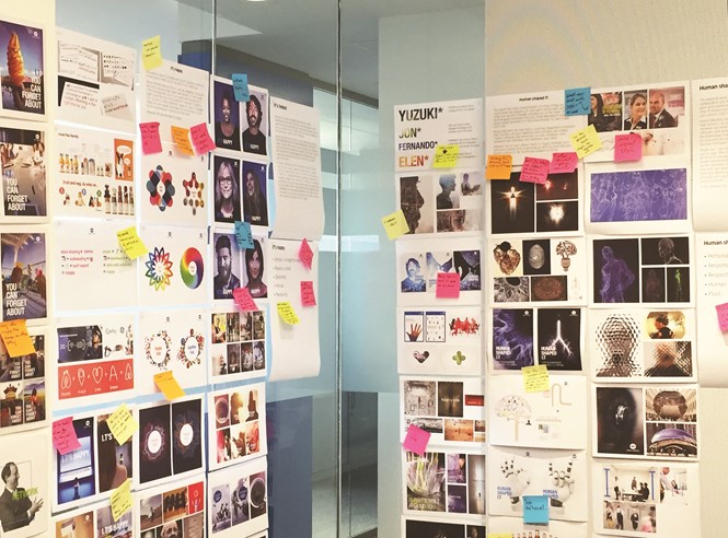
Alongside the narrative, Frank, Bright & Abel devised three different branding routes that were tested by several global research groups. The ndings were surprising. One initial approach was focused on imagination and creativity, a second on IT that “raises a smile” and the third on IT being “wonderfully simple.”
Though the internal favourite was the imaginative approach, because it pushed the boundaries of IT branding, those in the focus groups said it was too far removed from IT. It pushed the boundaries, but it pushed them too far. “Our customers don’t need that. They want reassurance that IT’s going to work for them. They want it to be very tangible, very relatable and with Workplace Hub as well, we knew that it would be a disruptive technology. In order to ensure that people understand the concept, the story has to be very simply told,” Sujeebun says.
“Our customers want reassurance that IT’s going
to work for them. They want it to be very tangible, very relatable and with Workplace Hub as well, we knew that
it would be a disruptive technology. In order to ensure that people understand the concept, the story has to be very simply told”

The “wonderfully simple” approach was not favoured by IT customers either because they said that IT was, in fact, not really that simple at all. Finally, IT “raising a smile” was welcome in western Europe, failed in eastern Europe where employees do not go to work to smile – so said one respondent – and in North America where the idiom did not translate. “I think if you’d asked the Konica Minolta team and us at the very beginning what we thought the end result would be, we thought the end result would be visually and in terms of language really bold and quite out there. And what we realised quickly in the research was in creative terms we might have thought that was really appealing, but for a platform that you might need to run the most important aspects of your business, it just didn’t have the right cues,” Price says.
Frank, Bright & Abel took the insights from these exploratory sessions and went back to work on the visual identity for the then-named Service Hub. One of the challenges though, in terms of the branding, was that most of what Workplace Hub does takes place in the cloud. Translating something invisible into something visual, while eschewing clichés, was not easy. Thomson says the team focused on the brief – creating a brand for Workplace Hub while repositioning Konica Minolta as a viable IT services provider. Edwards adds, “People de nitely wanted to see pictures of real people working in real environments with real devices, but in a slightly aspirational way.”
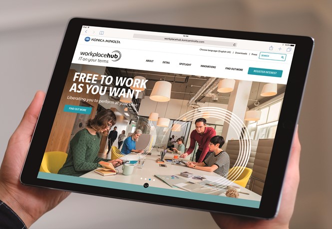
In a second round of research, two new visual identities with new language were presented, and the resulting brand draws on both. The hallmark of the visual identity is a graphic device comprised of ve grey lines, derived from the lines bisecting Konica Minolta’s iconic blue circle logo. It acts as a focal point, drawing attention to terms, illustrations or photographs, while also forming part of the Workplace Hub wordmark. “It’s quite dynamic,” Edwards says. “It has a sense of life and movement about it.”
The brand’s vibrancy is designed not only to re ect Workplace Hub’s aspirations to change the nature of the workplace, but to also stand out from the sea of “white, blue and black images out there,” that Sujeebun says de ne the sector. People-centric images worked both as a nod to Konica’s own brand positioning and the ultimate Workplace Hub proposition, ‘IT on your terms.’
Sujeebun says, “You’re always selling a lifestyle with branding. Through the verbal and visual guidelines, we want to illustrate what the future of work genuinely could look like through our products.”
Edwards, Thomson and Price developed a photo library that would set the visual tone for the brand. That presented new challenges in terms of meeting the expectations of what a diverse workforce and workplace looks like for a global audience. Instead of creating everything at once,
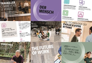
the photographic library is an aspirational sense of the workplace. It comes with brand guidelines that can be used by local Konica Minolta of ces to better suit different markets or facilitate future photo shoots. “Imagery that reinforced the fact that the Workplace Hub is about connecting people, places and devices did very well [in the research],” Price says. “Fluid workspaces where it may not be like everybody’s of ce, people really connected with.”
By this point in the process, Workplace Hub had grown from one product to three and had become a legitimate brand extension. That sparked the need for a graphic system that could be used within Workplace Hub, throughout the communication and as a brand differentiator.
Sujeebun says the research required to develop the library of icons was immense. “We had to consider what’s common in the world, what are the regulations and then what can we play with that’s credibly Konica Minolta. But we also had to be mindful of existing iconography that we have within the brand that we can play with,” she says.


The icons are designed to explain some of the functional aspects of Workplace Hub, Edwards says. “We wanted a graphic style that made it look simple and easy,” she adds. Some icons are identifiable, like a cloud, a wifi symbol, a security shield and a recognisable printer. Others, like Workplace Hub’s professional IT services or asset management functions are bespoke. The icons form a graphic legend that shows the interconnected family of tools and services provided by the Workplace Hub products. When Frank, Bright & Abel crafted the diagram and presented it back to Konica Minolta, it helped the Konica team actually understand the brand and its own products better.
The brand development process was crucial to Workplace Hub’s ultimate existence as a brand extension with multiple products underneath the Konica Minolta umbrella, but with the goal of shifting the company’s own positioning and the perception of IT services globally.
Most importantly, the team learned that the new brand, while distinct, didn’t have to eschew Konica Minolta’s 144 years of brand history to set the tone for the future. Elements like Konica Minolta’s colour palette and typeface are used across the Workplace Hub branding. The narrative style and tone of voice are boundary-pushing, but not breaking. And the Workplace Hub logo derives its style from the Saul Bass-designed Minolta logo still in use by Konica Minolta today.
Konica Minolta’s CEO, Shoei Yamana, said at the brand launch in Berlin, “We have focused more on developing workplace IT solutions for a digitally-empowered workforce.” The future of work, and of Konica Minolta, he says, will respond to the idea that there are changing attitudes to technology which are transforming the workplace. “It will transform our customers’ businesses and the future of work will be de ned by connected, intelligent systems,” he says. “That is what inspires me; to help our customers thrive.”


