#TransformTuesday: 8 June
Every week, Transform examines recent rebrands and updated visual identities. This week's picks are below. For more from #TransformTuesday, follow @Transformsays
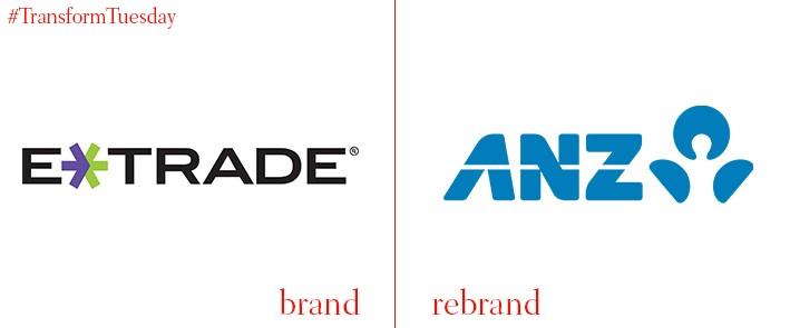
The Australian brand of E-Trade Financial Corporation, known commercially as E*Trade, has been rebranded by Australasian bank, ANZ. The platform, which is built on online share trading services, was formerly known as E*Trade Australia. It will now be known as ANZ Share Investing, capitalising on the strong brand recognition ANZ currently hold in Australia. The more corporate, capitalised black font of the previous E*Trade brand has been forgone in favour of the widespread ANZ branding. This is designed to cement consumer trust following the merger, and update the brand’s mission for the 21 century.
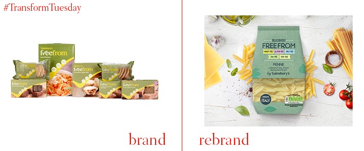
Consumer interest in foods marketed as free of allergens is increasing, and supermarkets have been quick to expand product ranges – Sainsbury’s is no exception. It has rolled out an updated version of product packaging in its Free From range, which excludes allergens such as gluten, wheat and dairy from everyday products. Its in-house own branding team has taken the brand back to basics, adjusting the green and yellow colour palette to a more subtle teal shade, to allow the products themselves to be the main focus. Adding the descriptor ‘deliciously’ in front of the product names also allows the Sainsbury’s own brand to compete with more established and recognised allergen-free product lines.
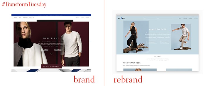
US-based clothing retailer, Kit and Ace, has enlisted digital agency, Engine Digital, to reimagine its brand and make it innovative for an online platform. Combining eCommerce with individual brand characteristics, Kit and Ace hope to reflect its in-store brand values on both its updated website and via its mobile apps. Adding storytelling to its brand narrative contributes to a more personal customer experience, while the updated colour palette evokes an atmosphere of calmness and serenity. Overall, Engine Digital, which is based in Canada, has created a socially engaging experience befitting of a higher-end retail brand.
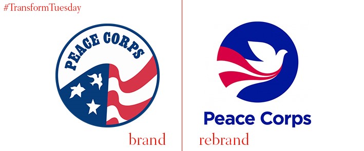
Established in 1961, the Peace Corps is one of the longest-running voluntary service organisations in the US, with its volunteers concerned with social and economic development. Washington DC-based consultancy Ogilvy Washington, in partnership with Virginia-based Forum One, has joined up with the Peace Corps to implement the rebrand its in-house team has been working on for two years. This involves an updated visual identity and a reformed logotype. Because the Peace Corps is so ingrained in US modern history, care has been taken to ensure the new visual identity reflects the organisation’s core mission while being a clear update. The patriotic US red, blue and white colour scheme is retained, along with the doves and stripes; the main change is the name, which now sits exterior to the roundel.
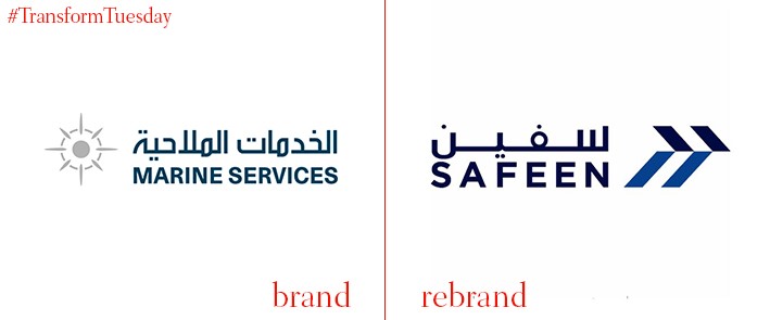
Safeen is an Arabic word, translating to mean ‘ships’ in English. Fittingly, this is the new name granted to a subsidiary of Abu Dhabi Ports, a rebrand undergone in-house to replace the previous functional yet perhaps unimaginative Abu Dhabi Marine Services. The subsidiary has also undergone an update of its visual identity to coincide with its fleet expansions, and the growth of its existing services. Retaining the nautical navy blue colour scheme, the newly named Safeen has, like the previous brand, incorporated both Arabic and English letterforms into its logo, highlighting its status as a trusted and growing global brand.
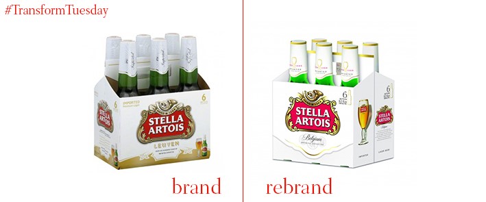
The brewing techniques of Stella Artois was developed in Belgium during the 14th century; the product as its now known was created by Sebastian Artois in the 1700s. Such brand heritage and longevity has not been forgone in the most recent visual update of its packaging, which sees a change to its glass bottle shape. This is as well as a more sophisticated colour distribution, designed by global design agency jones knowles ritchie (jkr) in a way that ensure the bottle outlines is more streamlined. The boxed beer packaging is also updated, allowing the customer to see gold-rimmed bottle tops. The brand update coincides with Stella Artois’ Be Legacy marketing campaign, which aims to align the brand with drinks consumed at noteworthy or quality occasions.
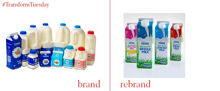
Creative agency, Nine874 Creative, has redesigned the packaging for Strathroy, Ireland’s oldest family-owned dairy. The company has farmers across Northern Ireland, as well as the Republic of Ireland. Designed to stand out across the Irish dairy market, Nine874 Creative has updated the packaging to highlight the fresh qualities of Strathroy’s milk. This is while retaining a feel for the company’s unique history. The physical packaging has also been changed, ensuring its uniqueness in the Irish market – a closed carton, rather than the traditional translucent plastic, lends the brand a selling point above its competitors.
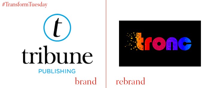
US-based media publishing company, Tribune Publishing Company, has announced it will be known as ‘tronc Inc’, following an in-house rebrand. The company currently owns a plethora of high-profile publications in the US, including the Chicago Tribune and Los Angeles Times. Tronc is reported by the Guardian as being a shortening of the company’s original name, with the rebrand specifically focusing on online channels and digital platforms. The tronc brand eschews classic connotations suggested by its previous visual identity, where the style reflected its 169-year origins; a bold, multi-coloured palette suggests the adoption of a digital-centric approach. Scepticism is also being generated over tronc Inc’s perhaps controversial choice to use a lowercase t, and uppercase I, I nits brand logotype.


