#TransformTuesday: 5 July

Every week, Transform examines recent rebrands and updated visual identities. This week's picks are below. For more from #TransformTuesday, follow @Transformsays
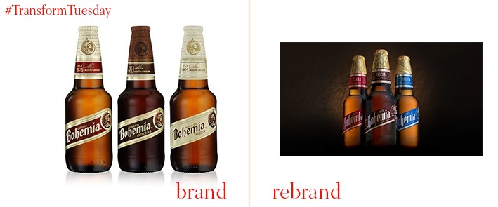
Bohemia, the oldest Mexican premium beer brand owned by Heineken, has been redesigned. Global brand design consultancy Elmwood headed the change to Bohemia’s visual identity, channelling the desires of Bohemia drinkers into a design which reflects their proud consumption of the product. Mexican lettering artists, Lettres, designed the Bohemia word mark, emphasising the playful nature of its brand. Bohemia and Elmwood hope to engage a new generation of Bohemia drinkers, while retaining the original audience.
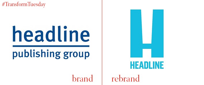
London-based design agency, Magpie Studio, has updated the visual identity for iconic British publishing company, Headline. Founded in 1986, this year sees Headline Publishing Company celebrate its 30th birthday. Its new, bright blue logo reflects both the look of Headline’s headquarters at Carmelite House, near Embankment, as well as the negative white space mirroring the look of an exclamation point. The rebrand reflects the energetic and playful nature of the brand, and sets Headline up for the launch of two new imprints later this year.
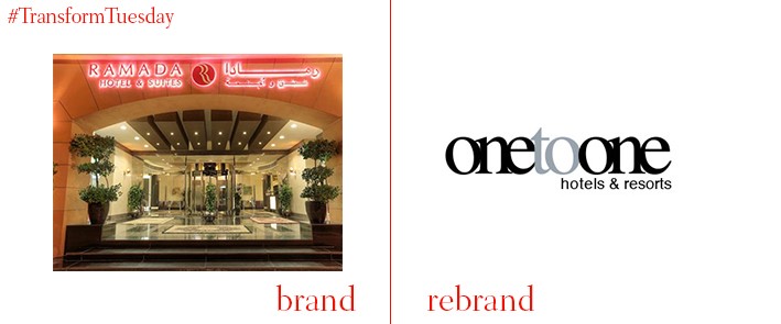
Ras Al-Khaimah is one of seven emirates that make up the United Arab Emirates (UAE). Tourism is a booming sector, with hotels and attractions expanding to accommodate the increasing flow of travellers to the region. The Ramada Hotel and Suites, based in Ras Al-Khaimah, is no exception. Following a diversifying of its business strategy, the hotel will now be known as One to One Clover Hotel and Suites. Its 38 suites and street-concept eateries make it an ideal candidate to be rebranded under the boutique hotels category, according to One to One Hotels group director, Mohammad Hassan Masood.
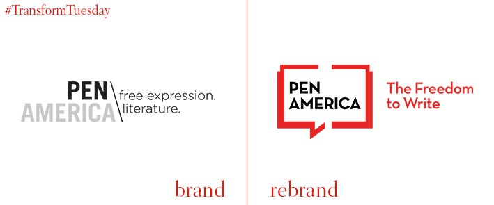
In 1922, the PEN America Center was founded in New York City, to defend freedom of expression in literature. 114 centres exist worldwide; PEN America has changed its visual identity to better reflect the work carried out by the organisation. Its refreshed logo carries the PEN America name, and is underscored by a new tagline – ‘the Freedom to Write.’ The logo itself represents both an open book, and a speech bubble. According to a press release, these signify “the free flow of ideas” emanating between the organisation and the global literary community.

Luxembourg-based RTL Group has used an in-house brand strategy team to rebrand its Dutch operations. With 59 TV channels and 31 radio stations, RTL has a very wide reach. This includes RTL Nederland, which is now known as RTL to ensure a coherent identity across its operations. RTL brand strategy and corporate communications chief, Kim Koppenol, says, “Despite the fact that we have grown tremendously and have many brands in our portfolio, the speed of our industry demands that we continue to look to the world with an open mind.”
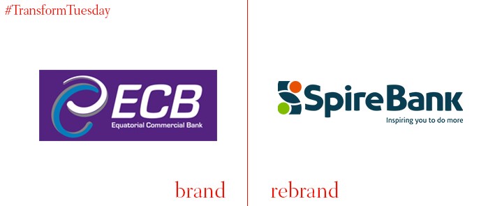
The Kenya-based bank formerly known as Equatorial Commercial Bank, has renamed and rebranded itself Spire Bank in a bid to expand its commercial operations. Part of its growth strategy includes expanding its provision remit to include, among others, retail and SME corporate banking products. Spire Bank hopes to open seven further branches by the end of 2017, as well as continue to develop the Sh.33bn it currently holds in asset base.


