#TransformTuesday: 27 September

Every week, Transform examines recent rebrands and updated visual identities. This week's picks are below. For more from #TransformTuesday, follow @Transformsays

Middlesborough-based brand design agency, The Creative Alchemist, has developed the first brand update in ten years for Teesside-based law firm, Archers Law. The firm, which employs over 60 people, has updated all its marketing, visual and communications materials to portray the sophisticated tone associated with a professional law firm. The vibrant colours of the logo also ensure Archers Law stands out in a market where companies tend to favour a similar colour palette. Creative director of The Creative Alchemist, Beccy Owen, who also headed the rebrand, says, “The rebrand for Archers Law is smart and modern, with a welcoming feel. We created a clean identity, making use of the diamond shape to convey a sense of quality and professionalism – something that has been embedded into the brand since it was established over 150 years ago.” Billingham Press, Symbol Signs, Calm Digital and Dave Charnley Photography are other local companies involved in the rebrand process.
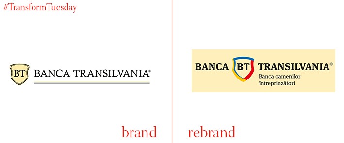
The third largest bank in Romania, Banca Transilvania (BT), was founded in 1994 through private capital and has been rebranded by global brand agency, Brandient. A new visual identity was needed which reflected its continued success in the modern, digital world, while acknowledging its heritage as a bank favoured by entrepreneurs and social start-ups. The shield symbol, which has become a main point of brand recognition for its customers and the public alike, was retained, with the addition of a tricolour palette based on the Romanian national colours. This choice reflects BT’s role in helping enterprising start-ups, while a series of graphic devices employed by Brandient enable the logo and identity to be used across all BT’s brand touchpoints.

Portuguese cable TV operator, Cabovisão, has rebranded as Nowo, which translates to ‘New’ in English. The logo has also been simplified, with its simpler and more modern aesthetic reflected in the bright colour palettes and a clear brand aim. CEO of Nowo, Miguel Veiga Martins, says the Nowo rebrand aims to shake up the Portuguese cable television market by providing customers with a better, more selective choice of the channels they want to watch. Speaking to telecom data provider, TeleGeography, Jose Henriques, chief marketing officer of Nowo, says, “The brand’s DNA is reflected in its simple, clear approach to communication, that does not use asterisks or small print.”
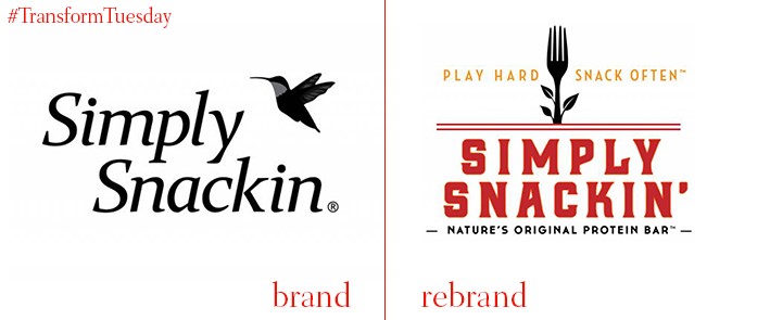
DBD International, a globally-focused branding agency run by David Brier, has applied its brand expertise to U.S.-based on-the-go snacking brand, Simply Snackin’. Reflecting the healthy credentials and convenience offered by Simply Snackin’ protein bars, DBD International has simplified the company’s logo and packaging to focus on nature and the quality ingredients its meat jerky range offers. Brier says, “We looked at the history of this category and saw there was a history of convenience snacks and meal replacements, which became today’s protein bars – a very popular and competitive category. We concluded we couldn’t win by being one more ‘premium jerky choice’. We developed the tagline ‘Nature’s Original Protein Bar’ to truly show for what the brand stands, while conveying a killer distinction.”
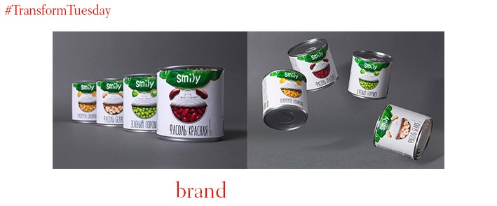
Creative branding agency, Gordost, based in the Russian city of Yekaterinburg, has developed the packaging and visual identity for Smily. One of the leading players in the Russian canned vegetable market, the Smily brand is aimed at more liberal-minded young Russians and has been designed to stand out among more conservative brands found in Russian supermarkets. Its plain white background gives the brand a crisp, simplified look; the imagery associated with the Smily brand reflects the action of a smile while portraying the high-quality ingredients inside the cans.
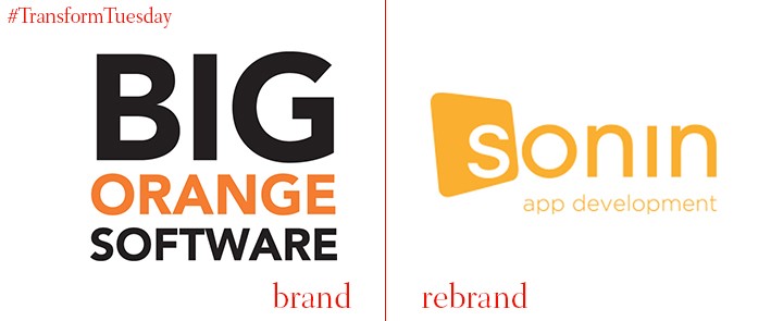
App-focused digital development agency, Sonin, has rebranded its name, updated its visual identity and redesigned its marketing material to better reflect the digital nature of its app products. The agency, which began as Big Orange Software in 2009, changed its name to Sonin in September 2016. This update is intended to reflect the continual evolution of the app market, while focusing on the history of what the agency offers specifically. The Sonin name was created through combining the chemical symbols of the three main elements which work under a screen to ensure it responds to touch – tin (Sn), oxygen (O) and Indium (In).

