#TransformTuesday: 26 April

Every week, Transform examines recent rebrands and updated visual identities. This week, it's a packaging design special. For more from #TransformTuesday, follow @Transformsays
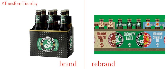
Brooklyn Brewery has a 30-year history, yet 2016 is the first year its packaging has undergone a refresh since the brand began. Led by celebrated US graphic designer Milton Glaser, who also created the brewery’s first designs in 1987, the beer retains its clear, capitalised fonts, and the iconic B which cements its US heritage. However, an updated colour scheme provides a clean differentiation between Brooklyn Brewery’s array of flavours. Glaser, according to the brewery, created a “fresh and bold” aesthetic. This should ensure Brooklyn Brewery’s beer is able to retain popularity in a market increasingly friendly to craft beers.
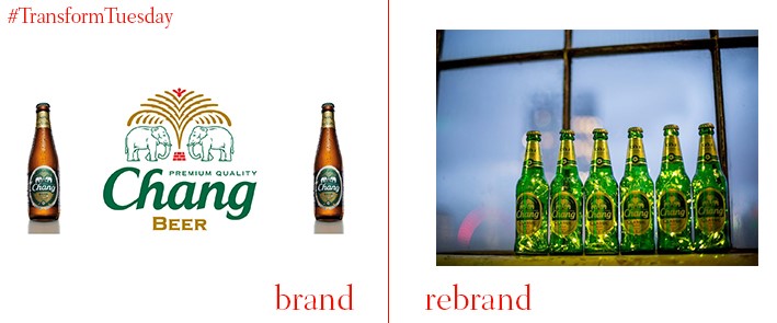
Leading Thai beer brand, Chang, has updated its packaging to coincide with its 21st birthday celebrations. Eschewing the original straight-edge brown bottle in favour of a classic green and well-contoured update, Chang beer retains its iconic elephants. both the animals and the brand name are rendered in white to create a pleasant contrast to its pine green label. The gold around the bottle neck and the label outline lends the brand a sense of luxury; this update should appeal to the premium end of both British and international markets.
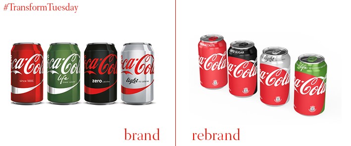
There are various iterations of the Coke identity, of which most people cite a certain favourite,and which are often more popular than the classic Coca-Cola itself. Yet a new in-house brand strategy sees Coca-Cola unite all its products under one creative campaign, “Taste the Feeling.” Planning for all Coca-Cola products in the brand to be coloured in the original red, the unification will also see all drinks include its iconic Red Disc. Flavour will be differentiated by a colour brand atop the drinks can, box or bottle. The new packaging will be rolled out in Mexico as of May 2016, with global distribution expected to be complete by 2017.
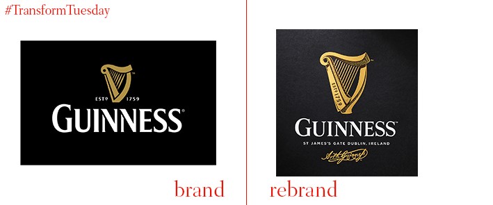
A collaborative effort has gone into the redesign of Guinness’ iconic harp brand mark. International brand agency Design Bridge, which redrew the icon, has been working in association with traditional harp makers Niebisch and Tree, which provided the initial sketches. After being formed into 3D models, illustrator and long-term Guinness design collaborator Gerry Barney created its new icon. Letter press studio New North Press created a physical impression of the harp, using embossing and metallic techniques to ensure the Guinness brand identity remains consistent across all aspects of its implementation and packaging.
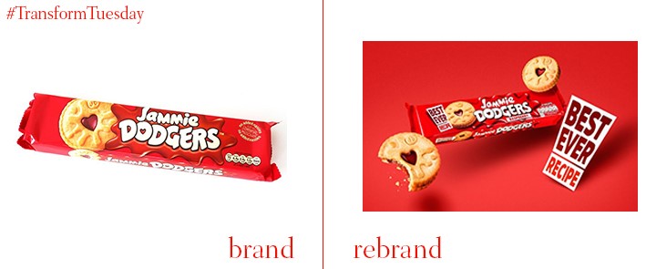
Independent brand consultancy Robot Food worked with biscuit manufacturer Burton Biscuits back in 2010. Yet they were again tasked with updating Jammie Dodgers’ visual identity, providing fresh packaging for the iconic biscuit brand and ensuring it remains appealing to all generations of consumers. Robot Food retained the bright colours so synonymous with both its packaging and the famous flavoured jams inside the biscuits – for this iteration, its main rebrand focus was the ‘best ever recipe’ claim on the packaging front. Robot Food also redesigned the famous ‘splat’ behind the Jammie Dogers logo, whose presence continues to lend a characteristic playfulness to the brand.
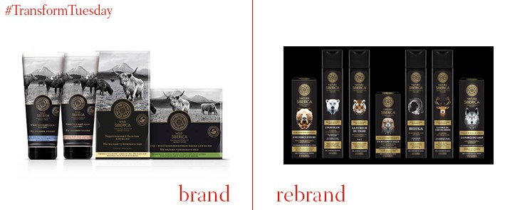
It is not often a Russian brand breaks into the international market. However, the latest packaging design of leading male toiletry brand Natura Siberica is intense, provocative and interesting enough that this trend may well be bucked. UK- and Russia-based brand design agency, Pure, has led the brand into its new iteration, with the inclusion of traditional Russian animals on the product frontage is a nod to its heritage. It also reflects the brand position and its key ingredients. Masculinity was a key touchpoint behind the brand repackaging; the holographic material on which it is printed ensures Natura Siberica remains firmly in the luxury end of the male toiletry market.
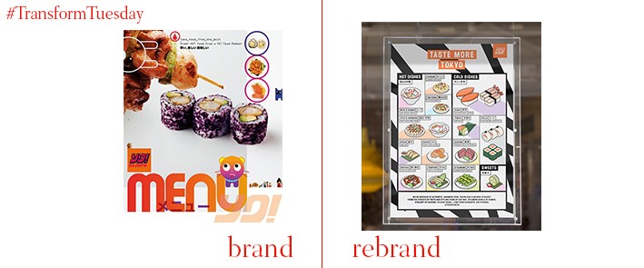
London-based branding and identity agency & Smith has drawn inspiration from traditional stalwarts of Japanese culture, manga and anime, to create a bold new concept for restaurant Yo! Sushi. Based on an editorial concept written in traditional Kanji script, the identity for Yo! Sushi encompasses all brand touchpoints, including its menu boards. Getting back in touch with its Japanese roots, director at & Smith, Dan Bernstein, says, was, “Where the zine/newspaper menu idea came from. It gave us the chance to show some nice snippets of art, fashion and music alongside their food.” It is expected the editorial content of the restaurant editorial concept will change every five years.


