#TransformTuesday: 12 April
Every week, Transform examines recent rebrands and updated visual identities. This week's picks are below. For more from #TransformTuesday, follow @Transformsays
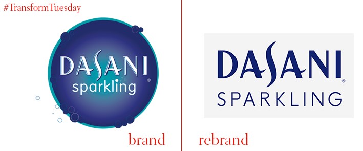
Dasani Sparkling, a product introduced by Coca-Cola in 2013, is an unsweetened sparkling drinks brand made without artificial flavours, and containing zero calories. Retiring the previous brand image tropes of fizzes, bubbles and sparkles, Dasani now opts for a cleaner, fresher feel, designed by San Francisco-based design and branding studio, Moniker. A new, sleek, uncomplicated packaging motif reflects the clarity of taste in its product. While the original Dasani wordmark is retained, images of fruit which adorned the can exteriors has been redesigned and simplified, in a more abstract format. All text on the cans is now centred; each flavour is granted a distinct colour, such as a light burgundy for berries. The Dasani wordmark remains a deep blue colour across all iterations, apart from the dark blue multipack boxes where it reverts to silver, its other lead tone.
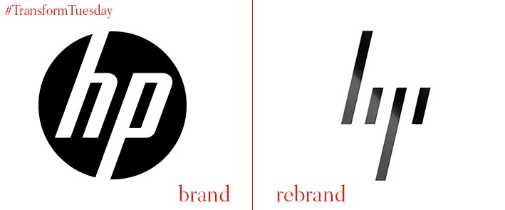
In 2015, the HP company was divided in two, creating the industrial-oriented Hewlett-Packard Enterprise, and the more individual-consumer focused HP. The HP side has changed its brand identity, to an iteration designed by Moving Brands several years ago. Gone is the circle which partially encased the HP initials – its new logo disregards font and textual norms, and has positioned its ‘H’ and ‘P’ at 13 degree angles. While a slightly unconventional approach, with thick-set dashes replacing the historically recognisable HP insignia, its implementation with a white/silver and black colour palette ensures the brand retains its sleek and sophisticated look.
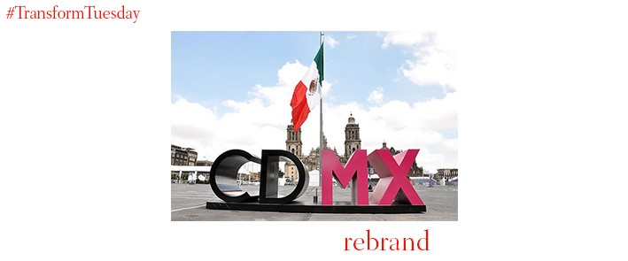
The capital of Mexico, Mexico City, has been named by President Enrique Peña Nieto as the official capital of Mexico. These changes mean the 16 boroughs of Mexico City have become municipalities, with individual mayors and councils, and is a step closer to the capital becoming recognised as a state in its own right. Known as Ciudad de México in Spanish, for many years its residents have instead referred to the Federal District, or FD – yet with its new place brand, a structure now resides in a city square. Black and pink lettering formalise the change. While this rebrand may cause confusion among some residents and visitors, it is claimed the name change will enshrine the city’s new constitution.
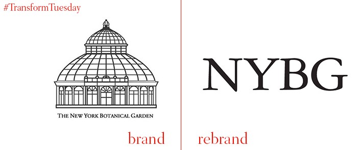
Logic and clarity is cited as the driving force behind the new New York Botanical Gardens logo, designed by Natasha Jen, partner at New York-based design firm Pentagram. The simplistic approach is a departure from the previous iteration, which pictured the iconic Enid A. Haupt Conservatory building atop the attraction’s full name. Its new brand identity instead opts for the NYBG acronym, set in its usual Garamond 3 font and operating as the sole identity indicator. The renewed NYBG brand requires also that its logo is placed always in the top left corner when used for correspondence and communication, allowing for an expansive photography and colour palette. 2016 is also an NYBG anniversary year – its 125th. 125 is thus written into much of the brand’s new implementations, with its rendering in a soft teal providing subtle contrast to an otherwise jet black layout.
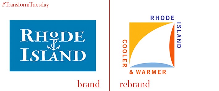
Rhode Island, the smallest state by area, is situated on the North East tip of the US and borders the Atlantic Ocean to the east. This is perhaps the inspiration behind the latest iteration of its place brand, which has been designed by New York-based graphic design studio Milton Glaser, Inc., refers to the ‘cooler’ and ‘warmer’ aspects of the state’s climatic variations – its enjoys warm, rainy summers and cold winters. Despite harnessing a fairly retro feel, the new visual identity for Rhode Island is perhaps more sophisticated than its predecessor, which was perhaps more suited to a family attraction, or fish restaurant. The sail on Rhode Island’s new logo, constructed from the white space, is framed by a milieu of bright colours. However, the overall effect is slightly unwieldly, with some commentators citing a lack of innovation and clarity as detrimental to the new designs.
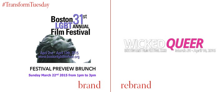
Having gone through a plethora of name changes, beginning in 1980 with the Boston Premier Gay Film Festival and known until 2015 as Boston LGBT Film Festival, one of Boston’s leading LGBT events has now settled with the moniker Wicked Queer: Boston LGBT Film Festival. Executive director James Nadeau, says, “Queer is one of those words that at its core means unusual” – this word choice should theoretically make the event accessible to a wider audience. The film festival’s brand design has also changed. Its previously staid iteration has developed into a brand image which celebrates the light-hearted nature of the event and refers to its origins. Inclusion of bright blues and pinks creates a welcoming mood, in-keeping with the event’s inclusive atmosphere.


