#TransformTuesday: 1 March
Every week, Transform examines recent rebrands and updated visual identities. This week's picks are below. For more from #TransformTuesday, follow @Transformsays
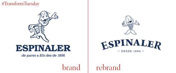
Authentic Spanish seafood and gourmet food retailer, Espinaler, has undergone a brand refresh which aims to communicate its product to a wider, younger consumer market. The bizarre fish bone image, complete with tail and grinning head, has characterised Espinaler’s product since the 1970s - this has been upgraded, with the new image forgoing the fish’s cane and looking altogether younger. The fish itself has taken on a more joyful expression, as though the new products are proudly on display to consumers. Although maybe an odd choice for a company whose products range in price to premium offerings, the image has become iconic - Barcelona-based branding agency Verdelimón ensured that its classic vibe is retained through the implementation of a sophisticated and clear font.
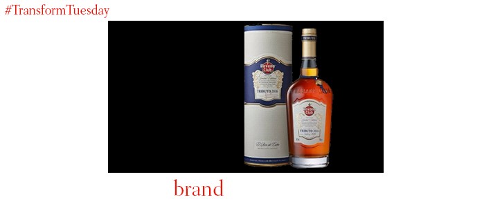
London-based design agency Nude Brand Creation leads the new visual identity for premium spirit brand Havana Club’s limited edition rebrand. 80 years old cask rum forms the base of the Havana Club Tributo Collection product, which is then mixed with other specially selected rums to enhance its strong, aromatic flavour. It is, says Asbel Morales, maestro ronero (master rum-maker) for Havana Club, “An expression for 2016”. Spanish baroque and the neoclassical heavily influence the bottle labels, with prevalence of both styles across Cuban architecture characterising the premium nature of the Tributo Collection. Patterned ceramic tiles characteristic of Havana’s streets informs the background design for both the bottle, and its gift pack.
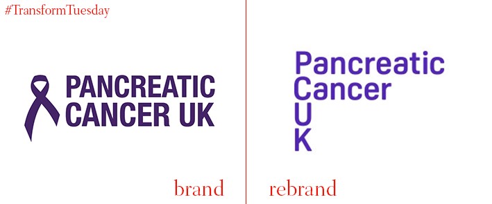
London-based design studio Red&White were tasked with the rebrand of leading cancer charity Pancreatic Cancer UK, in celebration of its 10th anniversary year. This includes a new palette and logotype to complement its striking purple colour scheme, with its new logo intended to act as a signpost to those looking for more information on pancreatic cancer. This has coincided with the charity updating its social media pages to ensure its purpose and message is clear. Despite being the largest pancreatic cancer charity in the UK, Pancreatic Cancer UK hope this brighter visual identity, as well as its new website, will raise awareness of the disease - one of the hardest cancers to treat.
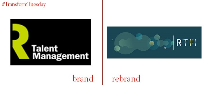
The talent recruitment agency formerly known as Rethink Talent Management has shortened its name, to become known by its acronym, RTM. This move follows the acquisition of talent management specialist Consort, by RTM, in April 2015. In a rebrand implemented by Bristol-based creative agency Workbrands, its previously bright but jarring lime green and black logo design has been forgone, in favour of an aquamarine colour palette - turquoise and blues create a softer, more thoughtful brand image. It also differentiates itself from parent company Rethink through the adoption of a yellow spotted font scheme for the T and M initials – with ‘The science of talent acquisition’ chosen as its strapline, the new design effect is, like its brand imagery, almost scientific.
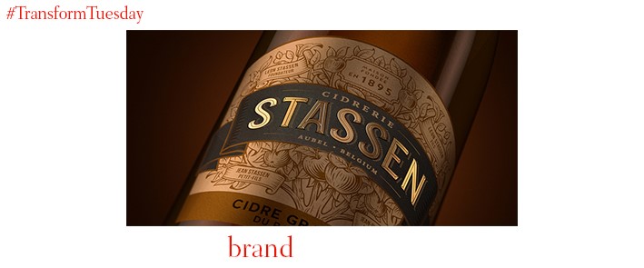
Encouraged by the recent trend in consumers favouring craft beers and ciders over traditional lagers, Heineken has launched its first premium brand cider. With the cider created by Belgian craft cider producer Famille Stassen, the new brand identity has been developed by international branding agency Bulletproof. Utilising an art nouveau style, the Ciderie Stassen packaging design is reminiscent of its founders, relying heavily on heritage and family ties to deliver its brand image. The Stassen family apple trees form an intricate design on the bottle’s label, conveying the product’s more premium qualities - the 1895 founding date engraved on the necks is a minor detail, given vibrancy through an elegant colour scheme.


