The type writer: Digital communications
Bruno Maag explains why the value of typeface design and its usage is magnified in digital communications
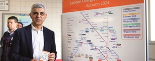
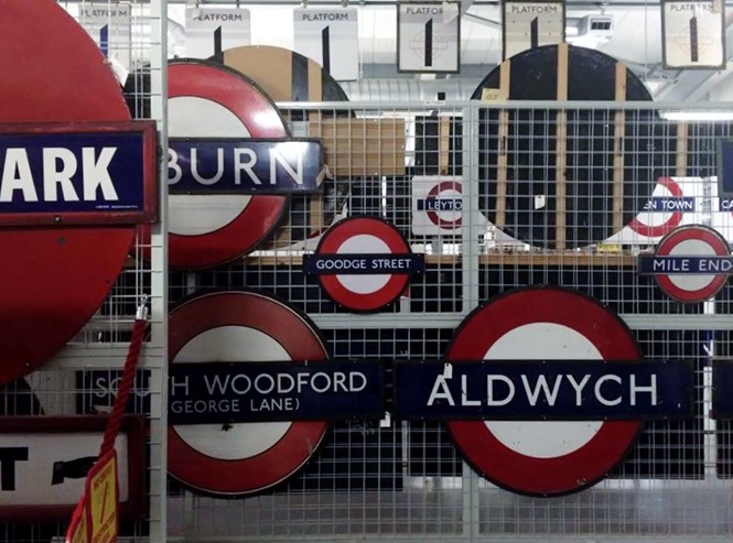
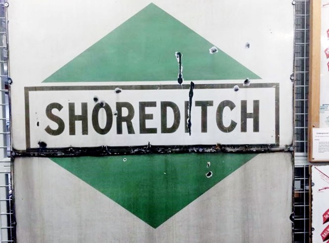
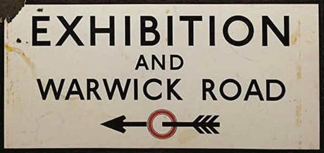
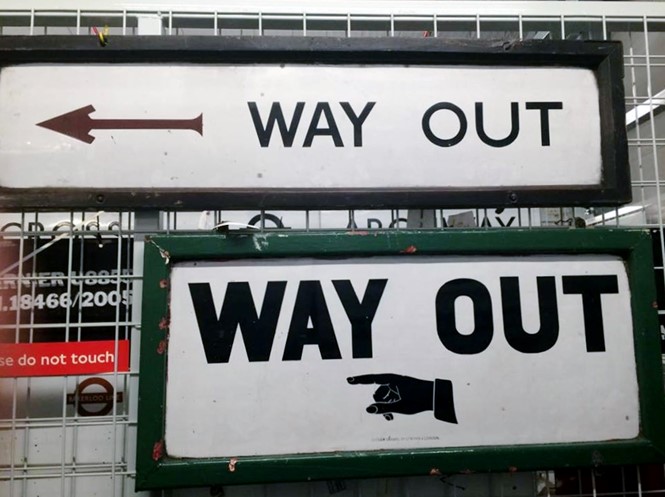
It has been 100 years since Edward Johnston designed the eponymous font for London Underground. The font was instrumental in tying together the disparate parts of the system and created a coherent brand experience that today is recognised around the world. The design has had a number of updates to adapt it to changing technologies but the brand expression, the emotion behind it, has stayed the same.
A brand’s visual expression must also exist in a digital space where it is nearly impossible to gauge a user’s experience. Typography is a way of successfully maintaining and even enriching brand experience, and the choice of typeface can be a deciding factor in whether a user engages or disengages with a brand. Southeastern Railway’s recent choice of Lubalin Graph is a stark example of poor engagement. By choosing an unsuitable design, and using it at inappropriately small sizes, the company has completely disregarded the customer’s need for readable, legible and accessible information.
HP understands that its expressive custom typeface helps to connect with potential customers. Its recently-launched website features a light font weight complementing large-scale stylish photography. It instantly creates a connection between product and customer. The digital space demands that brands pay attention to, and invest in, good typography. It is not always necessary to create a custom font family, as an off-the-shelf design can deliver both brand expression and functionality. Deciding which route to go down depends on many factors but should be led by the engagement needs of the brand, and not be driven by the finance department; skimping on the typeface may cost you dearly.
Bruno Maag is chairman of Dalton Maag