Timeline: Women's World Cup
Since 1991, the FIFA Women’s World Cup has been the pinnacle of women’s professional football. Though dominated by championship teams from the US and Germany, the history of the brand has drawn on cues from host countries and from the state of women’s football throughout the 1990s and beyond
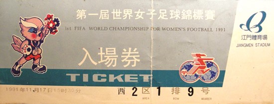
1991 The inaugural FIFA Women’s World Cup marked the beginning of a new era for professional sport on an international level. The games were hosted by China’s Guangdong region and called forth the era of American dominance of the sport. Legendary footballer Michelle Akers scored 10 goals to lead the US team to overall victory. Not much in the way of branding exists, but the logo is complemented by a bird-like mascot.
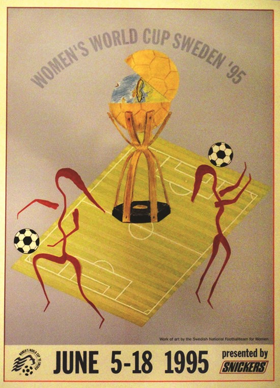
1995 In 1995’s edition of the tournament, Sweden presented quite a literal logo with a stylised woman’s head alongside a football. Yet the 1995 games preceded by a year the inaugural women’s football Olympic tournament, held in Atlanta. Neighbour Norway took home the championship in a game which saw two European teams face off in the final match for the first time.
1999 By 1999, women’s football at the international level was no longer a novelty, and the branding shows it. The first of two consecutive tournaments hosted by the United States, the bold, graphic yellow logo draws on the mid-’90s experimentation with typography. Yet, the branding also presents a confident, professional face to the world. The lasting image from the tournament, though, was an iconic photo of American forward Brandi Chastain celebrating on the field after scoring the title-winning penalty.
2003 The 2003 Women’s World Cup found a home in the US after the SARS scare prohibited China from playing host for the second time. The logo is the first to use national colours as part of the emblem. Teenage stars began to emerge from Canada to China as leaders on the field; proof of the Women’s World Cup’s impact on grassroots soccer and female involvement in the sport.
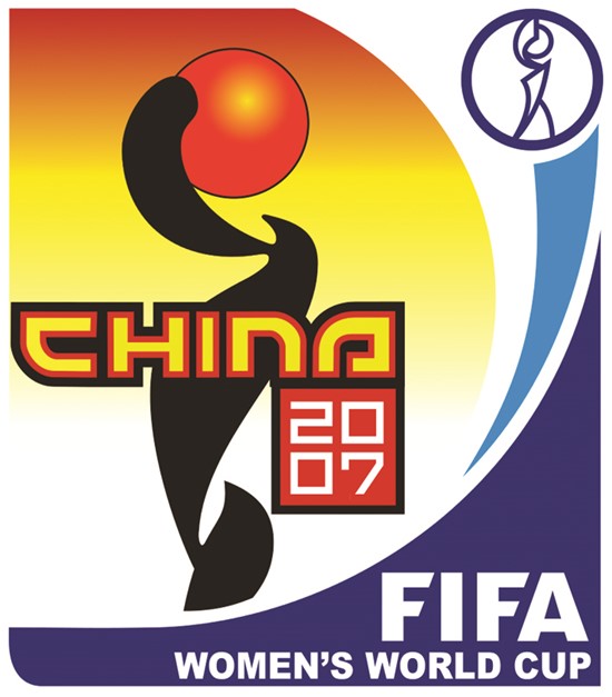
2007 In 2007, China got its chance to shine once again as host of the World Cup. The logo recalls Chinese calligraphy and typography while reflecting the curves of the World Cup trophy. It was the first to reflect the shift toward portrait-oriented emblem-like logos and was designed to represent unity and harmony in women’s football. With attendance at 1.2m, versus 510,000 in China last time as host, women’s football had become truly entrenched.
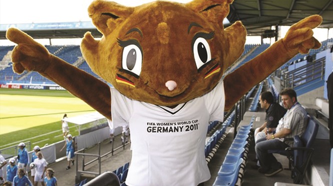
2011 Germany’s logo as host recalls the trend begun in 2003 as it uses the colours of the country’s flag to represent a football stadium. Stuttgart advertising agency WVP created the emblem while Frankfurt-based agency GMR developed the mascot, a cat known as Karla Kick. “Our objective with the logo on this occasion is to convey the incomparable emotions which can only be awakened by football,” said German FA president Theo Zwanziger in 2008. FIFA noted the importance of a logo’s ability to communicate on behalf of the World Cup.
2015 This year’s FIFA Women’s World Cup will kick off in Ottawa on June 6.
The emblem is designed to represent the ‘coast to coast’ ethos Canada’s organising committee has embodied. The joyful figure at the centre of the mark sprawls from the east’s maritime and agriculture to the frozen north and the prairies of the west. “The emblem of a competition is an important step on the road to the first game,” FIFA president Joseph S. Blatter said on its launch. “It symbolises and conveys the values of a country. One could say that it represents the beat of the host country’s heart with all its history and emotions.” The official mascot, the white owl Shuéme draws on Canada’s past, present and diverse character.

