Wolff Olins re-energises OVO design system

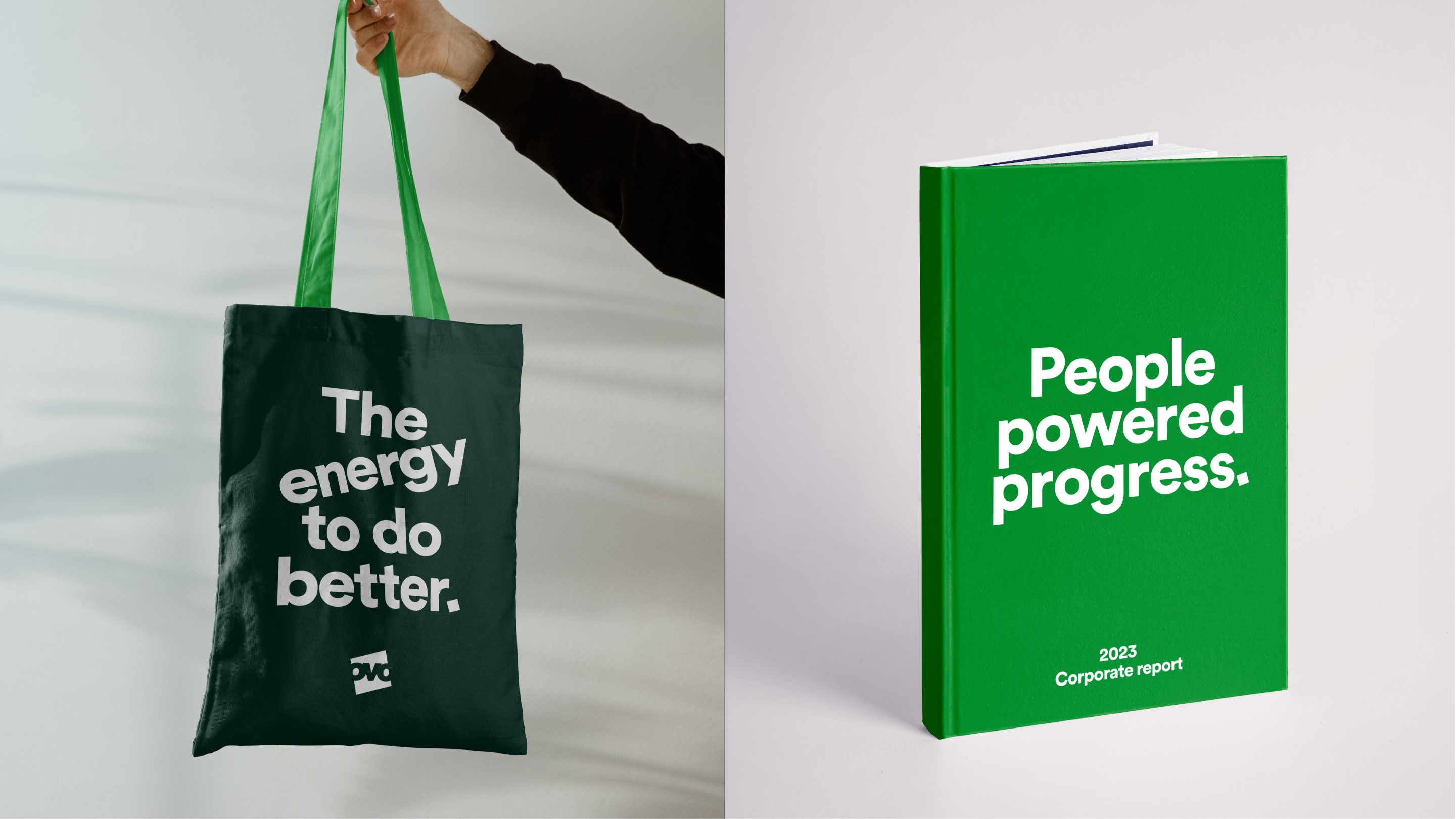
In reimagining the English energy supplier’s brand strategy, Wolff Olins aimed to champion people and the planet. The global brand consultancy crafted a new strategic brand platform, a reimagined design system and a new name, OVO (previously OVO Energy).
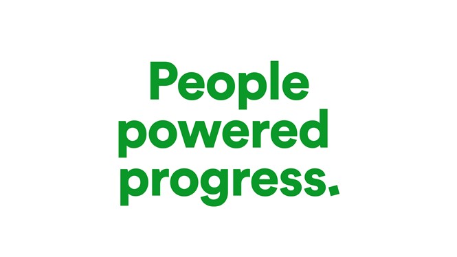
OVO’s new strategic brand platform, ‘Together, we have the power to make energy work for people and the planet’, is supported by its ‘Path to Zero’, which helps people across the UK to take practical steps to achieve net zero by 2035 through a new customer offering. This aims to speak to the energy brand’s core commitment of offering smart technology to create innovative energy-saving solutions, thus empowering customers.
Francesca Danczak, head of brand at OVO, says, “Wolff Olins has designed a brand strategy rooted in a market still facing an energy crisis - with the flex to see us into the next 10 years of our business. A foundation that can help us make energy work for people and the planet.”
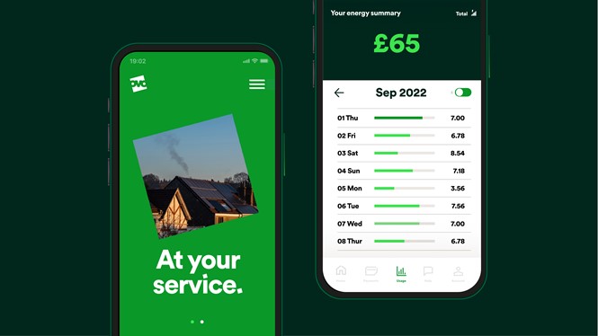
Building on previous work by NB Studio, the new design system seeks to express OVO’s challenger spirit in the market, demonstrated by its optimistic, gutsy and straight-talking personality. This was achieved by playing on the brand’s square logo and ownable green colour, which were seen as OVO’s most iconic elements. For instance, by using the square in photography and bringing it to life with a dynamic, user-centric motion system, Wolff Olins believes it shows how the brand can enable and champion its diverse set of customers.
In the hope of creating greater brand consistency and enhancing operational efficiency, the consultancy extended OVO’s colour palette by increasing its range of greens, introduced new dynamic layouts and updated its iconography.
“In a sea-of-sameness, the redesign helps us to stand out in a way that can truly resonate with customers,” adds Danczak.