Five minutes with Kim Mickenberg

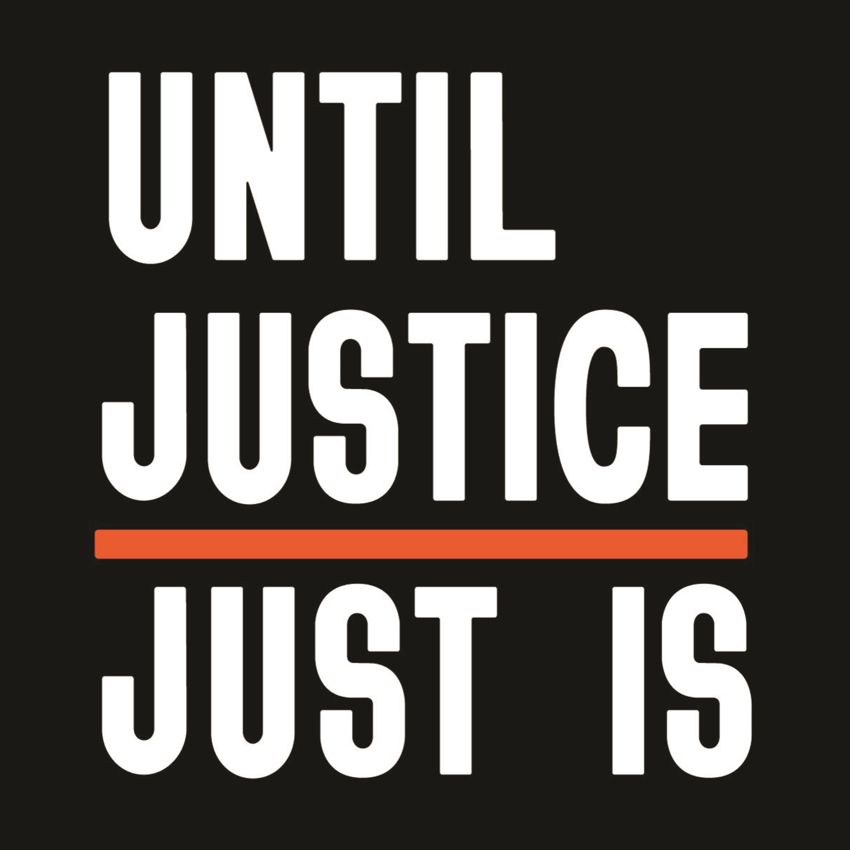
Transform sits down with VSA Partners’ executive creative director, Kim Mickenberg, to discuss her agency’s racial justice campaign with YWCA, a national nonprofit dedicated to eliminating racism and empowering women. ‘Until Justice Just Is’ was recently recognised at the Annual Anthem Awards as an “outstanding” example of work that raises awareness for human and civil rights causes.
Tell me about VSA’s relationship with YWCA and how you came to work together on this project.
VSA has worked with YWCA for a really long time. For many years we did a bunch of pro bono work for them, doing lots of campaigns and different activations throughout Chicago. This particular project started as a pitch in October 2018 when the YWCA came to us and said they wanted a campaign they could launch nationally. Inspired by their enduring commitment to social, racial, and economic justice, I came up with the idea 'Until Justice Just Is', built out the platform with my colleagues, and pitched it. They loved the concept and thought that it really spoke to who they are, but they didn’t feel, in 2018, that it was quite the time for them to launch it and really own it. Fast forward to spring 2020, when the pandemic was in full swing. There was tremendous social unrest following the murder of George Floyd and a feeling throughout the country that we needed to actually do something; we needed to profoundly change. At that point, the CEO of YWCA Chicago at the time, Dorri McWhorter, who had been our primary client for years, picked up the Until Justice Just Is campaign we had pitched years ago and saw new potential. She decided that it would be the perfect way to drive awareness of, and engagement with, a Racial Justice League she was starting, and that was dedicated to helping individuals and organisations alike make real, meaningful, measurable changes to advance racial justice. Then she called us and said she wanted to launch the campaign, and we pulled a team together and produced everything — from the video and OOH to a website and social posts — in about three weeks.
Typography was clearly important to the project. What design did you settle on and why?
We took a very type-driven approach. The designs are relatively simple and stark, but incredibly powerful typographically - you can't miss the message. The words are cut to the bone, they're very powerful and provocative and intentionally so, because part of what we were trying to convey was the urgency of acting and how this movement was a departure from the kind of complacency or virtue-signalling (like a black box on Instagram) that had frustrated the public. The typeface had to reflect and reinforce that message, so we put a lot of effort into finding the right one. The language had to mirror that and feel super forceful, so the typography was incredibly important. We actually went to a type foundry called Vocal Type that was founded by and owned by an African American designer named Tré Seals. And the typeface that we used is called Bayard, which is a unique typeface inspired by signs from the 1963 March on Washington for Jobs and Freedom.
And what about the rest of the visual identity?
There's a real story behind every single element. Obviously, type is the most prominent one as well as the persimmon and black colours, which are drawn from YWCA’s general palette. In addition to that, our design leads pulled a lot of the imagery that's in the anthemic video from activists on Instagram. We actually talked with activists and individual photographers directly to introduce them to the YWCA, tell them about the project and make sure they were comfortable with everything. One of the photographers who we relied on a lot was Daniel Delgado, who provided a few different images for the campaign. His photography added so much depth and emotion, and we felt so lucky to partner with him.
The project with YWCA was received well at the Annual Anthem Awards, winning a Bronze. What does success like this mean to VSA?
We were always excited about the work itself, but the most important part for all of us was making a genuine difference for real people. At VSA, we say that we design for a better human experience, and what we mean by that is that we're not putting fluff or noise out into the world. We centre around what real people and end users need and care about, so we can inspire them to act. So, the most important part of this project was seeing it actually perform and deliver for this incredible organisation that we couldn't be more passionate about and believe in more. Within a couple months of launch, the YWCA met their fundraising goals for the year, six months ahead of time. And then shortly after that, they got a $9 million grant from Mackenzie Scott. That's the greatest honour of all, knowing that in some small way you can really help people who are doing the most important work out there do even more of it.