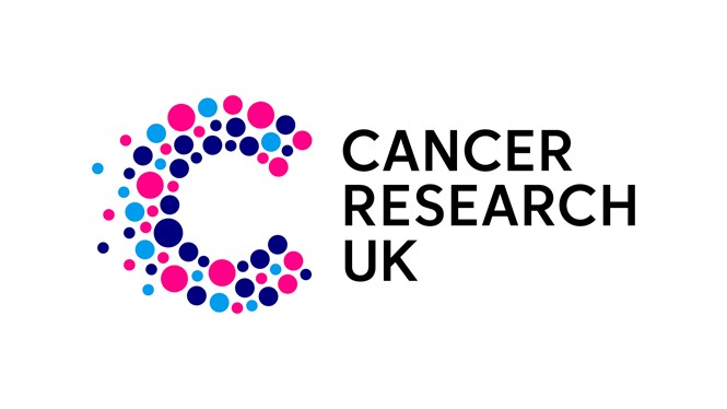
Cancer Research UK logo and tagline rebranded
Aiming to bring scientific progress and human impact to life within the brand, Cancer Research UK turned to WPP-owned Design Bridge and Partners. Along with reimagining the logo and tagline of the world’s largest charitable independent funder of cancer research, the design partnership also evolved the brand’s photography style and typography.
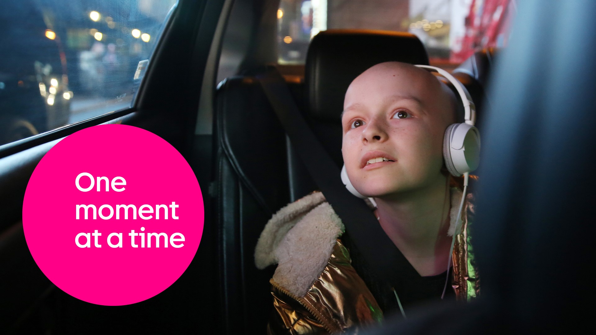
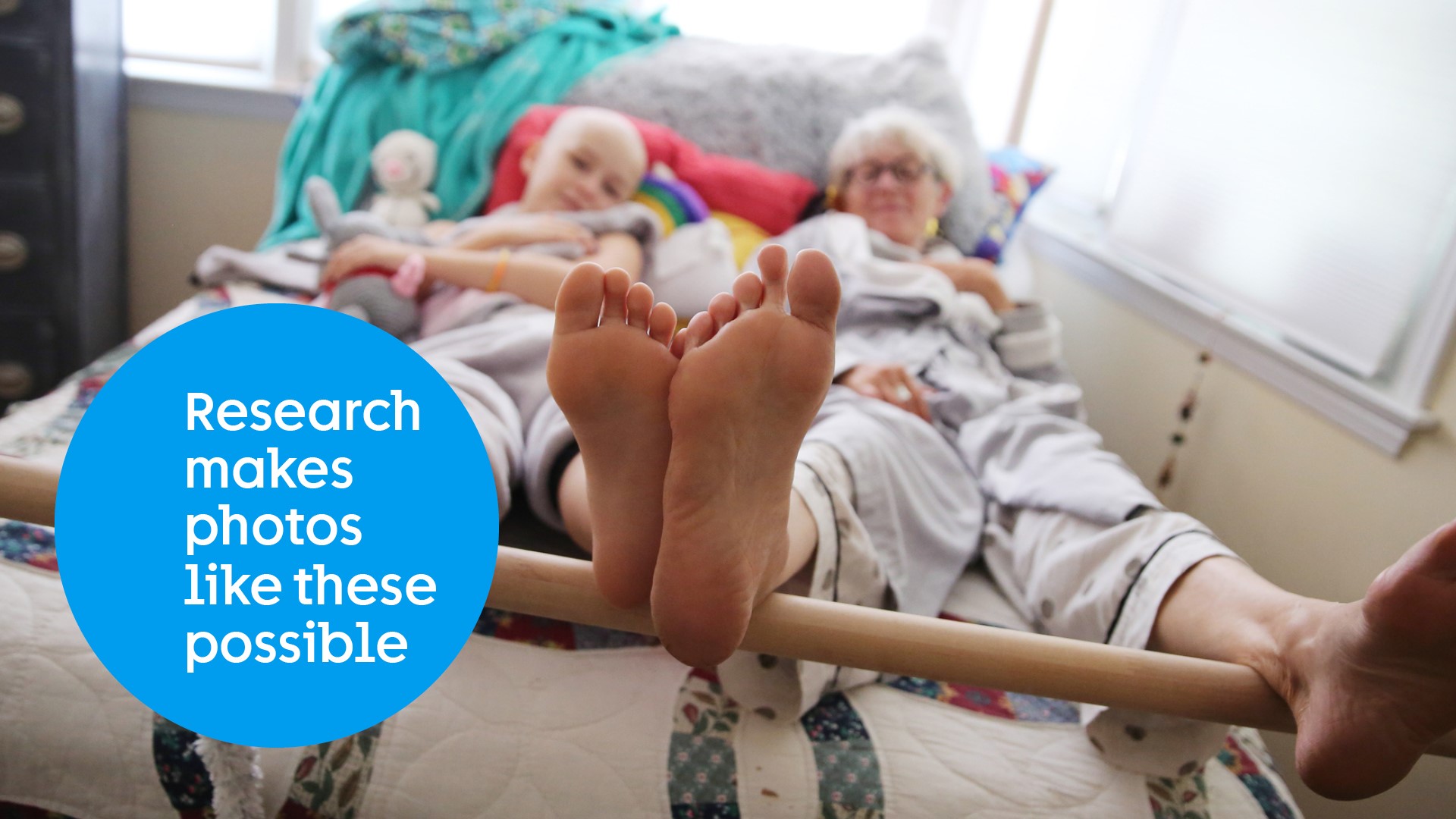
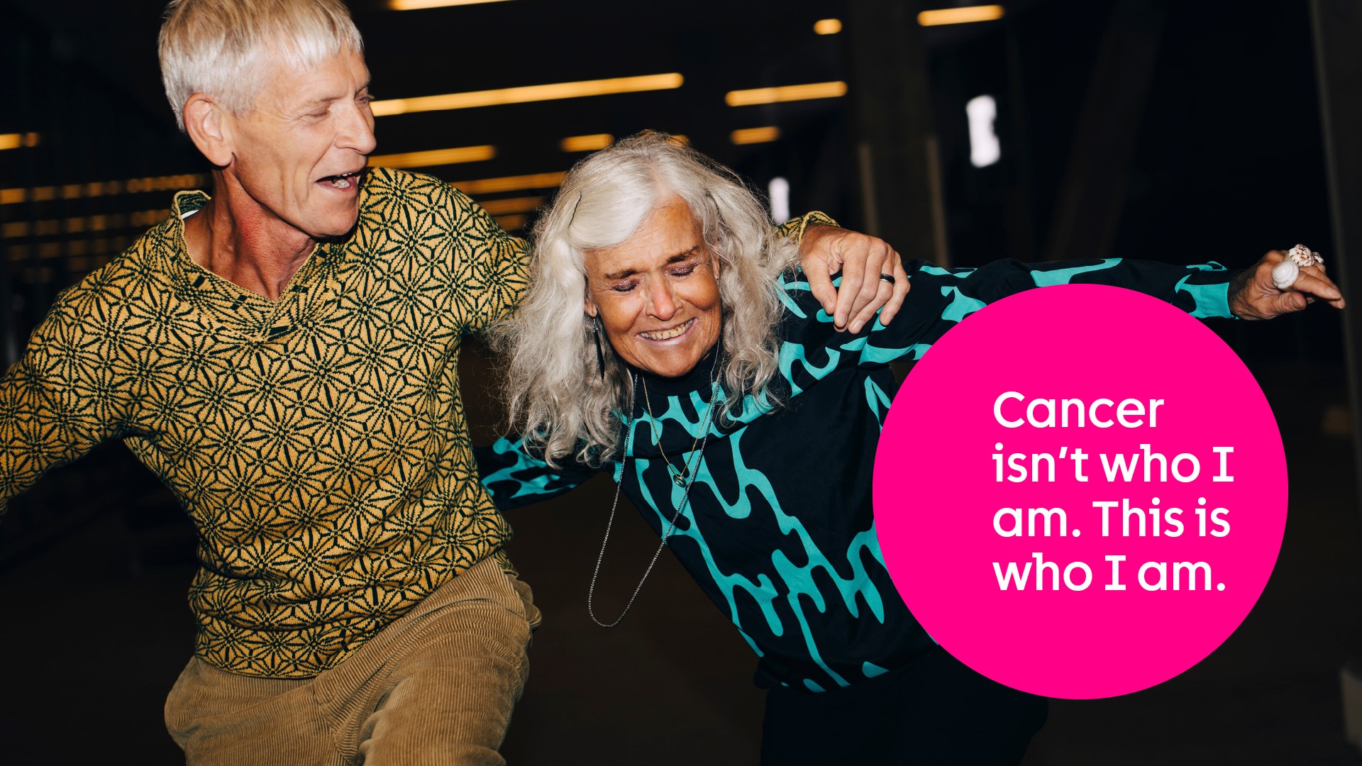
The work by Design Bridge and Partners aims to reflect the positive impact the charity has on the lives of people affected by cancer. This creative concept would then highlight the invaluable life moments that cancer patients and their families have been able to enjoy together thanks to the charity’s research.
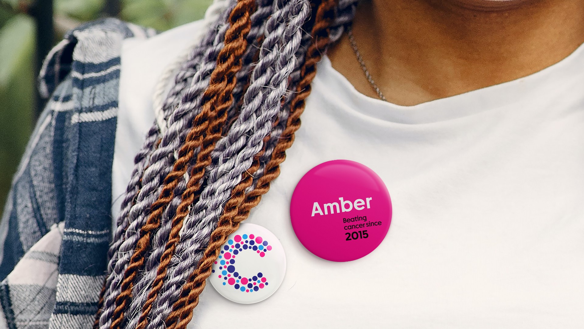
The brand’s updated logo, whose circles each ‘pinpoint’ a moment in time in the collective journey of beating cancer, has been simplified. Hoping to achieve a greater impact in print and on digital platforms, the logo retains its distinct magenta, cyan and navy colour palette.
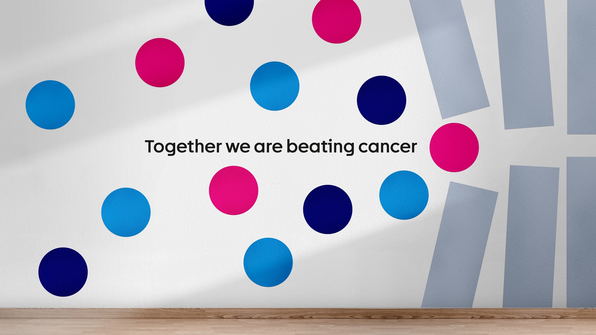
Elsewhere, its ‘Together we will beat cancer’ tagline has been dumped. Instead opting for ‘Together we are beating cancer’, Cancer Research UK is demonstrating its new focus on the progress that is made every day by UK scientists and researchers, rather than simply on the idea of finding a ‘single cure’.
Dave Roberts, creative partner, and Leanne Kitchen, senior designer, at Design Bridge and Partners, jointly say, “It was a privilege to support Cancer Research UK in its journey to refresh its visual identity. By placing science at the forefront but through a lens of genuine human moments, the refreshed visual identity strikes up the perfect balance, honouring the variety of incredible contributions being made each day to this urgent and critical cause.”
The charity’s new photographic style, which values authenticity, is used to show real life, and utilises candid images of each audience group. Finally, to speak to its multiple audiences in a consistent manner, the brand’s typeface was evolved by merging a sans serif and slab serif to form a unique hybrid font.
Philip Almond, executive director of marketing, fundraising and engagement at Cancer Research UK, adds, “We want to inspire people to see that our progress is their progress. And this progress is only happening thanks to their support. Refreshing our brand gives us the opportunity to get better cut through in a competitive fundraising environment and demonstrate the human impact of our vital work in an engaging and inspiring way. Supporting Cancer Research UK is being part of the solution to beating this awful disease and bringing about a world where everybody lives longer, better lives, free from the fear of cancer.”