Alliance Healthcare reveals new UK private insurance brand

The private insurance provider, named Kindred Health, was created in response to the NHS facing excessive challenges which have impacted its level of care. Alliance turned to London-based Chromatic Brands to craft an identity which could showcase the brand’s credentials as being a ‘better’ option.
Following extensive research and surveying over 600 prospective customers, the strategic and creative consultancy realised the best route was for Kindred to target people who have previous experience with either employer-funded or self-funded medical insurance. A crucial part of designing the brand involved leveraging the fact that Alliance is run by doctors and is renowned for its quality of care. Furthermore, the Kindred brand had to be aimed towards ordinary people, not just the privileged elite.
Chromatic Brands had to keep all this in mind when crafting the name, Kindred, which was settled on as a means of capturing the business’ spirit of togetherness. Also hoping to evoke a human touch in the brand, the new name also aims to position the brand as personal and family-centred.

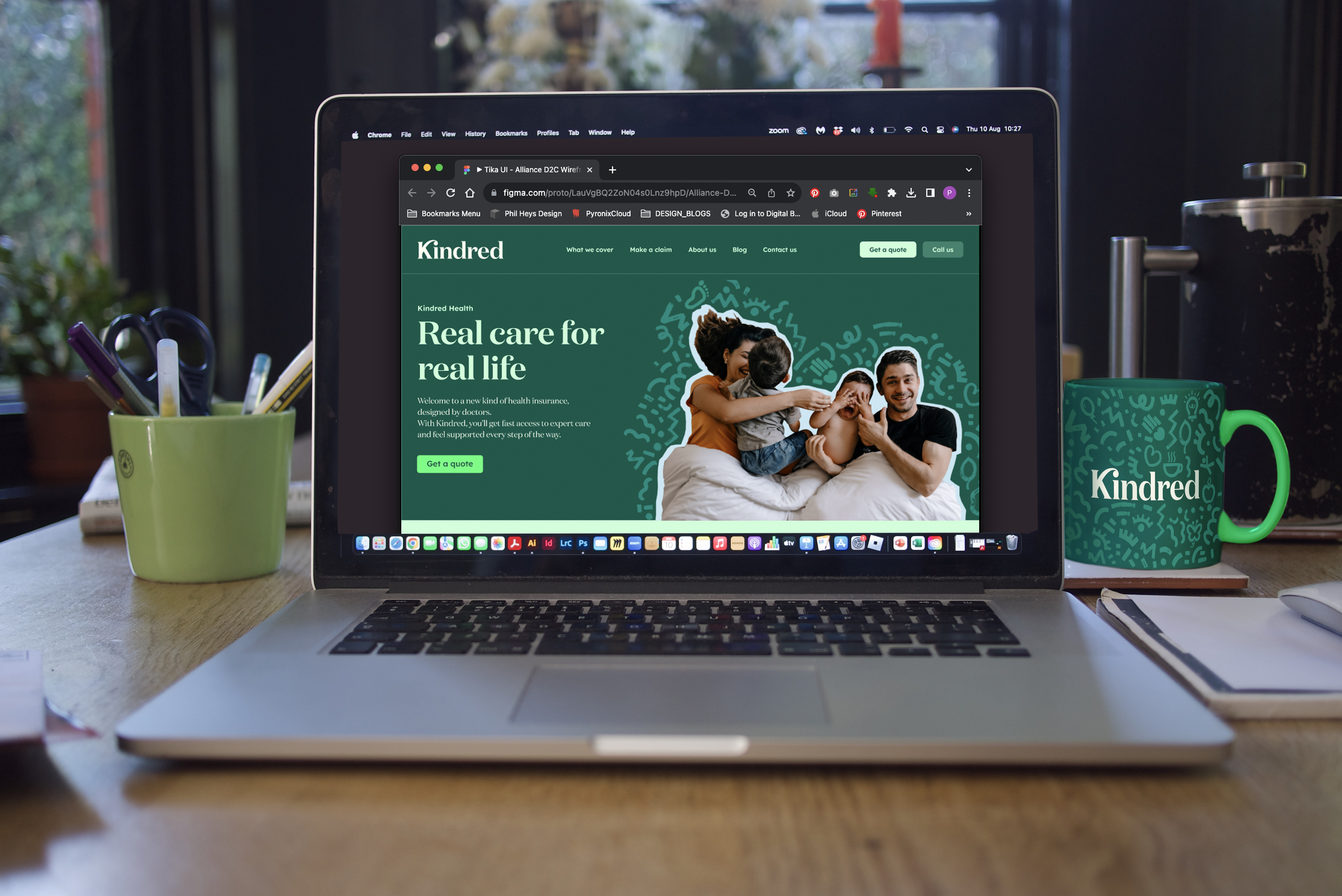
The overall visual identity was crafted to exude warmth, as demonstrated in the wordmark by the ligature between the ‘K’ and ‘I’ suggesting a hug. This is paired with an accessible display font called Lexend. The colour palette, meanwhile, adds to this theme of evoking normal households over clinical spaces, breaking conventional category rules.
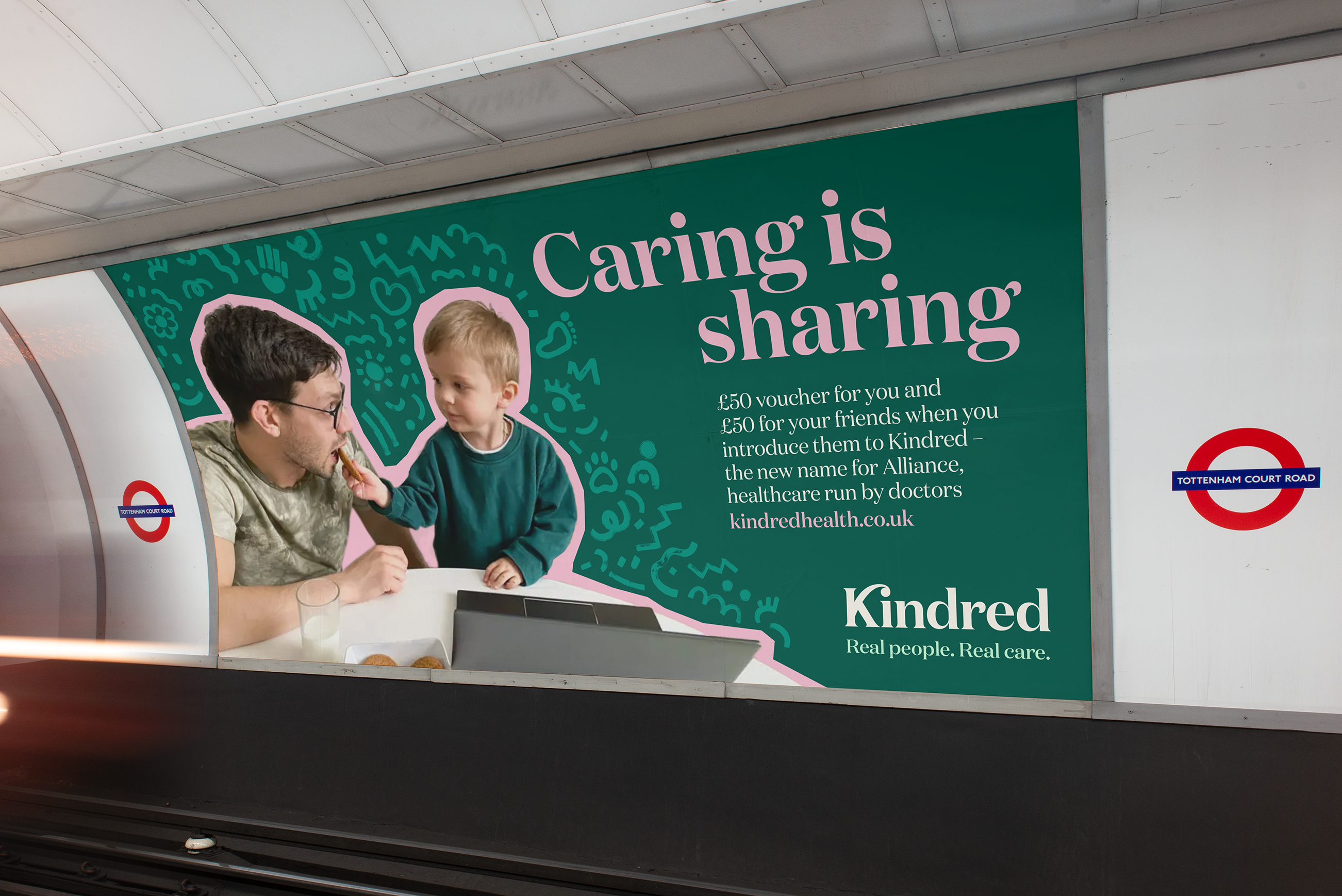
Finally, Kindred’s website aims to demonstrate compassion over complexity, and Chromatic Brands believes it will be crucial to the new brand’s success. The consultancy’s work culminated in a campaign launch which showed off Kindred’s ability to understand reality over idealised lives.


