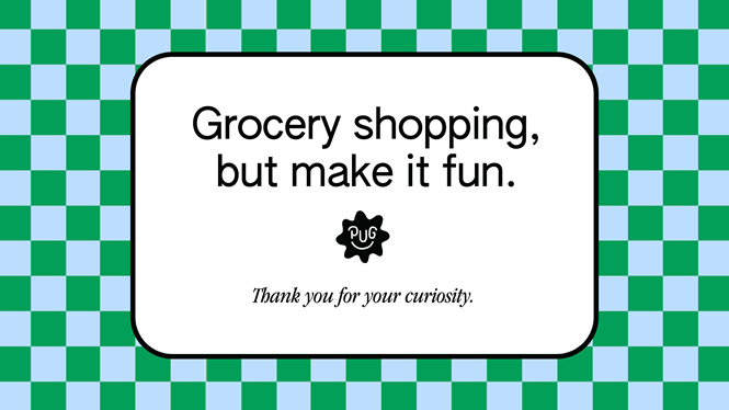
Gander designs old school visual identity for Pop Up Grocer
Pop Up Grocer, considered a ‘creativity and innovation hub for brands in the CPG space and beyond', sought the help of the Brooklyn-based design agency Gander to curate a visual rebrand that matches the company’s evolution over time.
The brand – launched in 2019 – aims to change the way we shop for groceries by making it not feel like something you have to do, but something you get to do.
Emily Schidlt, founder of Pop Up Grocer, says, “We are, first and foremost, a space for discovery. We were in need of a few more tools to allow us to continuously stimulate and entertain.”
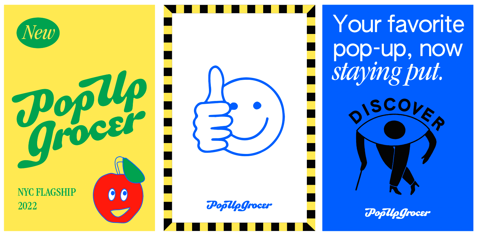
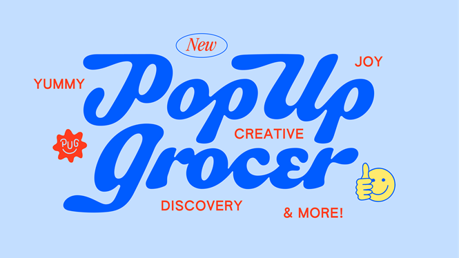
Aiming for the brand to be perceived as an immersive, design-forward concept shop in which customers can truly discover grocery products, Gander designed a logo and colour system that seeks to represent the future of Pop Up Grocer. Matched with a modern twist, a hand lettered logomark was designed which pays homage old to the tradition of sign painting outside New York shops.
Katie Levy, partner at Gander, says, “[The goal was to] create a brand that toes the line between being monumental and everyday that could flex between two very different experiences: [the permanent flagship upcoming in NYC and the pop-ups continuing around the country].”


