#TransformTuesday: 12 January

Here is this week's selection of rebrands from around the world. For more from #TransformTuesday, follow @Transformsays on Twitter.
Accuweather
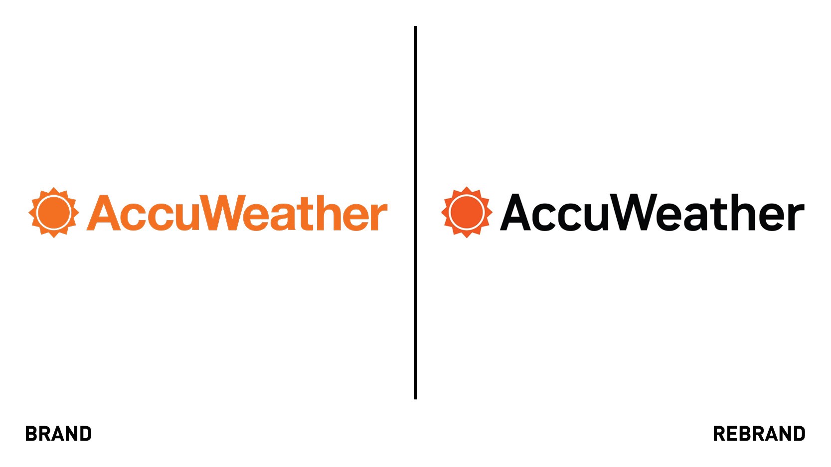
American weather brand AccuWeather underwent a design update with creative branding agency loaylkaspar to create a system that communicates the brand’s strong identity while also enhancing the effectiveness of its information design. The update was made in conjunction with AccuWeather's newly designed app, launched in July of 2020, that incorporated significant improvements to current features based on user feedback. The challenge was to balance ownable and recognisable brand assets with clarity of weather information given that weather conventions such as storm maps have pre-existing meaning assigned to certain colours and shapes. To work around this challenge, in addition to that of communicating concisely on the small space of a smartphone screen, loyalkaspar introduced new custom typeface Solis, as well as a unique colour palette and a variety of weather background designs and animations.
“We have come to understand and read weather data in a way that is consistent and universal–just think red for hot and blue for cold–so it’s clear that you can’t just create a new color palette. You can’t jeopardize clarity for design sake. A big challenge in terms of branding is that you have to find a way to create something ownable while honouring established conventions,” says executive creative director at loyalkaspar, Daniel Dörnemann.
ESPN
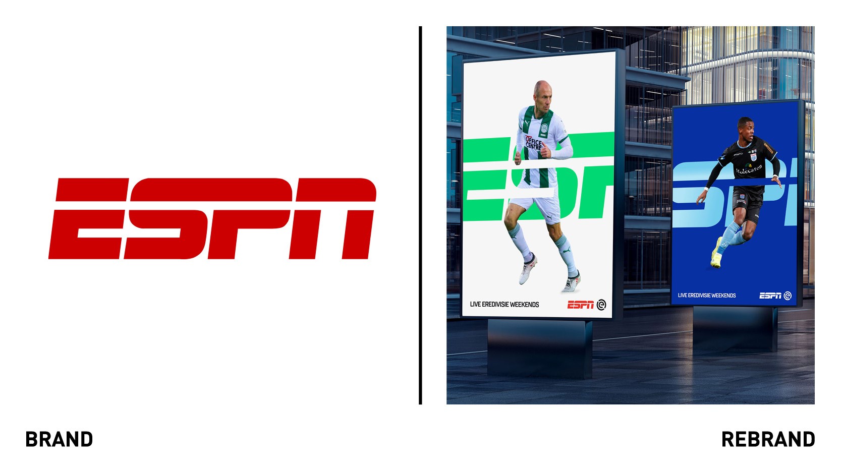
With all FOX Sports TV channels and digital media in the Netherlands having relaunched as ESPN since the beginning of this year, design agency DixonBaxi was selected to deliver an authentic sports experience to the Dutch audience, which would focus directly on Dutch football. The brand promise was clear and to the point: ignite the fan in everyone, a mission to inspire and generate love of fandom across the country. To do so, DixonBaxi created the ‘spotlight,’ a visual and metaphorical design system that illuminates every sporting hero, moment and story, aiming to bring fans closer to their ideals and capture moments of celebration and raw skill. The ‘spotlight’ design language illuminates every sport adapting to precisely display team colours, and include subtle details in match graphics to echo the light-filled motifs that reveal key information. The bold typography dials up the emotion and action bringing a hit of drama, that resembles the one seen in every sport. The timeless ESPN logo is key to the identity , in that it underpins the whole system and responds to team colours.
“The combination of the legendary global ESPN brand with a firm, local football culture in the Netherlands is most inspiring and eye catching.. With a new brand and design, we are ready to bring some light and joy to the eyes and hearts of millions of Eredivisie fans across the country,” says Jan Bonjer, director of marketing and creative services at ESPN, the Netherlands.
GM
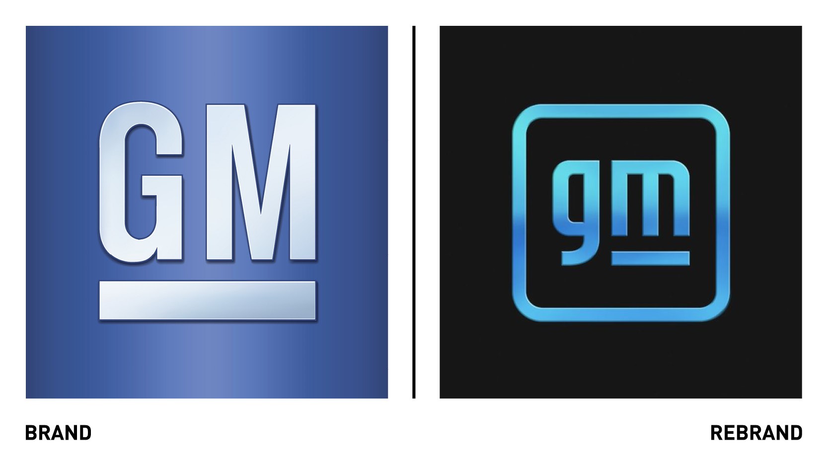
Automaker giant General Motors has unveiled a new corporate logo, for the fifth time in its century long history, to mark the business’ transition in the new era of electrification. The new logo builds on a strong heritage while brining a modern and vibrant look to the classic blue square, adopting lowercase letters for the first time. The new brand identity is digitally savvy and extends to technology brands including Ultium. Through the logo, created by the team in-house, the company aims to balance the history and trust inherent to the existing design with its innovative vision for the future. The blue colour palette evokes the clean skies of a zero-emissions future and the energy of the Ultimum platform. The underline of the letter ‘m’ connects the previous logos as well as visually representing the Ultimum platform, while the negative space within the letter resembles the shape of an electrical plug.
“There are moments in history when everything changes. Inflection points. We believe such a point is upon us for the mass adoption of electric vehicles. Unlike ever before, we have the solutions, capability, technology and scale to put everyone in an EV. Our new brand identity and campaign are designed to reflect this,” says Deborah Wahl, GM global chief marketing officer.
JEN by Shangri-La
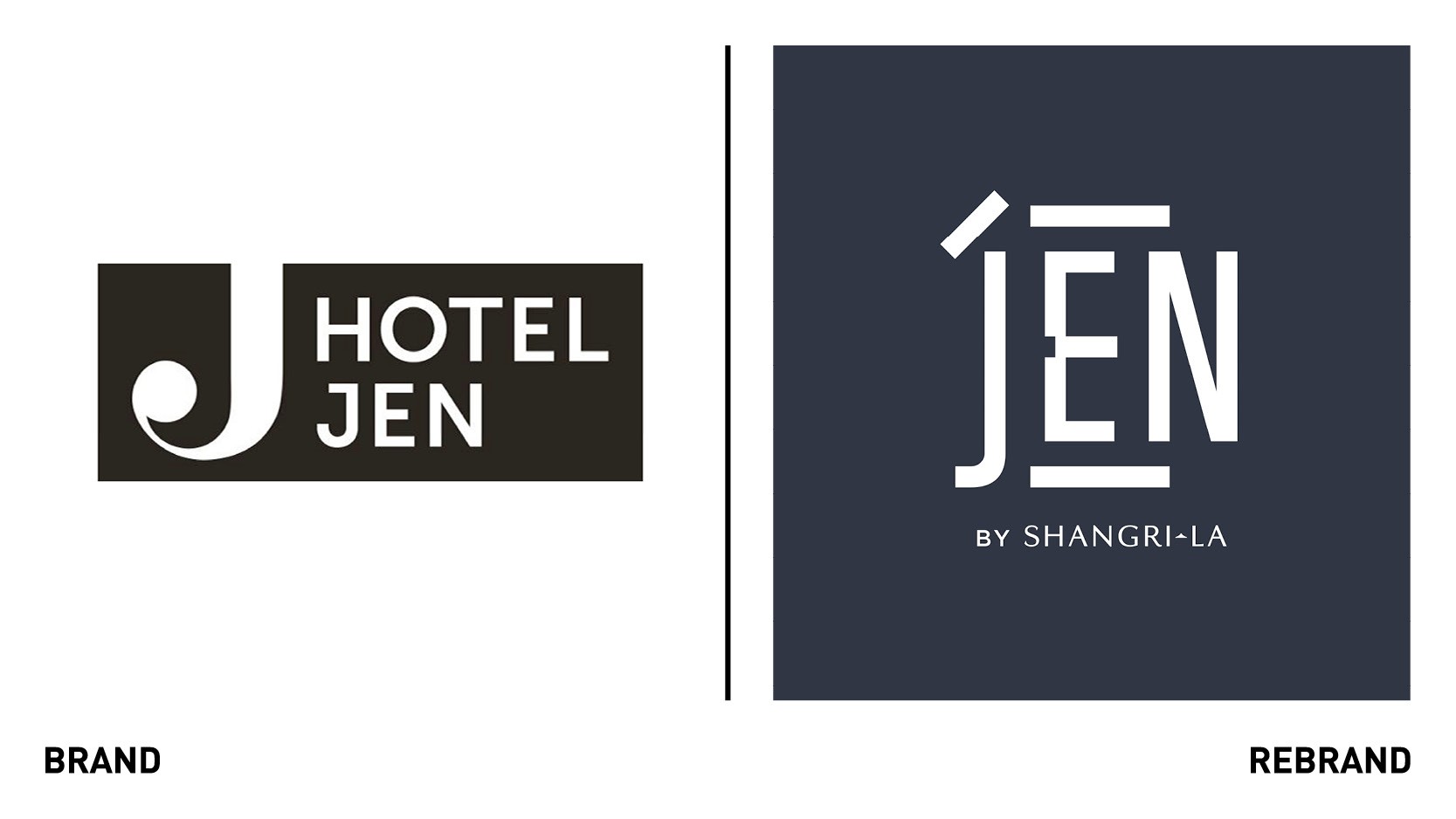
Global design agency Design Bridge Shanghai launched a rebrand of JEN, Shangri-La’s diverse chain of up-scale hotels aimed at urban travellers. The new identity, which sees the hotel chain being renamed from Hotel Jen to JEN by Shangri-La, is inspired from Asia’s vibrant and progressive cityscapes that invites curious explorers to discover the new Asia. The new identity takes the brand beyond a physical place to a community of likeminded travellers. At the heart of the rebrand is the dual-language logo, which reads in both Chinese and English; the Chinese character rén, representing benevolence and harmony, has been combined with the English word Jen. This builds inclusivity and appeal into the brand for both the Chinese tourism market and English-speaking travellers. The interpretation of the rén symbol has also been used as a flexible super graphic, instilling print and digital touchpoints with JEN’s bold and graphic identity. The symbol is also used to create a Jen typeface and a series of geometric patterns in a new colour palette inspired from contemporary urban environment.
“The whole visual language builds on our roots as an iconic Asian hospitality group and positions JEN perfectly amidst the changing landscape of hospitality,” says vice president of JEN Shangri-La Group Kevin Siew.
Labbrand
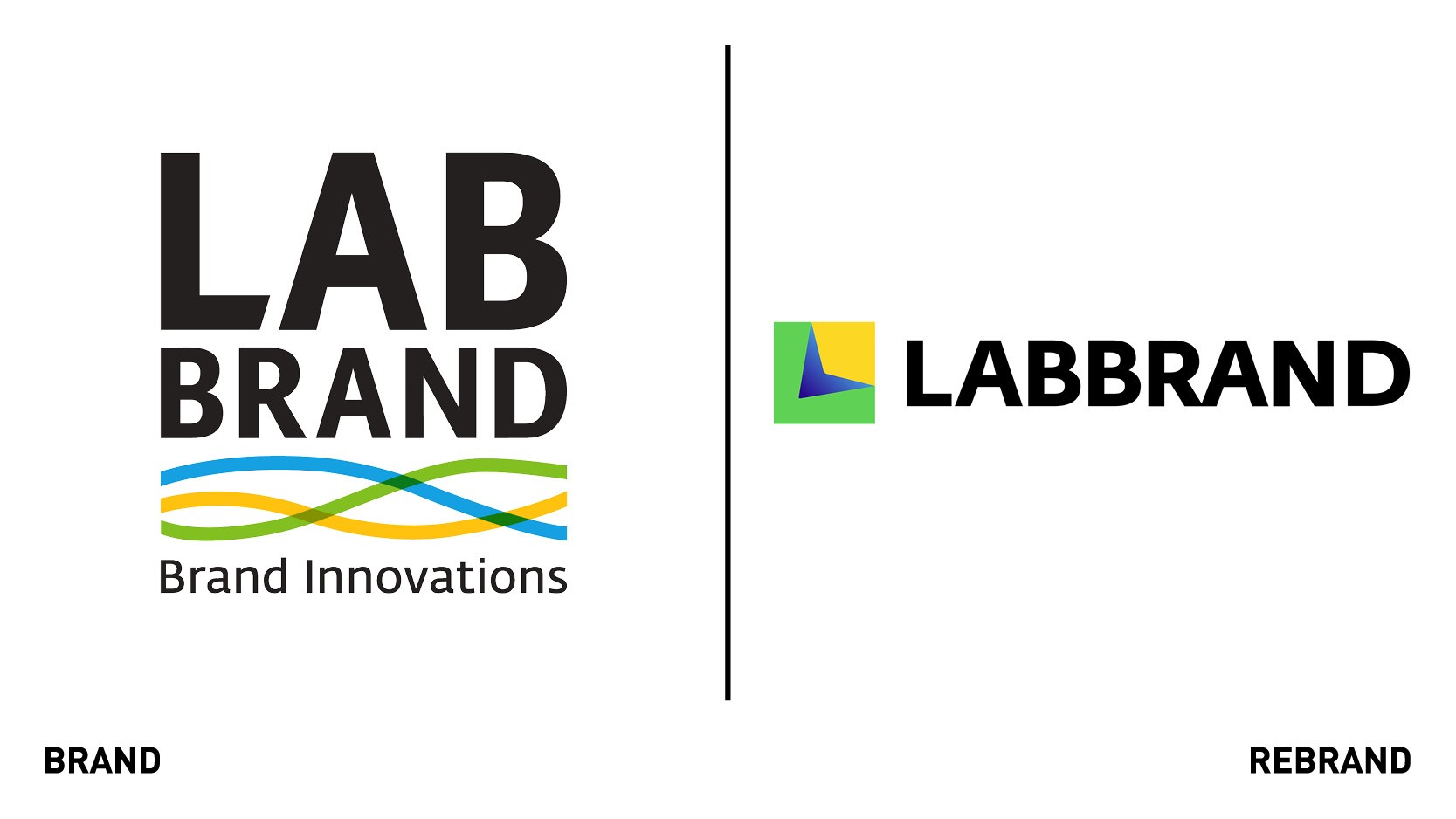
To celebrate its 15th anniversary and stepping into the new era, global brand consultancy Labbrand reveals a new brand identity, including refreshed brand signature and a new website experience. The new visual style of Labbrand is the expression of the modern identity of the company and represents the company’s commitment to be the guiding partner for brand innovations. The concept of the creation behind the design is to offer an immersive experience to a journey depicting the Labbrand universe, where viewers can experience the depth of the culture embedded in words, ideas and visuals. Throughout the journey Labbrand will enact as guiding partner and lead the audience through the journey to a dimensional projection of Labbrand. The new design language is contemporary and bold, expressing the company’s modern character, as seen through the vibrant colours and the contrast of shape lights and scale. The new system portrays a dreamlike universe that projects the core values and vision of Labbrand. The new identity expresses openness and strength of character. The L shape symbolises Labbrand and the land it stands on. Inspired by the perspective seen from a binocular, the blue arrow symbolises visionary guiding partner leading brands throughout different journeys of brand innovation. The signature can be transformed into four different configurations, representing the four pillars in Labbrand.
Stitch
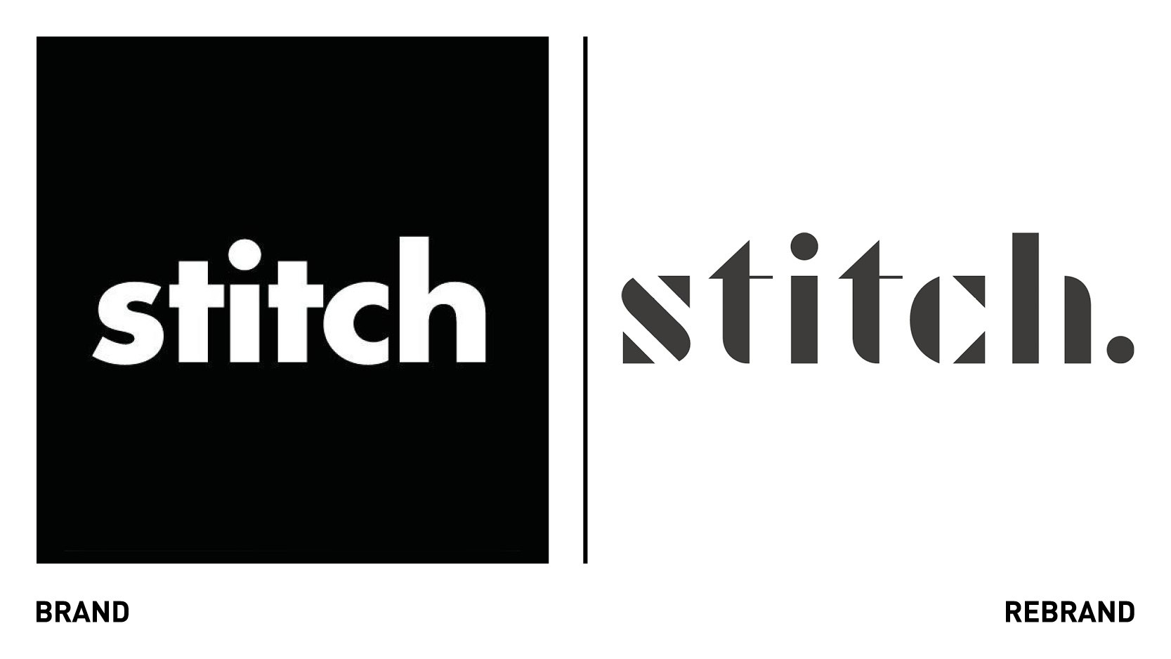
Mutts&Misfits, the creative and branding collective founded by ex-Ogilvy and Dare ECD Brian Cooper, has revealed a new brand identity for Stitch, a London-based studio of architects and urban designers. The new identity focuses on Stitch’s community-first spirit, which came through extensive interviews with the company’s key stakeholders, including existing clients. Another central aspect to the rebrand, seen in the new straplines ‘experience before design’ and ‘walk the streets’ is Stitch’s ‘joined up design’ approach, a mission to create not just beautiful buildings, but enriching environments for residents to live and foster community within for years to come.
“Stitch’s new proposition brings to life the studio’s commitment to creating spaces that enable communities to thrive. The geometric segments in the logo represent the components used to create physical buildings. In turn, the letters in the logo have been manipulated to create abstract, eye-catching wallpapers and animations across the website,” says Brian Cooper, founder of Mutts&Misfits.
“Our new look and messaging communicates what we know from experience - looking beyond project boundaries, getting under the skin of wider issues, engaging and being agile with ideas. All this presents a real opportunity for residents, planners and developers to participate in building real neighborhoods,” adds Sally Lewis, director of Stitch.


