This Way Up creates branding and packaging for new vegan cheese range
This Way Up, a London-based design agency specialising in healthier food and drink, has created the branding and packaging for 'flexitarian-focused' new plant-based cheese range, Nurishh.
In 2020, Groupe Bel, French multinational cheese marketer, acquired All in Foods, a French plant-based cheese start up, with the aim to develop a globally recognised plant-based cheese profile that appealed to mainstream and flexitarian audiences.
“Increasingly, people of all ages and backgrounds are seeking out more accessible and flavour-first plant-based options. The delicious and versatile Nurishh range, designed in partnership with This Way Up, will help retailers meet this rising demand,” says Caroline Tilloy, Nurishh global brand director.
Rather than focusing on the vegan market, Groupe Bel and This Way Up sought to create a brand with wide appeal. Following global brand analysis into the category, This Way Up identified their key audience as “agile home heroes”—essentially parents of teens or carers looking to feed the entire family with the one meal that everyone would enjoy.
TWU worked with Groupe Bel to name the range, and landed on Nurishh to create an ownable brand (thanks to the spelling), that aims to imply “goodness” and notions of family.
This Way Up says it sees “health and taste as being not mutually exclusive,” and that approach helped to inform the design language used across all Nurishh touchpoints.
“The designs needed to strongly communicate taste, which was a massive barrier in the vegan cheese market. Nothing in the plant based cheese category was shouting about taste or colour. This opened up a space to create a design which was full of colour, eye catching and appealing for everyone,” says This Way Up designer, Beth Kelsall.
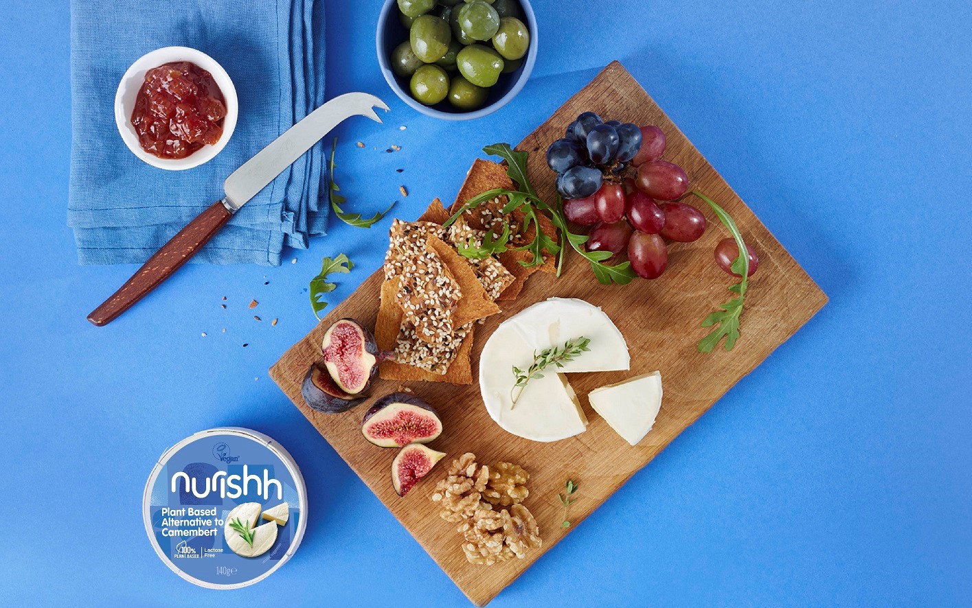
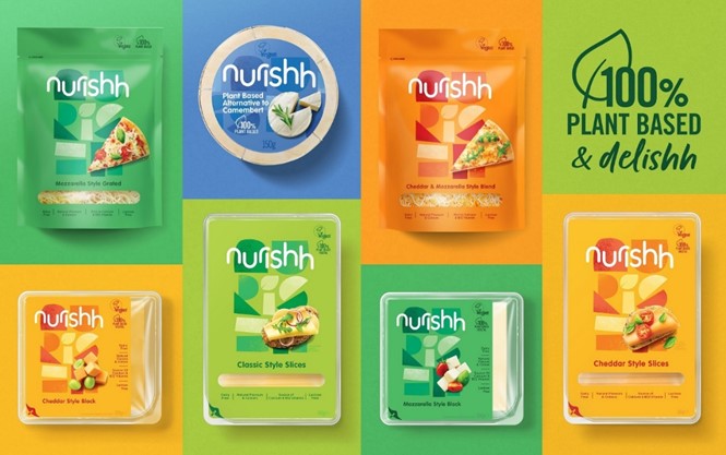
Nurrishh, as both product and brand, aims to break with the conventions of vegan cheese, often packaged either as facsimiles of its dairy cousins or with neutral aesthetics that play up to its connotations of restricted diets. Nurishh, on the other hand, uses bright, cheerful colours and playful type on the packaging, in addition to on-pack photography to dial up taste cues.
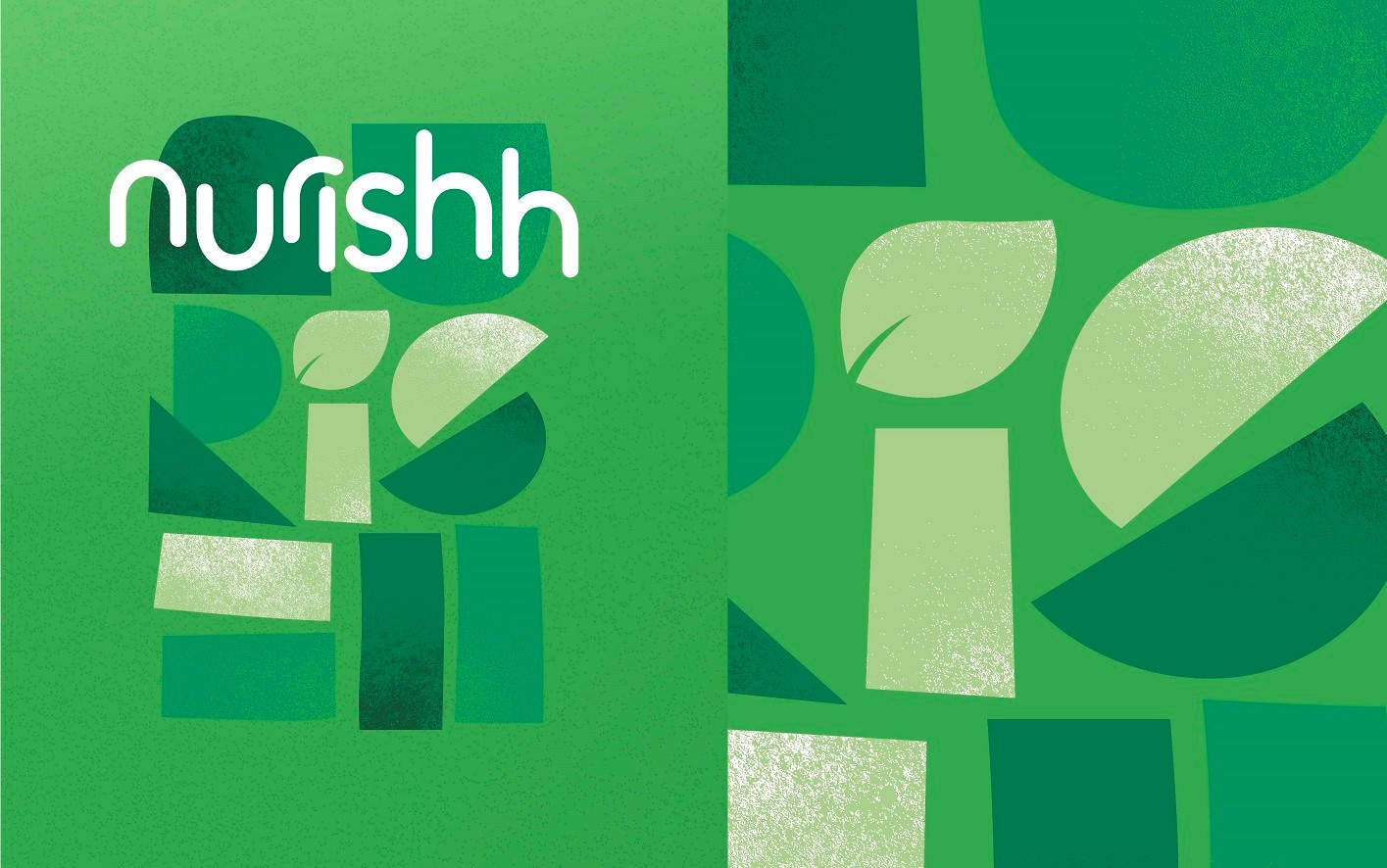
The Nurishh logotype is set in all lowercase, and this wordmark is used alongside more experiential, illustrative lettering formed of simple shapes. Kelsall says, “These abstract shapes represent Nurishh’s mission to bring everyone together. All food needs and cravings are fulfilled with Nurishh.”
A stacked and condensed version of the logo aims to illustrate how the brand overall was created to be flexible across varying touchpoints from digital to print.
“As a product, Nurishh makes plant-based cheese accessible and inclusive, and the brand reflects this. Accessibility and inclusivity have been the building blocks of creating a brand experience - both in real life and online - that welcomes our agile home heroes fully into the fold,” says Chris White, managing director and founder of This Way Up.