The Foundry Types and Thonik develop new typeface for Dutch Design Week
London type designers The Foundry Types worked with Amsterdam-based design agency Thonik to develop Fernhout, a new typeface for the Dutch Design Week (DDW), the biggest design event in Northern Europe.
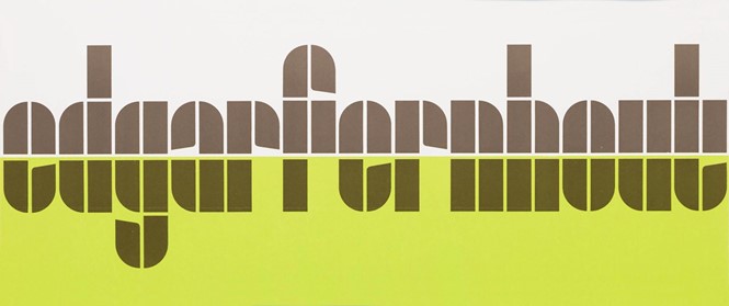
The new typeface is based on the simple primitive forms- rectangles and quarter circles- by the late Dutch graphic designer Wim Crouwel’s ‘Edgar Fernhout’ exhibition poster and catalogue for the Van Abbemuseum in 1963.
Thonik approached the Foundry Types and asked them to create a typeface based on the new logo they had designed, expanding the character set to include a-z in lowercase, figures, and punctuation glyphs. The Foundry Types’ objective was to create a clear expansion of the Crouwel ‘Edgar Fernhout’ letterforms that seamlessly integrates with the new DDW brand identity.
“Just like Crouwel’s lettering, his posters and catalogues are unique. All vary in style and execution, often displaying humanity within his strict modular grid vision: systematic, logical, but crafted by hand and with a keen eye,” says Stuart de Rozario, co-partner at The Foundry Types.
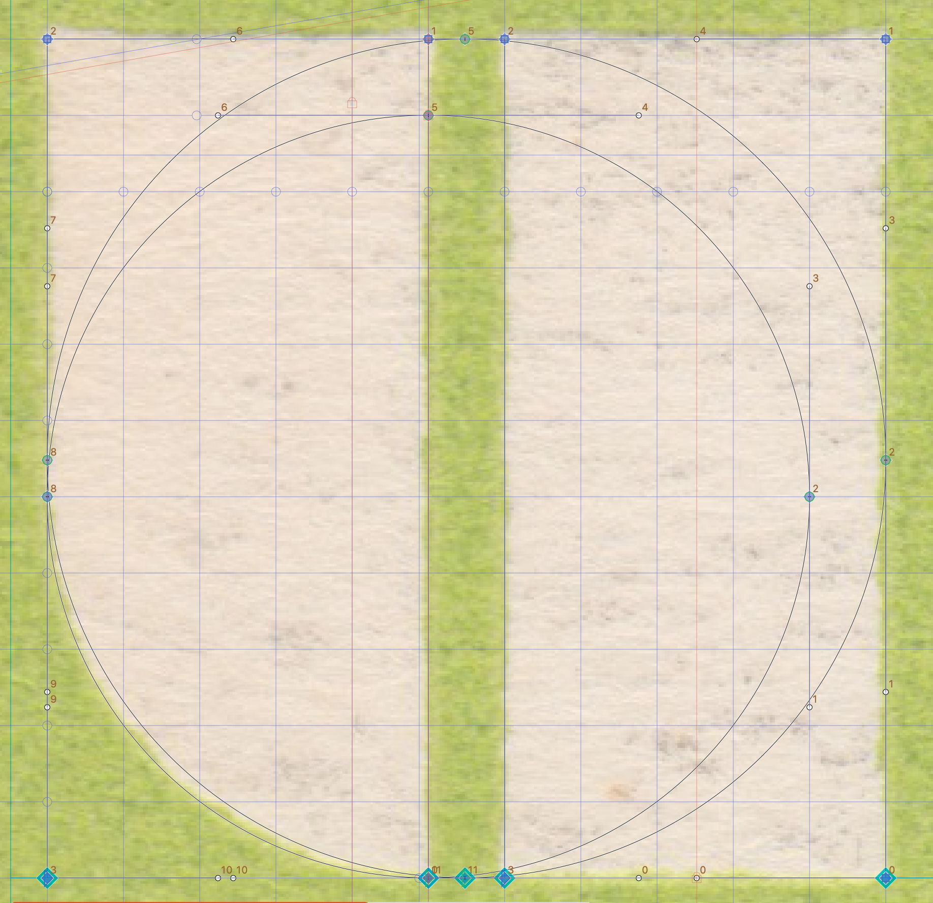
The constructed ‘Edgar Fernhout’ letterforms consist of a simplistic rectangle block system, two columns wide and four oblongs tall, circled segments and angled indentations. Although the glyph shapes are playful and simple – these basic forms often throw up challenging complex problems and limitations. The Foundry Types decided to introduce another element, the square, which allowed a little more freedom to express the concept in a more refined way.
“Animating the newly developed font for the DDW site felt natural, when the letters started moving, the underlying grid became visually present. A bridge was forged between the aesthetics of the past and the design language of the future: motion design,” says Roy Terhorst, partner at Thonik.
“We’ve chosen all lowercase letters since they feel more democratic and look sympathetic. The use of indentations has helped increase legibility,” adds Thomas Widdershoven, co-founder at Thonik.


