Robot Food launches complete brand transformation for Vocation Brewery
Leeds-based independent branding agency, Robot Food, created a new brand positioning and visual identity for independent craft brewer, Vocation.
The new branding by Robot Food aims to celebrate the committed and passionate spirit of Vocation’s team and drinkers, whilst also creating a recognisable brand presence that feels at home at craft shops, bars, and supermarkets alike.
Robot Food’s task was to overhaul the design to achieve greater brand stand-out as well as more consistency between the core Vocation range and its ongoing specials. The agency also had to focus on creating brand recognition in bar settings.
“The craft category is ever-growing and it's still quite noisy. Vocation wanted to become better established in the on-trade bar scene, so it was about striking a balance between being brand focused and keeping its craft sensibility at the same time,” says Rich Robinson, Robot Food senior designer.
Natalie Redford, creative strategist at Robot Food adds, “As a brand, what Vocation really wants is to be accessible—at the end of the day, it’s simply about getting better beer to more people.”
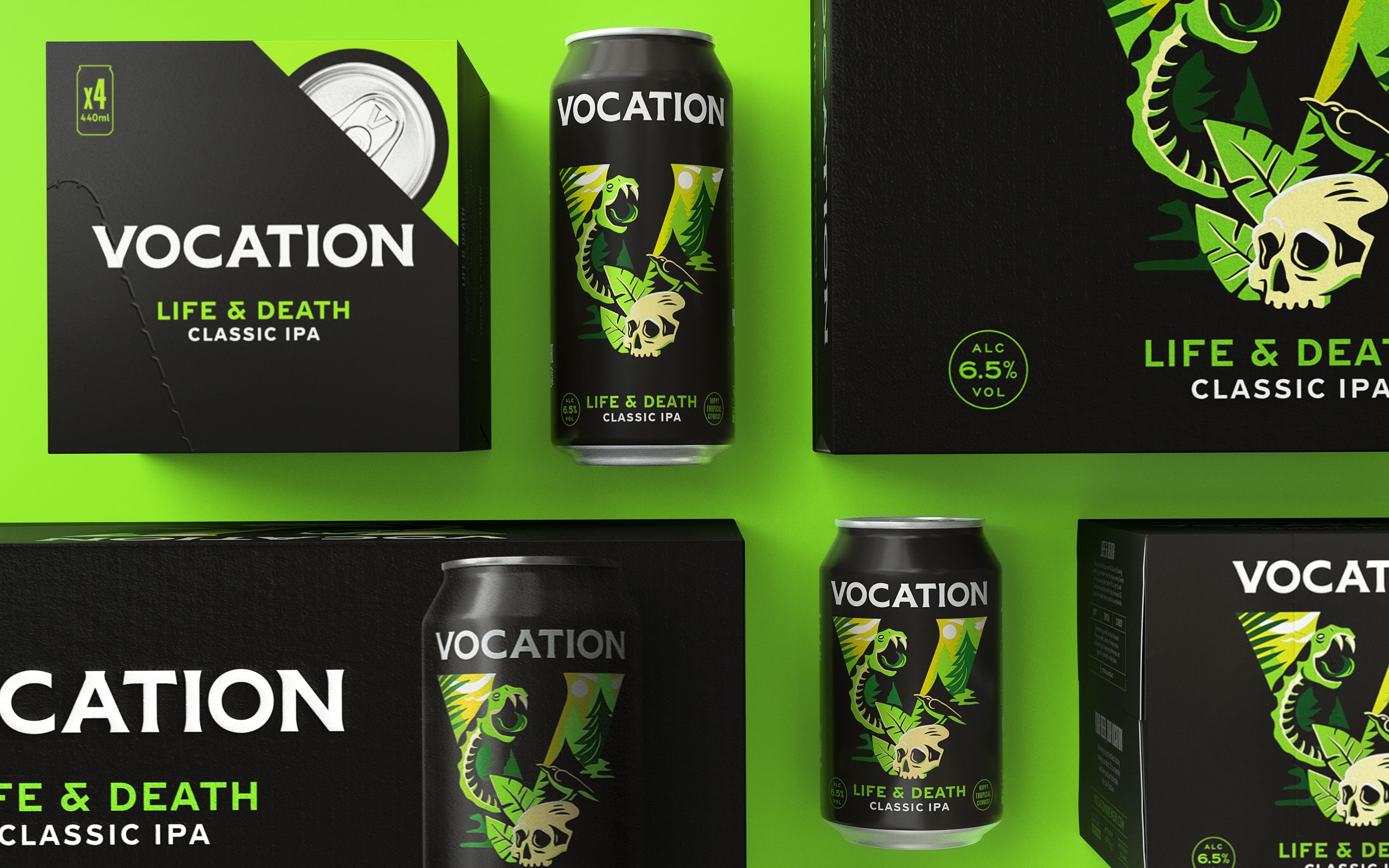
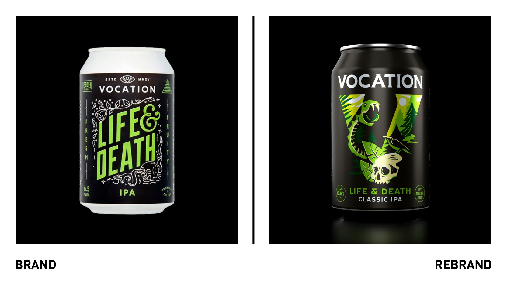
Until this new branding work, the can designs heroed the beers’ names rather than the brewery’s as they’ve always been beer first. With the brewery’s aim to sell more on-trade, it became vital that Vocation had a branding system that united its offer and amplified brand recognition everywhere the beer was sold.
“If there was a new special on tap, people wouldn’t make the connection between Vocation and the Life & Death they’d seen in the supermarket. The brand was getting a bit lost. Part of the challenge was building a bigger brand in the craft beer category, where people are a bit suspicious of big brands: it had to be more prominent, but keep all that excitement, fun and difference of craft beer,” says Ben Brears, Robot Food strategic design director.
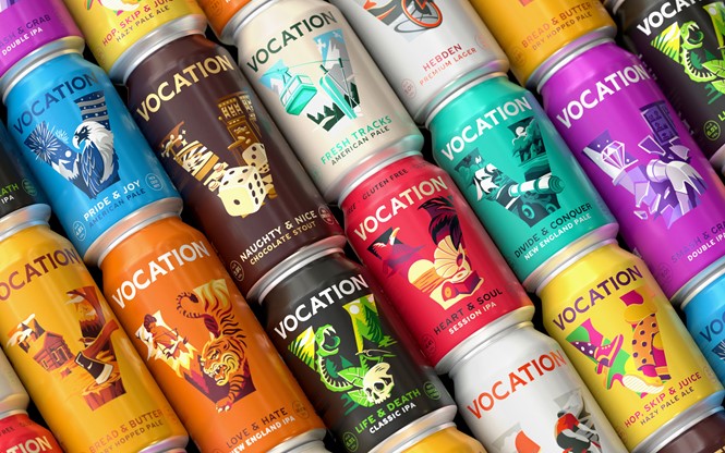
The new design aims to epitomise Robot Food’s ‘simplify and amplify’ approach: they’re impactful, but functional in creating cohesion across the brand while allowing for flexibility. The bold new wordmark acts as the primary logo across all brand communications, with a typographic style that pays homage to the brand’s Yorkshire roots through its heavy weighting and visual nods to industrial lettering.
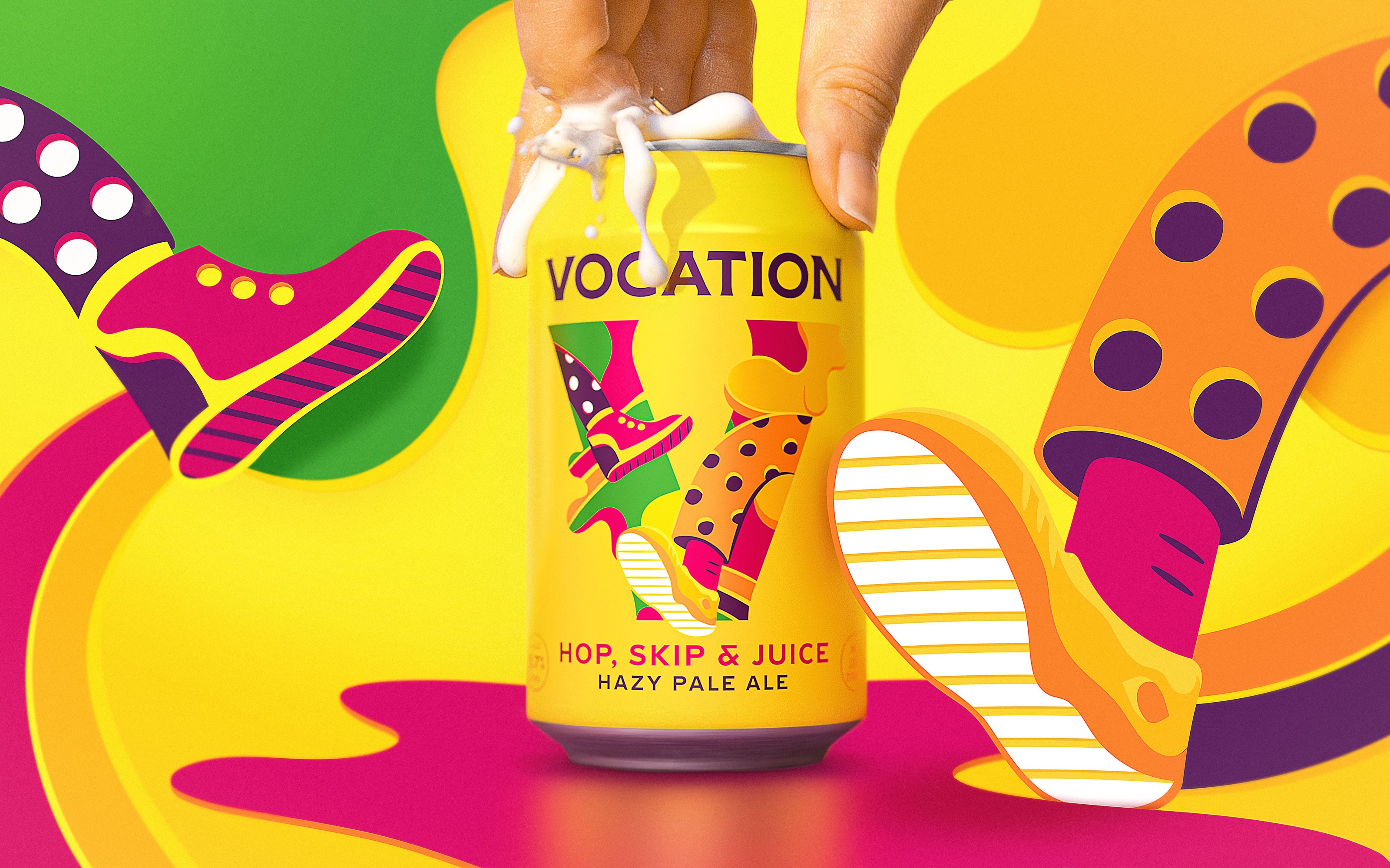
Moving away from the former black core range cans, the new packs use vibrant colours and illustrations, to add to each beers’ own distinct personality. The colours used on each can are based on the previous design’s typography (such as green for Life & Death and blue for Pride & Joy) to aid recognition.
“There’s a familiarity, but as everything’s evolved the brand’s become bigger and stronger. We didn’t rip up the rule book—we just upped the weighting,” says Robinson.
A new “Vocation V” brand icon is used to support the wordmark and create a frame for the packaging illustrations. Away from packaging, the V icon can be used to create visual impact, acting as a background piece to help product photography pop, for example.
Robot Food also created a separate architecture for the designs of specials and limited-edition beers to allow for flexibility as new variants launch, while keeping the Vocation brand at the forefront. The new Vocation branding seeks to play into the very nature of the brand itself; celebrating the perseverance, passion, and friendly Yorkshire grit of the brewery team for whom good beer is their vocation. The brand’s objective isn’t about trying to be cutting edge and cool, but authentic and inclusive, proving the “supermarket stigma” to be irrelevant.