Norwich City FC refreshes crest for first time in 50 years

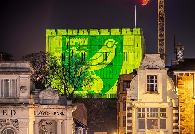
Norwich City Football Club worked with design agency, SomeOne in London, to develop a new crest for the first time in 50 years.

The old crest faced different technical and digital challenges having been created 12 years before the birth of the internet. There were also many inconsistencies with the different versions of the crest in circulation, from the one found on the concourse to that on the club stationary. The new crest had to pay homage to the club’s history, yet also be digitally friendly and cohesive across different touchpoints.
To tackle these challenges, SomeOne held an extensive consultation process with supporters, club directors, fan groups and other parties, to ensure the crest would be the correct balance of past and future.
"We worked with world class artists in the development of the crest and explored numerous iterations before settling on the final version. It wasn’t a case of going in and making a fundamental change, it was about taking all of the best bits and making them even better for a digital age,” says Rich Rhodes, executive creative director at SomeOne in London.
Commercial director of Norwich City FC, Sam Jeffery, agrees. “Having garnered feedback from numerous stakeholders, both internally and externally, it was always going to be ‘evolution’ not ‘revolution’ and we’re extremely proud of the outcome,” he says.
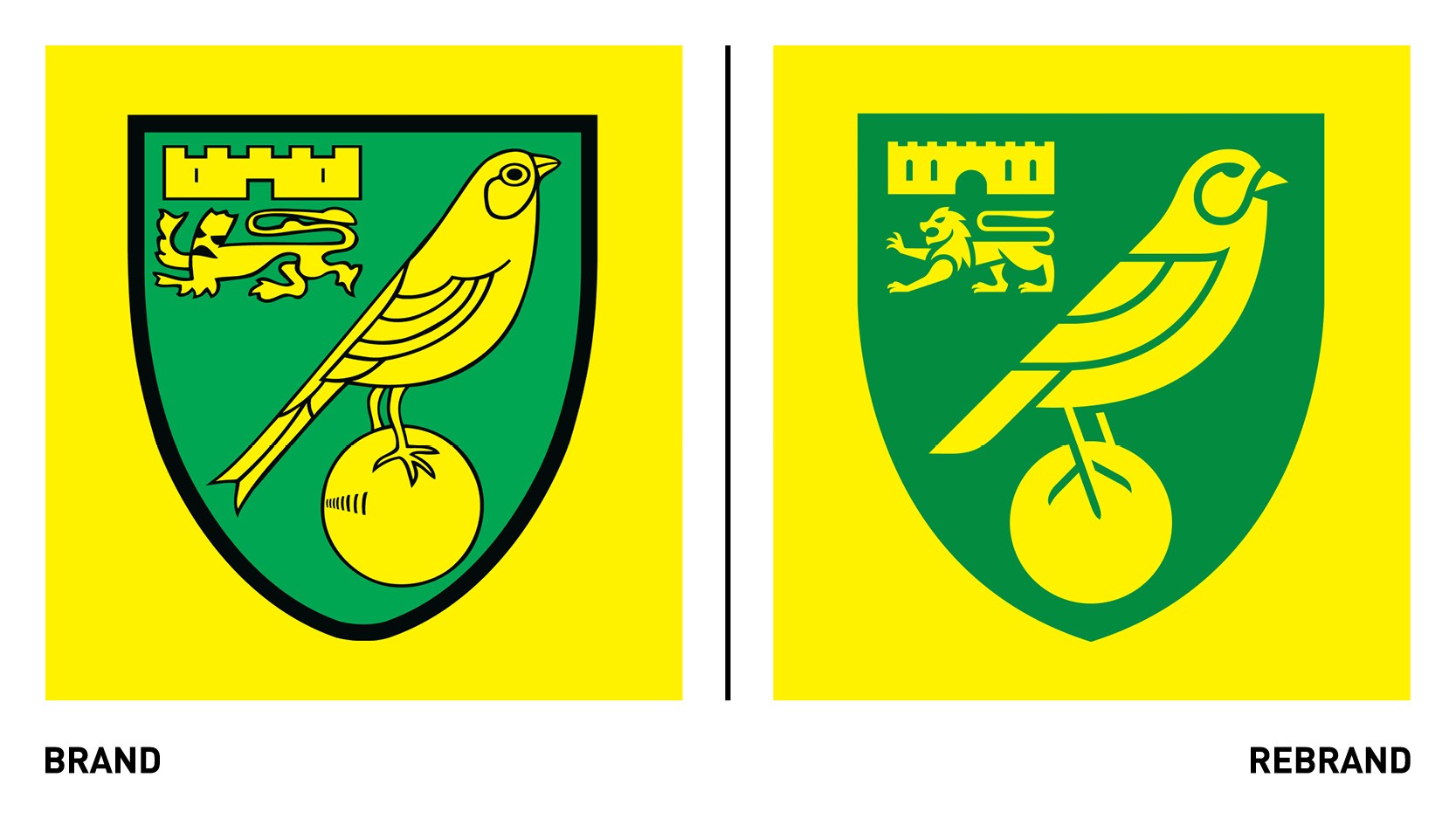
While the primary Norwich colours and elements within the crest remain the same, the new one looses the black keyline surrounding the elements, which caused issues when the crest was viewed at small sizes on digital applications. Reducing the new crest to the green and yellow aims to create a more iconic symbol that is legible at smaller sizes.
"After extensive consultation with varying stakeholders we felt the exiting elements- the castle, lion and canary- all had provenance and should be retained. Albeit subtle updates, all elements have been technically and aesthetically enhanced. The castle, for example, now has the correct number of crenellations, while the lion now represents the pride of the city. The canary aligns with the modern aspirations of the club," Rhodes says.
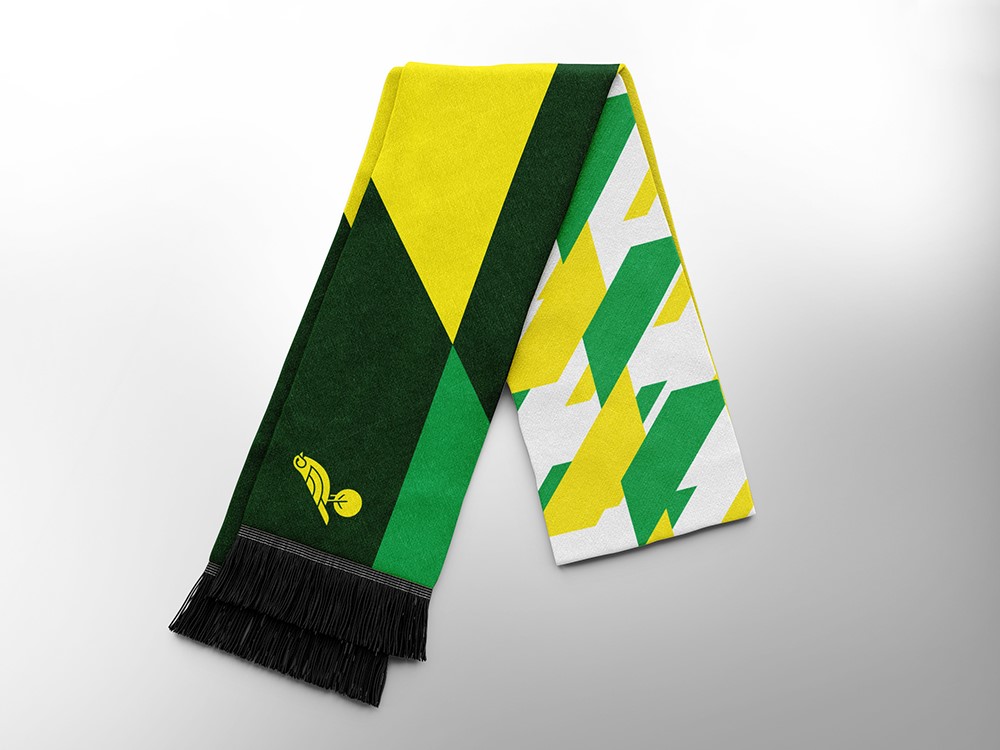
The new crest aims to reflect the aspiration and ambition of the club whilst becoming a symbol of progression. Additional brand assets such as a bespoke typography and brand property, which complement the crest, will be revealed in June 2022.


