#NewBrandMonday: 5 April
Here are this week's selection of newly launched brands from around the world. For more from #NewBrandMonday, follow @Transformsays on Twitter.
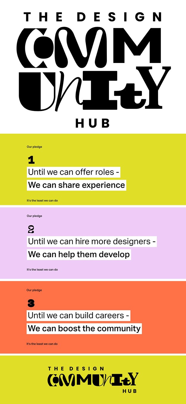
The Design Community Hub
Design agency Elmwood, formerly known as Born Ugly, created the logo, visual identity and brand positioning for the Design Community Hub. The digital platform aims to provide support and guidance to new designers trying to enter the industry and to those who have been furloughed or made redundant. The name came through the a correlation between the Hub’s creative founders, Callum Lumsden, founder and creative director at Lumsden; Tim Greenhalgh, CCO from Landor & Fitch and Jonathan non-executive director at Elmwood and chairman of Born Ugly. The unique letters that make up the brand marque reflect the diverse community of designers. The logo aims to be playful, flexible and welcoming, rather than corporate, to encourage engagement, particularly from students and design practitioners that want to engage on a social level.
"I wanted to make the most of the idea of ‘unity' within community in the stacked version of the mark as for me it encapsulated the celebration of lots of different minds and personalities coming together to form one collective. The letterforms are a mixture of contemporary styles whilst incorporating traditional letterpress forms,” says Born Ugly’s youngest designer Anna Edgell, who lead the project.
“We also wanted something that typographically spoke to our primary audience, our student audience and the next generation of designers, whilst not alienating those in our industry that have also been displaced through the pandemic. The typographic style we hope is uplifting and happy and very much of the moment,” says Sands.
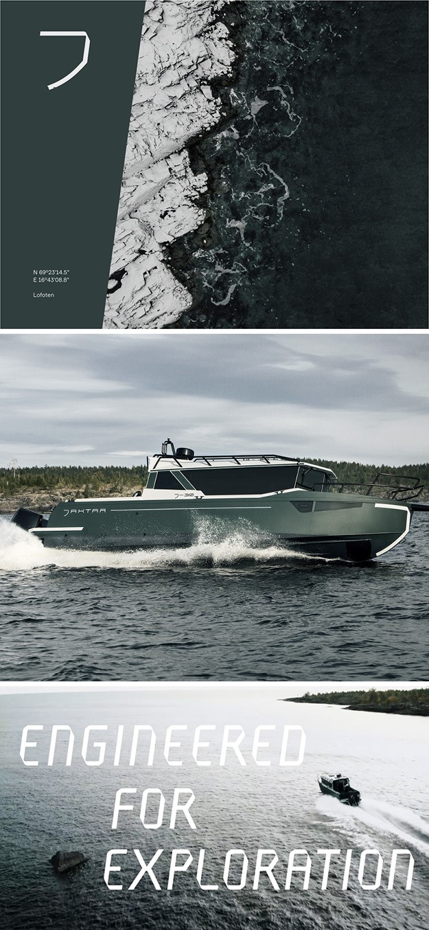
Jaktar
Stockholm-based design agency Bedow developed the design strategy and branding for Jaktar, a new boat brand designed for exploration and keeping people comfortable in the wild. The name was developed from the common term for seafarers in the 19th century, Jack Tars. The boat is inspired by remote Scandinavian landscapes that are only accessible by sea, as this boat is designed to bring people into the unknown, on new adventures. The branding concept ‘Engineered for Exploration’ captures the core values (engineering and adventure) at the heart of the company and created a solid foundation for the brand as a whole. The logo forms a ‘J’ from the shape of the boat’s bow. The word mark, bespoke typeface and angle device are all developed from engineered angles of the boat’s design. The desaturated colour palette was chosen to blend into the natural environment the boat is made for, with a flash of orange inspired by life vests and buoys. with the aim of creating a solid, carefully engineered brand built to last.
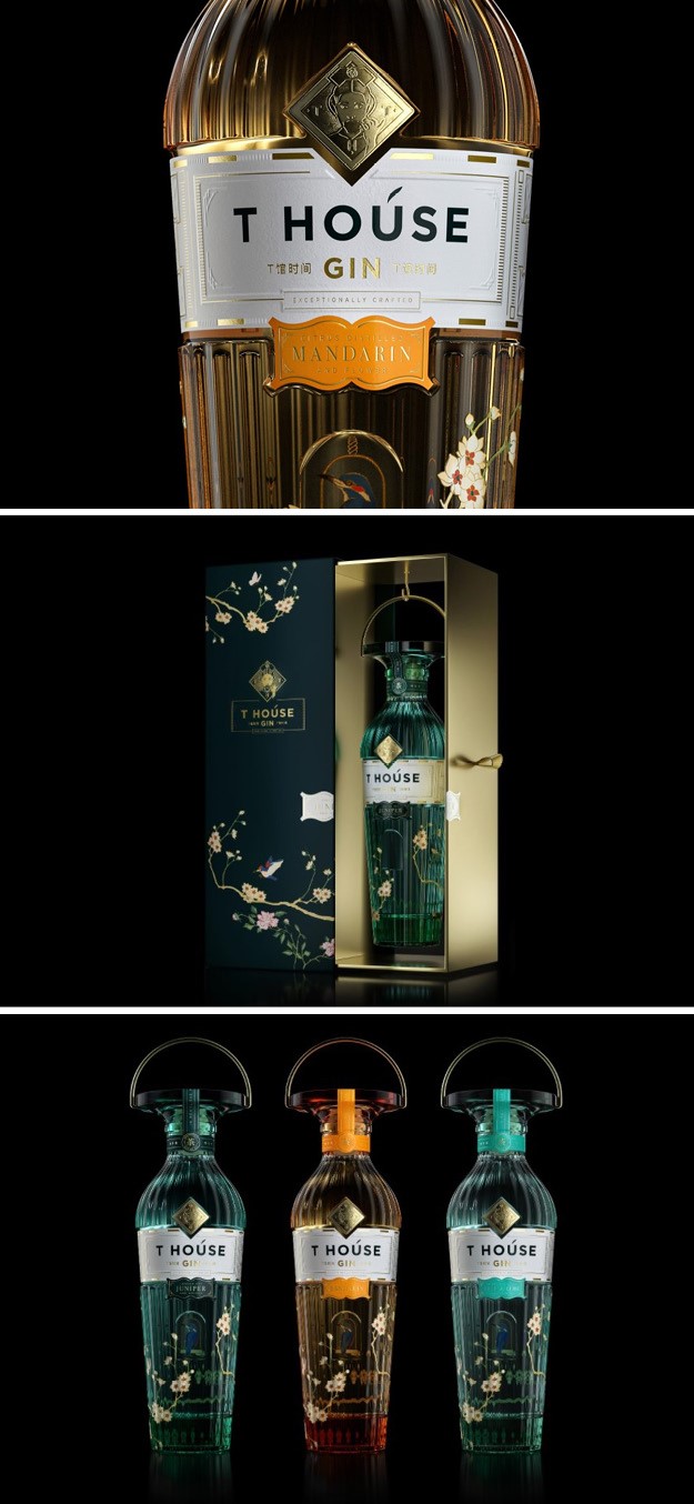
T House Gin
Brand design agency Intertype Studio designed the packaging and brand identity for premium spirit T House Gin, a gin distilled in China using a London dry recipe combined with Chinese botanicals, tea and fruit. The design was inspired by a meeting between an English dignitary and the Empress Cixi. The dignitary brought the gift of London dry gin to the Forbidden City, and in return the empress gave him a rare bird, held within a beautifully crafted cage. The exchange of gifts is a traditional part of Chinese culture, to show solidarity when attending a formal meeting, where tea was served.
The liquid combine classic London dry Gin botanicals with a hint of infused premium Chinese tea and locally grown citrus fruits. The range includes a juniper Variant, as well a mandarin liquid and a gin with a hint of Yuzu. The bottle structure is inspired by functions like a bird cage, whilst the glass stopper is influenced by the traditional head-wear worn by Empress Cixi. The illustration style and technique is inspired by a Qing dynasty vase. The bottle is hangs within the box to complete the concept. The paper label reflects the layout of the forbidden city in plan view, with the empress positioned to the rear centre of the courtyard, where she would typically host visitors.
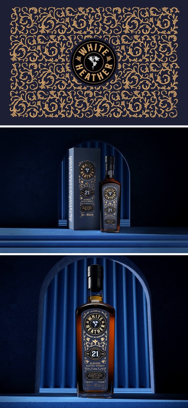
White Heather
UK-based drinks design agency Thirst Craft created a packaging design for new Scottish blended scotch whisky brand, White Heather. To make blended whisky covetable again, Thirst Craft began from the name; as Scottish legend has it, the elusive White Heather brings good fortune to all who find it. Therefore, the blends of this quality whisky are as rare as its namesake. The floral filigree wrapping the label reflects the uncommon degree of craft and care that goes into creating the particular blend of whisky. The bespoke wordmark picks out a sprig of white heather at its heart to showcase its preciousness, with the embossing around it adding a luxurious level of tactility to the overall label. The intricacy and detailed packaging as a whole aims to give off a premium-feel so that customers know what to expect when buying the product.
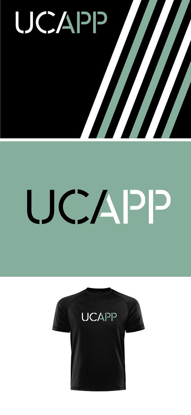
UCAPP
Design agency Offthetopofmyhead developed a new visual identity for the University of Cambridge Athlete Performance Programme. The challenge was to create a logo that represents a high-quality programme and also focuses on the merging of academia and sport. As part of UCAPP’s graphic identity, Offthetopofmyhead developed the A stroke into multipurpose graphics to support the logo and bring energy to an assortment of collateral, such as stationery and sports clothing. The colour palette is a striking combination of black and the famous Cambridge blue.
“Stencilled letterforms are traditionally associated with sport. Our stencil-inspired logo, with its two-tone letter A, captures the coming together of academic and athletic careers. The A is also used as an independent icon in social media, and on merchandise and promotional items,” says John Spencer, founder and creative director of Offthetopofmyhead.