Matter Unlimited looks for humanity in data with data.org rebrand
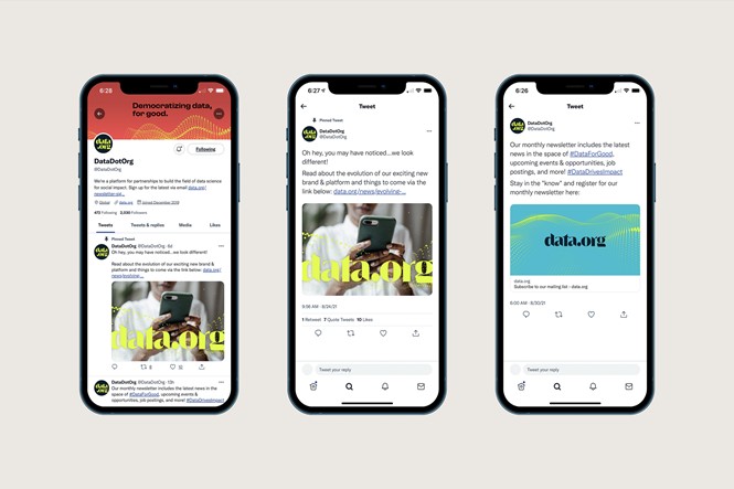
New York-based creative consultancy, Matter Unlimited, launched a new identity for data-focused social impact organisation, data.org, which aims to defy data’s obscure and often misused image.
Launched by Mastercard Center for Inclusive Growth and The Rockefeller Foundation, data.org seeks to offer an accessible and future-facing vision to match the organisation’s bold ambitions.
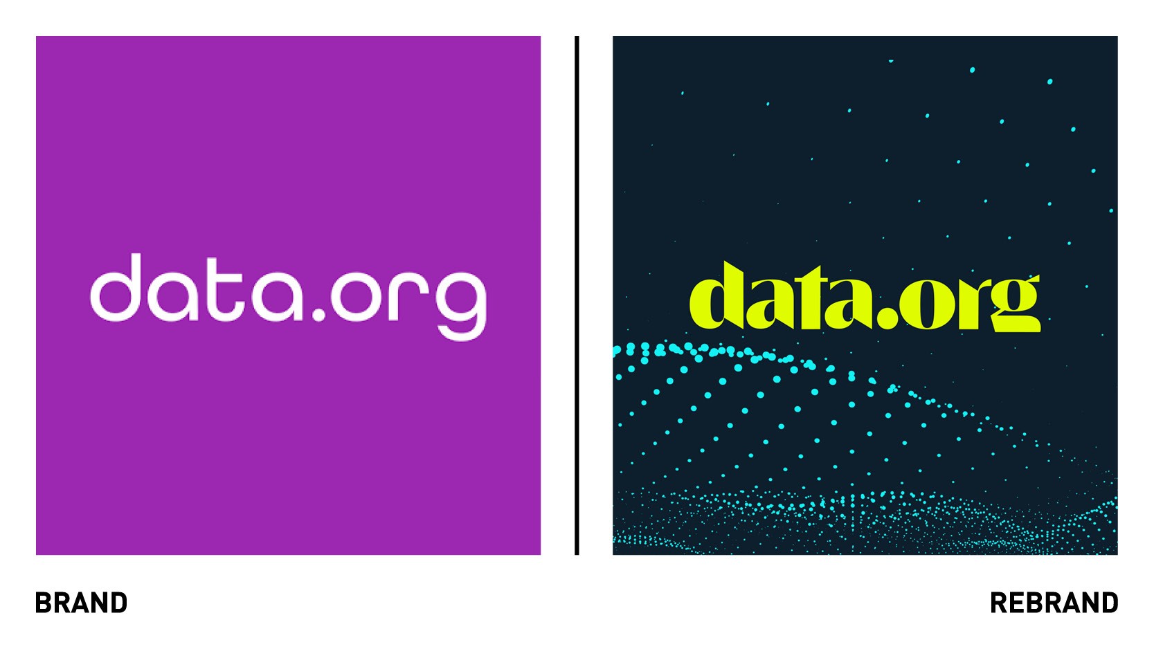
In rethinking its brand, Matter Unlimited avoided the usual design cues that dominate the category -representing data as clinical and mathematical- and instead embraced an aesthetic that feels more human and inviting while still being digital-first. This meant striking a balance between visuals that felt ‘organic' versus ‘designed’ in the photography, graphics and even the wordmark itself.
The wordmark, which was created to tell a story, had to have some ‘tension and relief within it,’ explains Matter Unlimited design director, Frank William Miller, Jr.
“We achieved this by working on this customised ‘semi-serif’ that was bold, angular and sharp, but also felt literary, weighted and legible. Harkening back to the creation of the Gutenberg Press and start of the printing revolution, we felt this thick, movable type-inspired font would be a cheeky reference to a seminal moment in history where knowledge was democratised and information and flowed more freely, not just in the hands of the powerful few," he says.
Central to the new identity is also a series of wave-like dotted patterns, woven throughout the brand designs. These custom graphics, hinting at a rolling sea of information, were chosen to be the best expression of the brand’s tech and human sides.
For Matter Unlimited it was also important to offer a colour palette that radiated a sense of positivity, openness and excitement. “Often when people consider data as a concept, especially 'big data', some darker, more ominous and anti-social applications of data come to mind first. We wanted to provide colours that did not feel heavy, dark, or shrouded in secrecy. Our focus was less on the cold, mathematical science of data and instead centred on the people this data is collected for,” says Miller
“The data.org team was brave with their choices, ambitious with their vision and committed to a visual identity aligned with their mission. Together we reimagined the brand to be a stronger vehicle for their message and to help amplify their impact for years to come,” adds Alexandra Gordon, Matter Unlimited managing partner.