Jones Knowles Ritchie gives Mr. Peanut and Planters fresh brand look
American snacking nuts brand Planters worked with international branding agency Jones Knowles Ritchie to develop a new look, tone and strategic platform that puts ‘substance front and centre.’
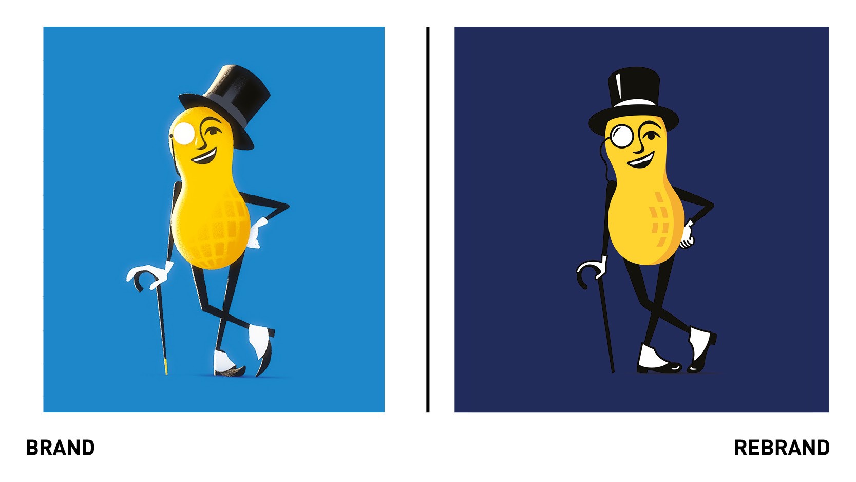
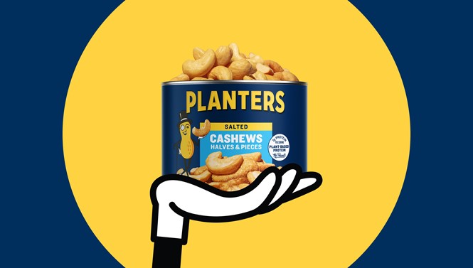
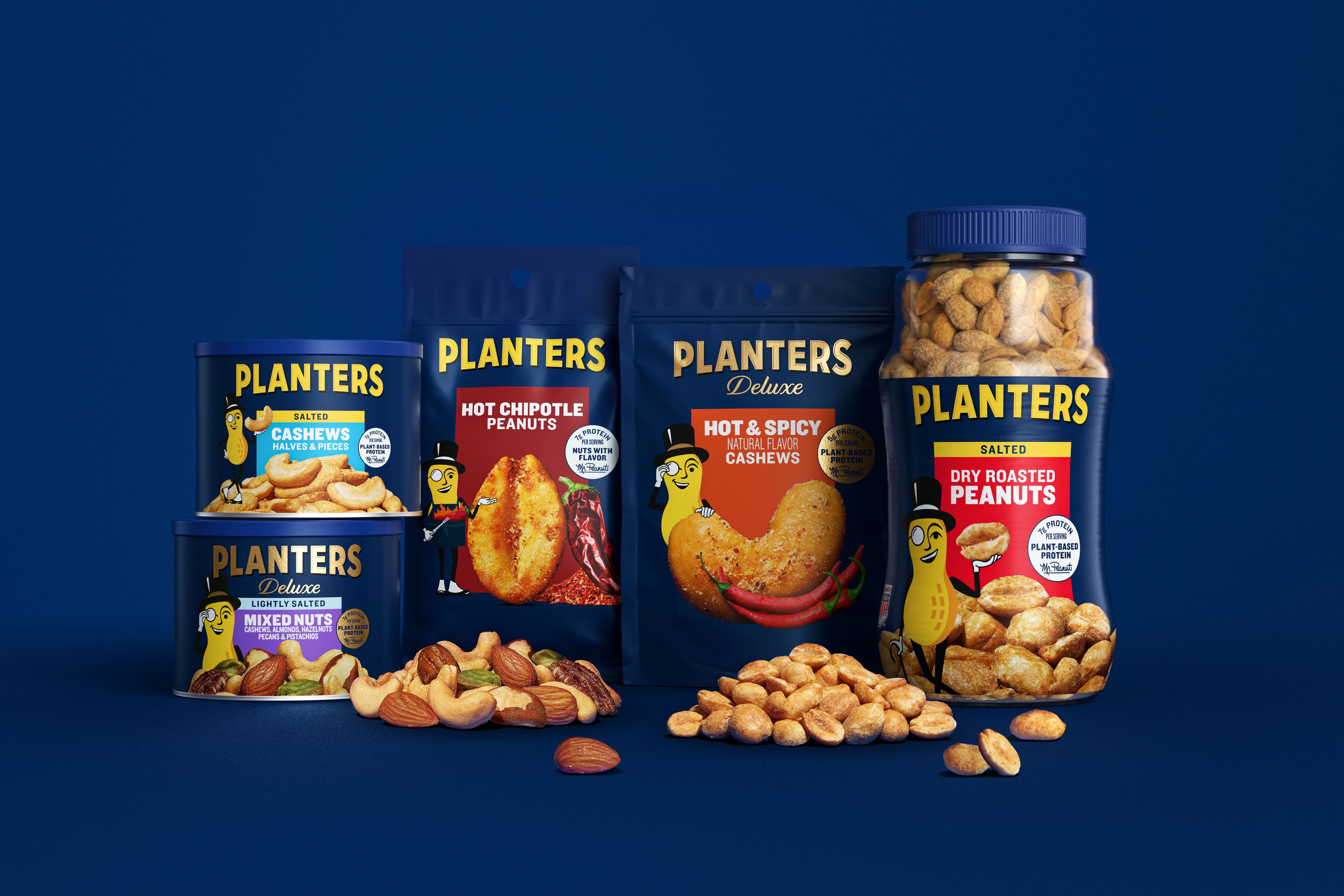
The brand’s 105-year-old mascot, Mr Peanut, has come back to life in his usual form with hat, walking stick and monocle, after he was killed off by the brand late 2020. Every detail from the logo to the colour palette, which now centres around a darker shade of blue, have been refined to celebrate the new brand.
The new typeface appears less rounded and more flat, taking up more space on the packaging and achieving greater shelf standout. The new photography aims to highlight the ‘irresistible taste, texture, and variety of flavors of its nuts.’
“Planters is a true American icon, connecting generations and providing real food satisfaction with substance. The creative idea behind the new brand identity, ‘Substance with Swagger,’ is all about celebrating the brand’s straight-to-the-nut sensibility, debonair flare, and crave-worthy irresistibility. We’re thrilled to finally share with the world the many sides of our beloved Mr. Peanut,” says JB Hartford, creative director at Jones Knowles Ritchie.
The brand will also launch a new creative campaign from VaynerMedia, first illustrated in a spot titled ‘Sustenance,' which highlights how nut snacks, like Planters, can give people the fuel to do great things first.


