Hulu appoints DixonBaxi to create a new, unified brand experience
Creative agency DixonBaxi worked with U.S streaming platform Hulu to create a new brand design that unifies the Hulu experience with a brand system born from the origins of its name, One Hulu.
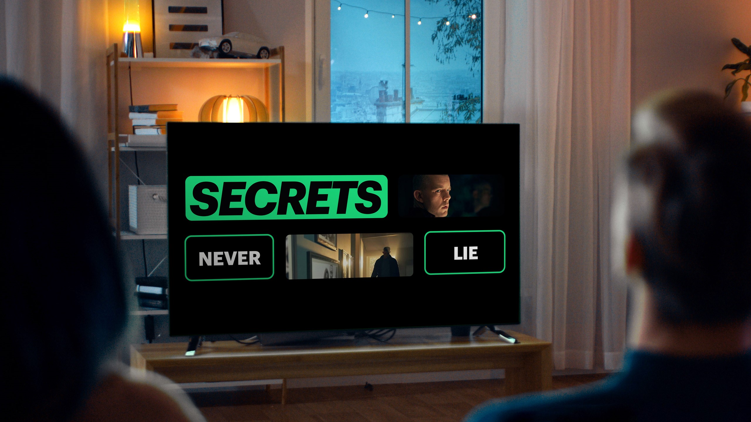
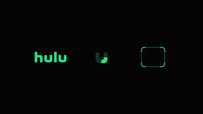
While the existing logo was retained, it was given more meaning. Research led DixonBaxi to uncover the origins of the name, an ancient Chinese proverb that describes Hulu as a ‘gourd,’ the ‘holder of precious things’. This discovery became the basis for the new brand design with the ‘U’ in the logo forming part of the vessel. This is a very flexible and adaptive design and narrative system, both helping to spark conversations and serving as a guide. It connects the brand and product, and celebrates powerful characters.
A new network ID was developed to live at the start of every Hulu Original. The sonic identity developed in partnership with Zelig features a unique four-beat mnemonic, which is carried through all key brand interactions from pre-rolls to campaign end-tags.
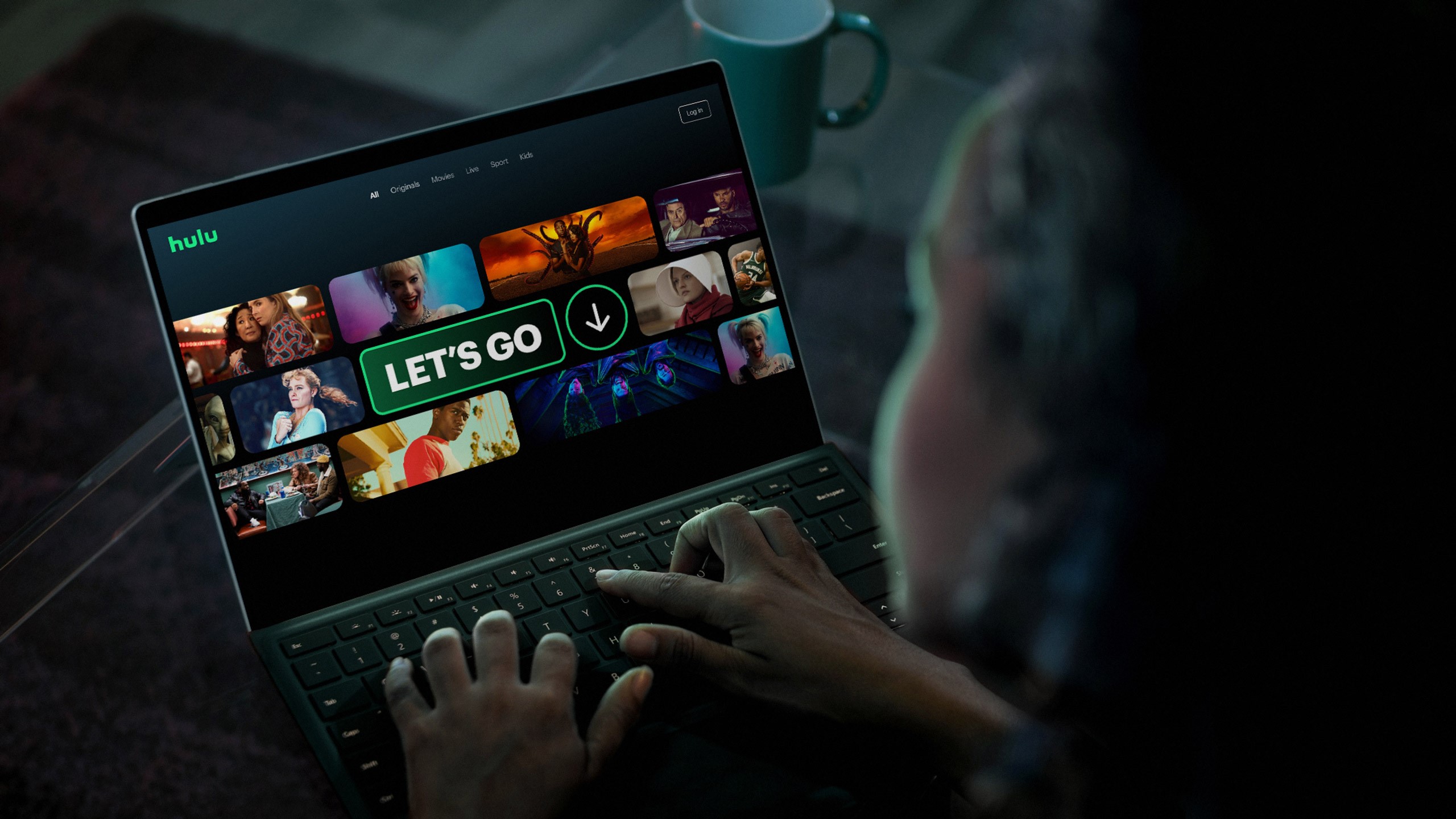
The colour palette is brighter and ‘greener,’ keeping in like with Hulu’s distinct and recognisable colour. The palette was also expanded with deeper, content-inspired colours with the aim of creating an atmospheric world, injecting the warm glow of the TV experience into the brand.
The brand identity is streamlined from two typefaces to one across the entire experience. The Graphik typeface brings character, swagger and style, while bold icons help viewers find their way through Hulu.
The rebrand was fuelled by four global design principles, which express the need to put the story first, be warm, do it differently and be ‘simply essential.’