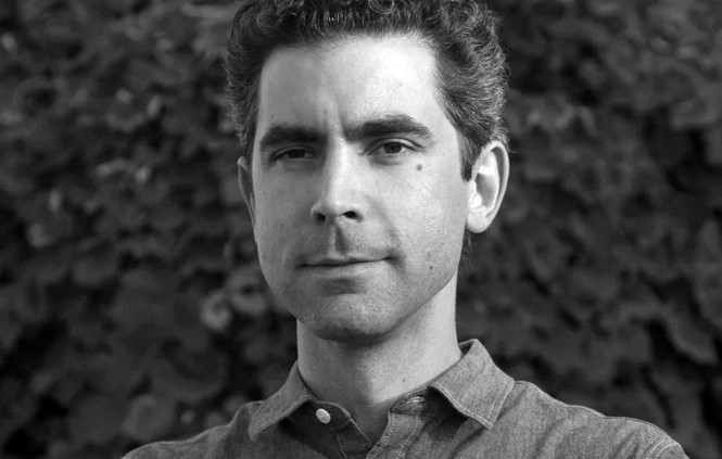
Five minutes with Burke Miles

Burke Miles, creative director at MOCEAN, the agency which designed the NBC Tokyo Olympics logo, speaks to Transform magazine about creating a logo that connects with the culture of the host city without being reductive of Japan’s culture. Miles discusses the ways in which the logo encapsulate the spirit and athleticism of the games and how much of Japanese culture and design inspired the logo.
How did MOCEAN secure the lead on designing the NBC Tokyo Olympics logo?
MOCEAN is an integrated agency for entertainment and brands. Our experience branding blockbuster-sized events made us a natural fit for a moment as massive as the 2020 Tokyo Olympics. International releases and international competitions have a lot in common. There’s the cultural weight of an enormous event and the need for clarity to reach a very broad audience. Broadcasting the Olympics is not a niche market, it should resonate with a wide range of ages and backgrounds in a way that is exciting and familiar all at once.
MOCEAN's creative leads have a successful history creating branding for companies as diverse as Marvel, NESN and Tumblr. We developed a shorthand with the NBC Sports team allowed for a successful collaboration. The goals were clear from previous experience creating branding that was both expressive of the host city and the grace and athleticism of the games.
How did you work on creating a logo that connects with the culture of the host city (Tokyo) without being reductive of Japan’s culture?
Deep research was key to developing a mark that was representative of Tokyo as a whole. To avoid being reductive to a single aspect or narrow perception of the place from a distance, we collected a variety of references from architecture, fashion, painting, design, athletics, typography and more from both historic and contemporary sources. Through that research, we were able to develop a deeper understanding of the symbols and style that could influence the mark. Talking with people who have a relationship with the culture of the city also helped clarify the feeling of the place.
Additionally, being respectful of culture is a consideration on any branding project. We work to be mindful of the brand we’re representing and the people who relate to it. People connect with brands in a way that becomes a part of their identity. We strive to create something authentic that feels representative of the brand in a way that connects with the people who are closest to the brand. The sensitivity is heightened on brands that have a long legacy. Marvel branding projects have a scrutiny that is nearly unparalleled. The deep relationships people have with the properties give them an ownership over the stories in a way that we need to honor with as much reverence. There are also projects with deep connections to a place, like NESN in Boston. They’re fierce about their sports in Boston and we knew we had to create a brand worthy of their sports network with a more than 30 year legacy.
In what ways does the logo encapsulate the spirit and athleticism of the games?
The flow of the lines within the mark propel you across it with an athletic grace. The shapes flow from one letter to another in a way that aims to generate an energy familiar from the form of an athlete’s body in motion. There are details derived from hand drawn kanji that carry a humanity and sense of movement into even the smallest nuances of the mark. The geometric O’s relate back to the rings of the games, which unify the representation of all the games since 1913.
How much of Japanese culture and design inspired the logo?
Japanese culture was a heavy influence on the logo from the kanji character for “human” acting as a foundation of the mark, through modern Japanese graphic design and architecture informing the shapes of the letterforms. In the deep design development process, a common theme of the directions developed was a tie to the place that was hosting the games as a foundation for an identity that would feel specific to the 2020 games.
How did you overcome the challenge of repping a legacy brand like the Olympics whilst still trying to evolve the branding into a contemporary space for 2020?
Fortunately, the foundations of both the NBC brand and the Olympics brand are both timeless. The NBC peacock, first designed by John Graham in the ‘50s and refined into its current form by Staff Geissbuhler in the ‘80s, feels contemporary still. The Olympic Rings have held up as a mark since their origin when there were 5 continents competing in the games, represented by the rings. With that combination of brands and a host city as futuristic as Tokyo, it’s natural to evolve the branding of the 2020 Tokyo Olympics into a contemporary space with only a nod to the historic weight of the games and Tokyo.
We also worked with the New England Sports Network to develop their recent rebrand. The blue ticket that was their previous identity had been developed in 1986 and had a very nostalgic place in the heart of a lot of New Englanders. We went through hundreds of iterations of the mark searching for the next evolution. No matter what you develop for a project with that kind of history, people are going to be sad to see the familiar go away. We aimed to create a mark that was strong enough to last at least as long as the blue ticket in a future when a paper ticket would feel as antiquated as a rotary phone does today. That’s always our goal with a branding project, to create something that’s exciting now but stands the test of time.


