Event communications agency Broadsword rebrands

Event communications agency, Broadsword, has rebranded with a refreshed visual identity, an updated agency positioning and a new website.

During the past 18-months, the agency has reinvented its business with the launch of a new proprietary virtual event platform, an expanded service offering now also including communications and content strategy, and an office relocation to support hybrid working.
“The pandemic period has been undoubtedly tough, but it has brought us opportunities as well as challenges. Growing our agency team was always our ambition, and in lockdown, these strategy, creative, content and digital services were exactly what our clients needed from us. Our rebrand will helps us communicate our updated positioning and ambitions to them and to a wider audience in the future,” says Anna Green, MD at Broadsword.
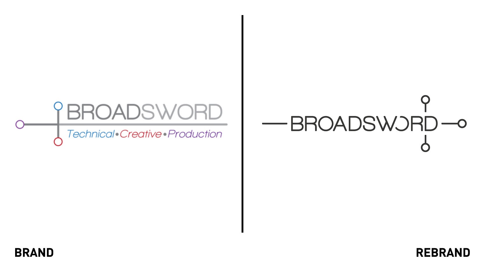
Both the logo and the company name were simplified. While it used to be called Broadsword Event House, which was ‘a bit of a mouthful,’ Green says, clients knew it and referred to it as Broadsword. The logo was adjusted accordingly. It combines stylised lettering and an abstract sword shape into one unified brand mark. The use of perfect circles and rounded edges aims to represent Broadsword’s collaborative working style.
“For our new logo, we have moved the name 'Broadsword' so that it cuts across the line, symbolising the way we work to craft a story and the messaging for an event, cutting through the noise so that the content is meaningful and impactful,” Green says.
The previous colour palette was an array of multicolours, with many iterations of the brand’s documentation mirroring its largest client. The company felt it had somewhat lost its identity and therefore adjusted its colour palette to aubergine, teal and two tones of grey.
“We feel the palette is more sophisticated and elegant, as well as warming. This reflects our personality as a team,” Green adds.
The tone of voice, described by the team as being ‘conversational, witty, knowledgeable and thoughtful,’ also aims to represent the team’s personality. The brand uses humour, metaphors and historical examples to explain abstract concepts in a relatable way. The use of colour images, primarily case study photography, are used to show how Broadsword brings its clients’ brands to life.


