Cambridge University Boat Club unveils new logo
After merging its three separate rowing clubs into one, Cambridge University worked with design agency Offthetopofmyhead to create a single, consistent Cambridge University Boat Club brand
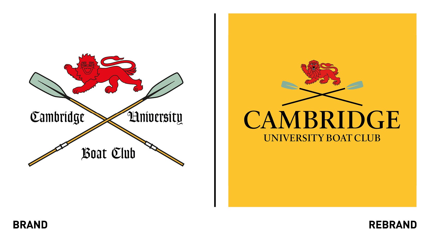
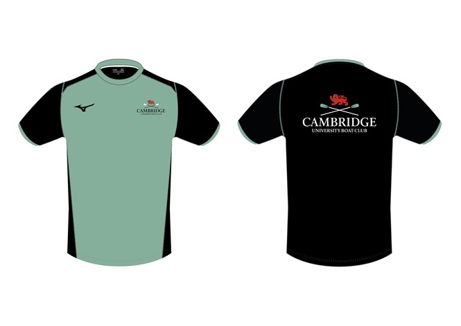
The Club’s new logo aims to convey the right balance between continuity and heritage, while demonstrating that it is a new club, not the same Cambridge University Boat Club of before, despite its name. The central graphic of the logo, the red lion has been retained but redesigned. Similarly, the oars have been refreshed to be bolder and simpler.
“We’ve redrawn the crossed oars and taken the namestyle directly from the University of Cambridge’s logo to emphasise the bond between the University and the Club,” says John Spencer, founder and creative director of Offthetopofmyhead.
The colour palette is centred around the ‘Cambridge Blue,’ black and red, and yellow, the traditional team kit colour of the men’s and women’s reserve crews, Goldie and Blondie.


