Building trade supplier rebrands as part of nationwide expansion
Manchester-based Design and brand agency True North was hired to develop and extend the portfolio of sub-brands owned by building trade supplier TIMCO, as part of the brand’s nationwide expansion and growth strategy.
True North advised the business to focus on revamping and strengthening its main core brand and to use it as a single brand for all its product ranges, rather than developing its many lesser-known sub-brands.
“Although the parent brand was better-known for its core screws and fastenings, our research showed that retailers and end-users would in fact choose a TIMCO-branded product over one carrying its sub-brand,” says Ady Bibby, managing director of True North.
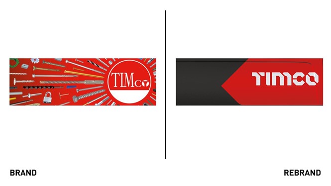
The solution was to transfer all the existing warmth and trustworthiness of the core brand into every TIMCO product at the point of sale. The bold new TIMCO logo is based on a stencil typeface built from modular components that animate in digital applications. True North translated this distinctive style into a display font for use on packaging, brochures and other marketing collateral.
Building on TIMCO's 'toolbox red' as a primary brand colour, True North developed a simple complementary grey and white palette for the range, while retaining a handful of product-specific highlight colours that had traction in their respective markets.
The rebrand influences every touchpoint of the business. Guided by the positioning statement ‘Made for the Trade’, the brand guidelines extend beyond the products themselves, with the aim of giving TIMCO a more compelling, coherent story to pitch to retailers.
The masterbrand-led system enables TIMCO to continue its expansion without diluting the precious brand equity it has built over almost half a century.


