BBC unveils new logos in bid to modernise audience experience
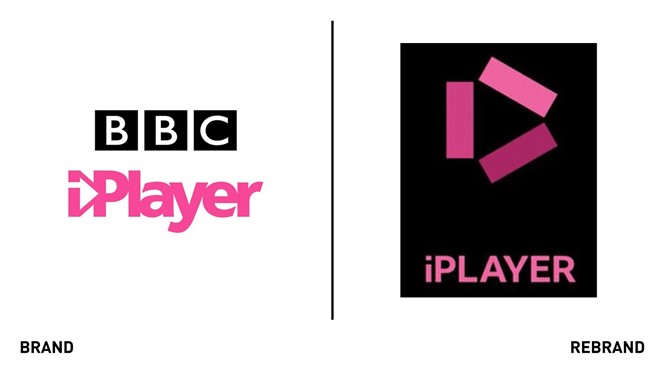
The BBC revealed a logo makeover for a range of its channels, including iPlayer, Sounds, Sport and Weather. The decision to rebrand came after audiences told the corporation its service was ‘old fashioned’ and ‘out of date.’
In the new visual identity, the three blocks within the BBC letters will be wider apart and feature the corporation’s own font, Rieth, named after the BBC’s founder, which will replace the Gill Sans one.
The new look aims to reflect the ‘dramatic’ change BBC past undergone in the past two decades and give the audience the best possible experience across all services, explains Kerris Bright, chief customer officer at the BBC, in a blog post.
The News and Weather logos will have new symbols consisting of three blocks placed at different angles to distinguish its service, with the Weather one resembling a sun. The rebrand also includes an ease in navigation in services like the iPlayer.
"As we update our digital services, it makes sense to modernise how we present them too. Updated, recognisable colours, logos and graphics will identify each service and help improve navigation between them,” Bright says.
The rebrand, which will be introduced gradually, also aims to join the dots between the different BBC channels through simplified layouts and graphics, Bright adds.


