Auckland Opera Studio rebrand to attract younger generation
The Auckland Opera Studio (AOS), a not-for-profit organisation that nurtures and develops young singing talent, worked with design agency Emily Picot Studio to develop a new and more relevant brand that would attract a younger generation of supporters.
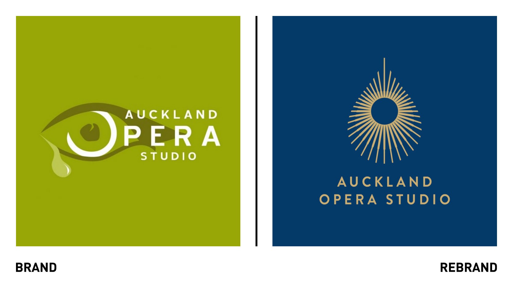
The new brand needed to both evolve the current look while maintaining an aspect of the crying eye symbol, which symbolises a ‘window to the soul.’ Emily Picot Studio developed a stylised teardrop shaped ‘iris’ formed out of a radiating halo of line, as a modern reinterpretation of what had gone before. The halo also represents the nurturing and protective learning environment that is an integral aspect of the studio.
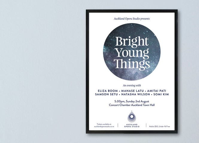
In addition to the new logo, the rebrand also includes a new colour palette of deep blue and gold, and a more sophisticated use of typography, event s tagging and promotional materials.


