#TransformTuesday: 8 December

Here is this week's selection of rebrands from around the world. For more from #TransformTuesday, follow @Transformsays on Twitter.
Adonis
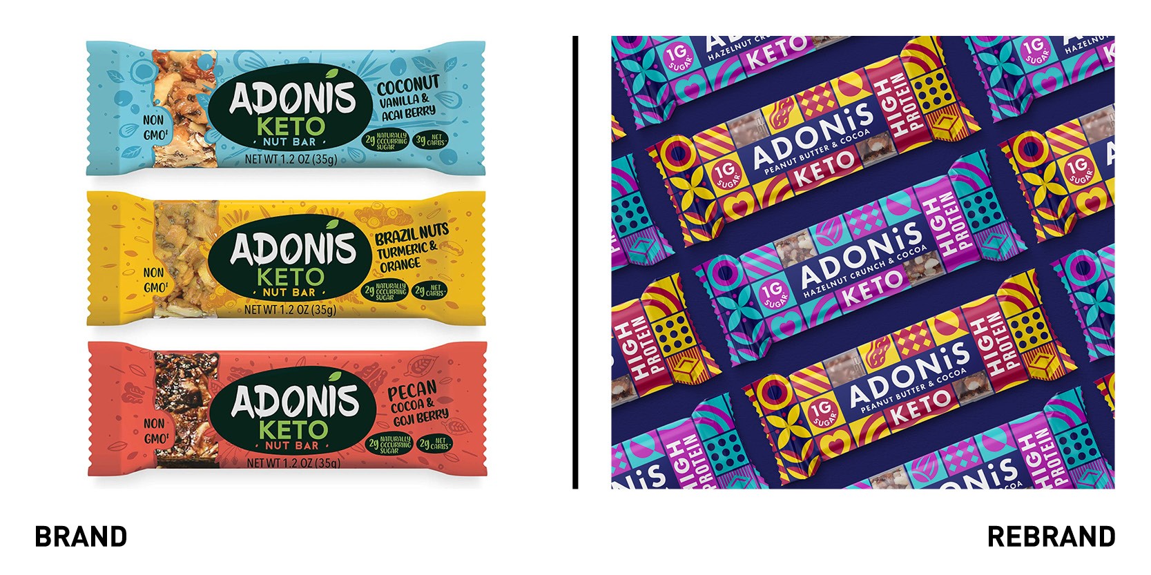
South west branding agency agency the Space Creative worked with keto snacking brand Adonis to overhaul its branding, packaging and messaging and gaining key new retail listings in the process. The Space Creative helped Adonis rationalise their on-pack communication to create a standout brand with a distinct personality and clarity of messaging. The goal was to create a design that had both beauty and purpose in a cluttered and hyper competitive environment, as customers look for products with distinct and clear benefits. The modular system of geometric symbols and illustrations integrate signposts for shoppers to enable them to understand the product immediately on shelf. The grams of sugar, fundamental in a ketogenic diet, and the primary ingredients of the snack bar written in bold, chunky letters are the first things that stand out on the packaging and attract consumer attention.
Civica
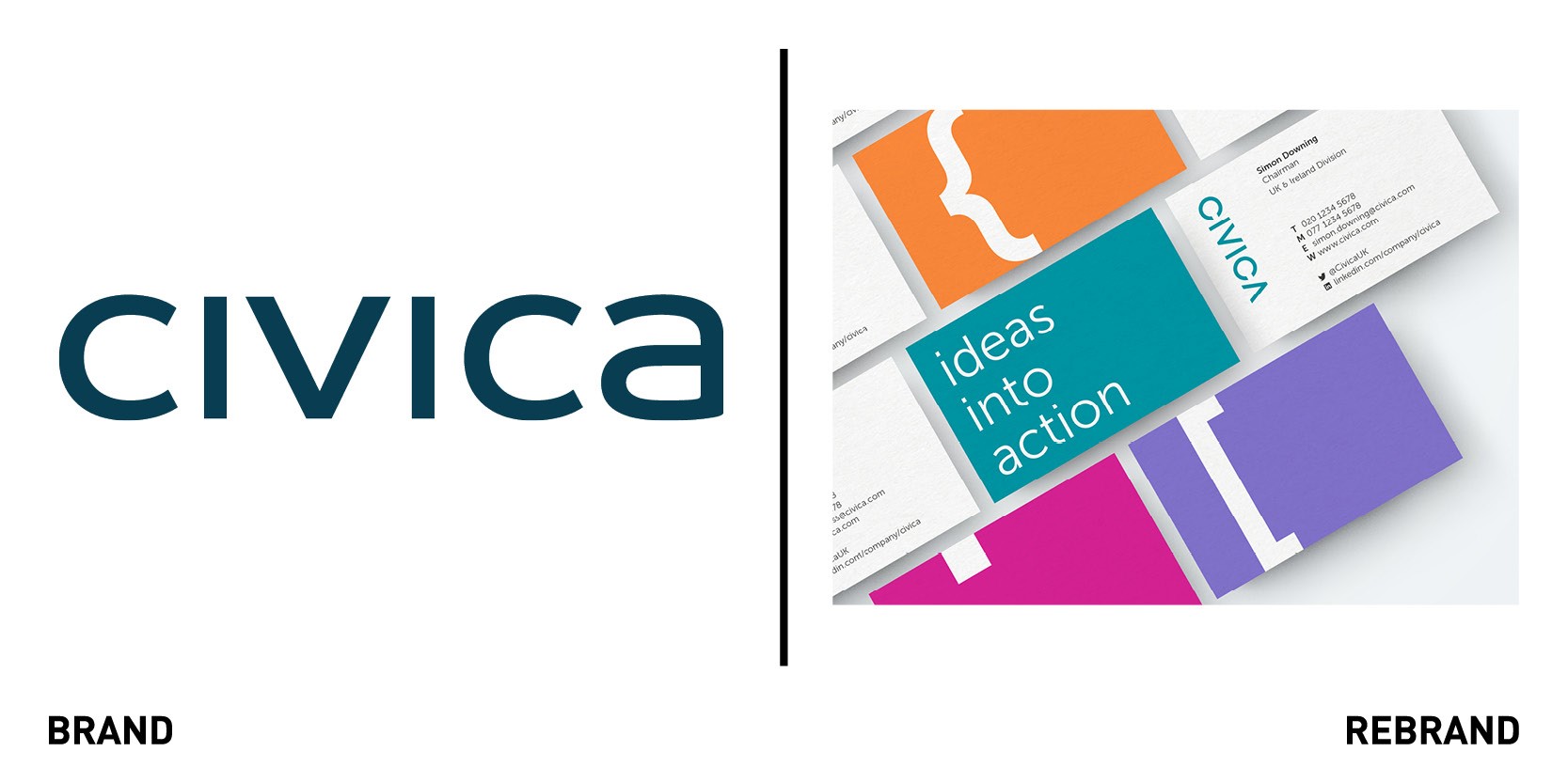
Brand design agency Coley Porter Bell worked with Ogilvy UK to rebrand Civica, one of the global leaders in software for public services. The updated brand positioning highlights how Civica helps public sector organisations through smarter software and helps its customers sustain and enhance vital public services, particularly with the rise of remote working due to Covid-19. Coley Porter Bell modernised the design to better communicate the personality of the business, emphasising the open, dynamic and bright dimensions of the culture and organisation. The new logo design uses upper case typography to appear more symmetrical, while the iconography is written using the language of software to help demonstrate the essence of the brand.
“We wanted our redesign to reflect the strong position and purpose of Civica as an innovative partner for the public sector and our ambition for the future. The teams at Ogilvy and Coley Porter Bell really understood our vision and helped translate that into a modern and appealing brand,” says Tim Magness, chief marketing officer at Civica. Ogilvy recreated the internal messaging and developed a film, complete with original soundtrack in collaboration with the University of Creative Arts, to launch the brand and reinforce the company’s new purpose and vision.
Rowse Honey
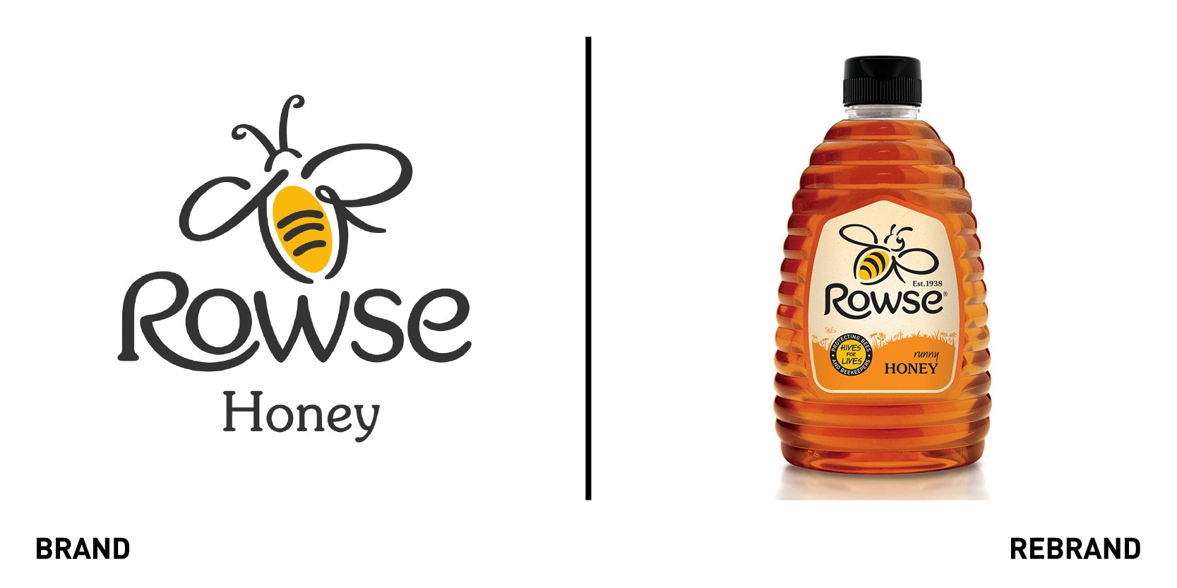
Independent brand design consultancy bluemarlin rebranded Rowse Honey, celebrating the brand’s innate connection to nature and championing its support for honeybees and beekeepers across the UK and beyond. New brand principles defined to guide the creative side discovered a need for people to take a break from the hustle of daily life to enjoy simple pleasures, which helped refocus Rowse’s purpose. The new design elevates brand assets and inspires consumers to connect to nature through honeybees and honey, something which is rooted in the founder’s love for beekeeping. The latter also informs the logo, which was evolved to suggest a bee in flight whilst the silhouette of a field reinforces the brand’s connection to nature. Warm colours are used to help differentiate variants across the range. The circular emblem conveys the commitment to ‘hives for Lives,’ Rowse’s CSR platform. Bluemarlin also produced a brand purpose film and reconfigured the brand’s portfolio architecture.
"Our aim was to encourage people to turn off auto-pilot, not only in shopping for honey, but in life in general, and marvel at the wonderful world around them. The new visual identity tells this moving story with a sense of wonder and a bit of fun, whilst also making consumers aware of the sheer breadth of Rowse's offering,” says David Hodgson, co-founder and executive creative director at bluemarlin.
SingleStore
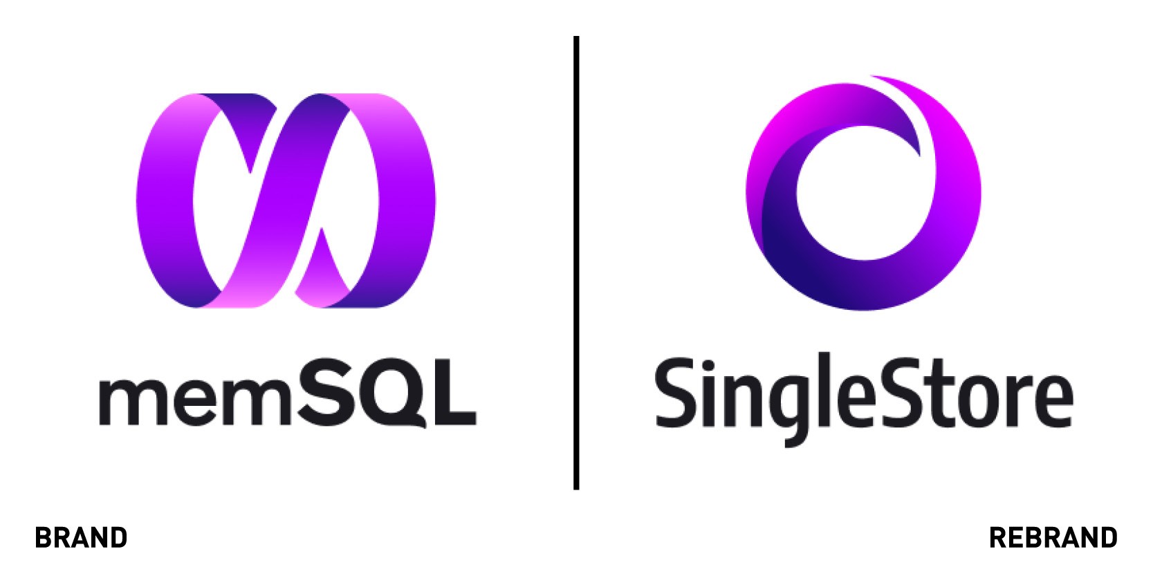
SingleStore, a distributed SQL database management system previously known as MemSQL launched a new brand identity to reflect its growth over the years, and that it offers more than an in-memory database. The change is reflected through the new name SingleStore, which, when surveyed on, tech professionals referred to as a ‘single place to store all your data and find everything in one place.’ The name, encompassing the new brand identity, is modern, innovative, trustworthy and easy to use. The rebrand signals SingleStore’s intent to expand diversity of data types, data models and data access patterns beyond the current multi-model. The logo, which was inspired by the zen symbol ‘Enso’ representing enlightenment and limitless strength, symbolises data rotating around quickly. The colour palette centred around different shades of purple give the brand a modern feel while also differentiating it against competitors’ colours like Oracle’s red and Microsoft’s blue. With the recent rebranding announcement also comes a preview of the expanded vision of the product, which will provide access to data located anywhere, even beyond SingleStore.


