#TransformTuesday: 28 July

Here is this week's selection of rebrands from around the world. For more from #TransformTuesday, follow @Transformsays on Twitter.
Go1
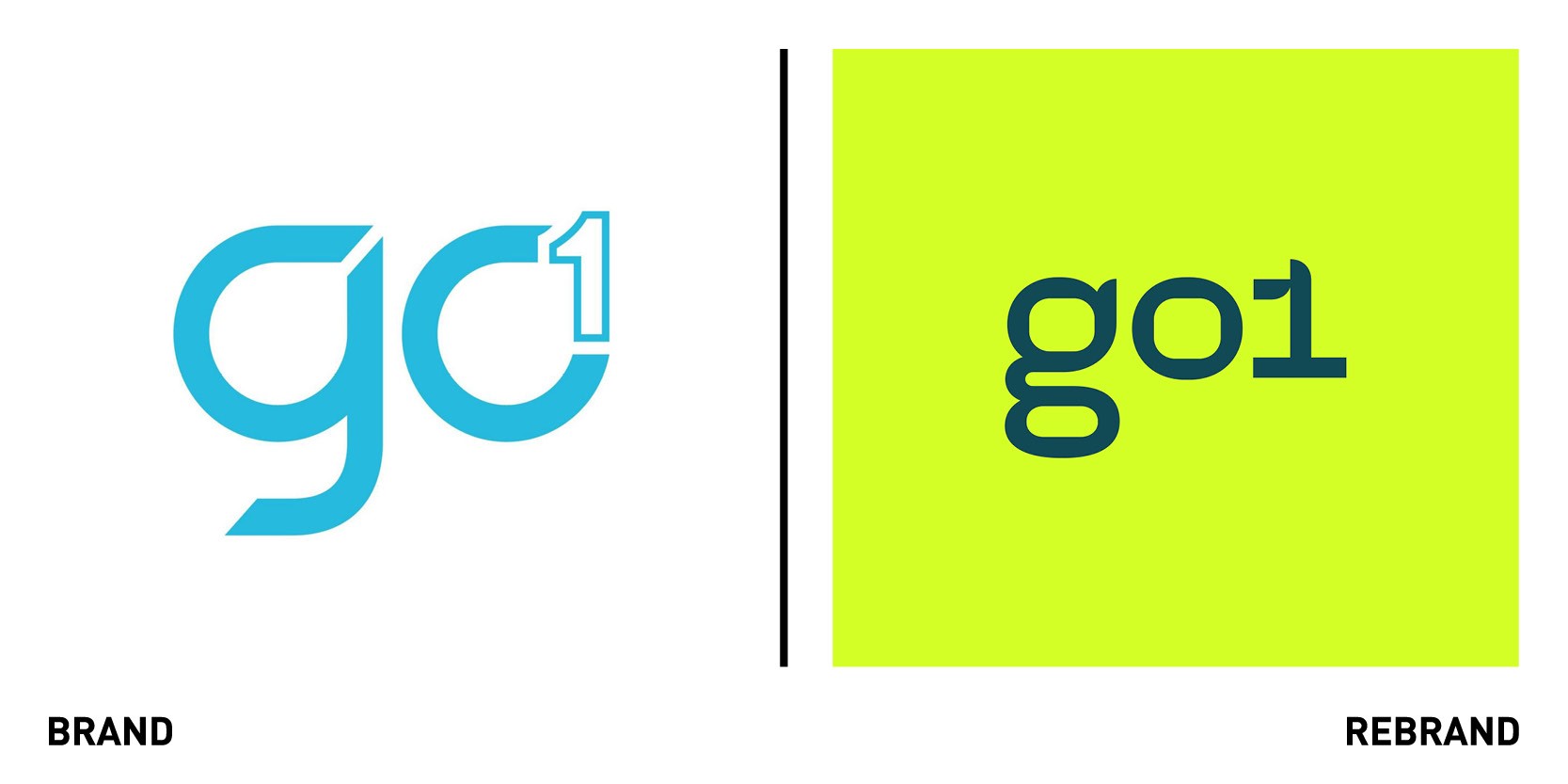
DesignStudio Sydney worked with Microsoft backed EdTech business ‘Go1’ to create a new brand strategy and identity. Constantly evolving since their 2015 launch, Go1 needed to redefine its brand strategy to better reflect the business they’d become, which spoke to the difference they make to teams and business globally. Understanding the brand’s mission of transforming professional learning into something more relevant and effective, DesignStudio developed the proposition ‘Learn Athletic:’ a call to arms to make learning a part of the everyday routine, helping individuals, teams and business stay fit for the future. The brand sought to get away from the idea of corporate learning, often associate with bland conferences, and rather develop a visual system as unique sa Go1, which sp0oke to the energy and potential learning can offer. To reflect this, Go1’s new identity was built around a dynamic system, connecting blocks of communication mirroring how Go1 connects content to teams and users. The new logo is clean, modern and injects personality into a short set of letters. DesignStudio Sydney collaborated with illustrator Camilo Huinca to commission a suite of illustrations which show the human side of the brand and the people at the heart of the experience
“As we’ve grown from four co-founders to a team of over two hundred people, there’s not previously been a real chance to pause and consolidate how we describe what we do in a really intentional manner. The rebrand has helped tie a clear thread from our strategy through to how we deliver on our mission to unlock positive potential through learning for all of our customers,” says Andrew Barnes, CEO and co-founder of Go1.
“Go1 needed a brand with personality and energy which would give them the purpose and tools to equip for their next stage of growth globally. We drew upon Go1’s ambition and drive to help shape teams and businesses to be future ready and flexible to build a brand with movement and personality at its core. Partnering with Camilo Huinca, we’ve brought their offer to life in playful and unexpected ways. Having worked closely with the Go1, they now have everything they need to globally grow the product and brand with personality and energy,” adds James Gilmore, creative director at DesignStudio Sydney.
Material+
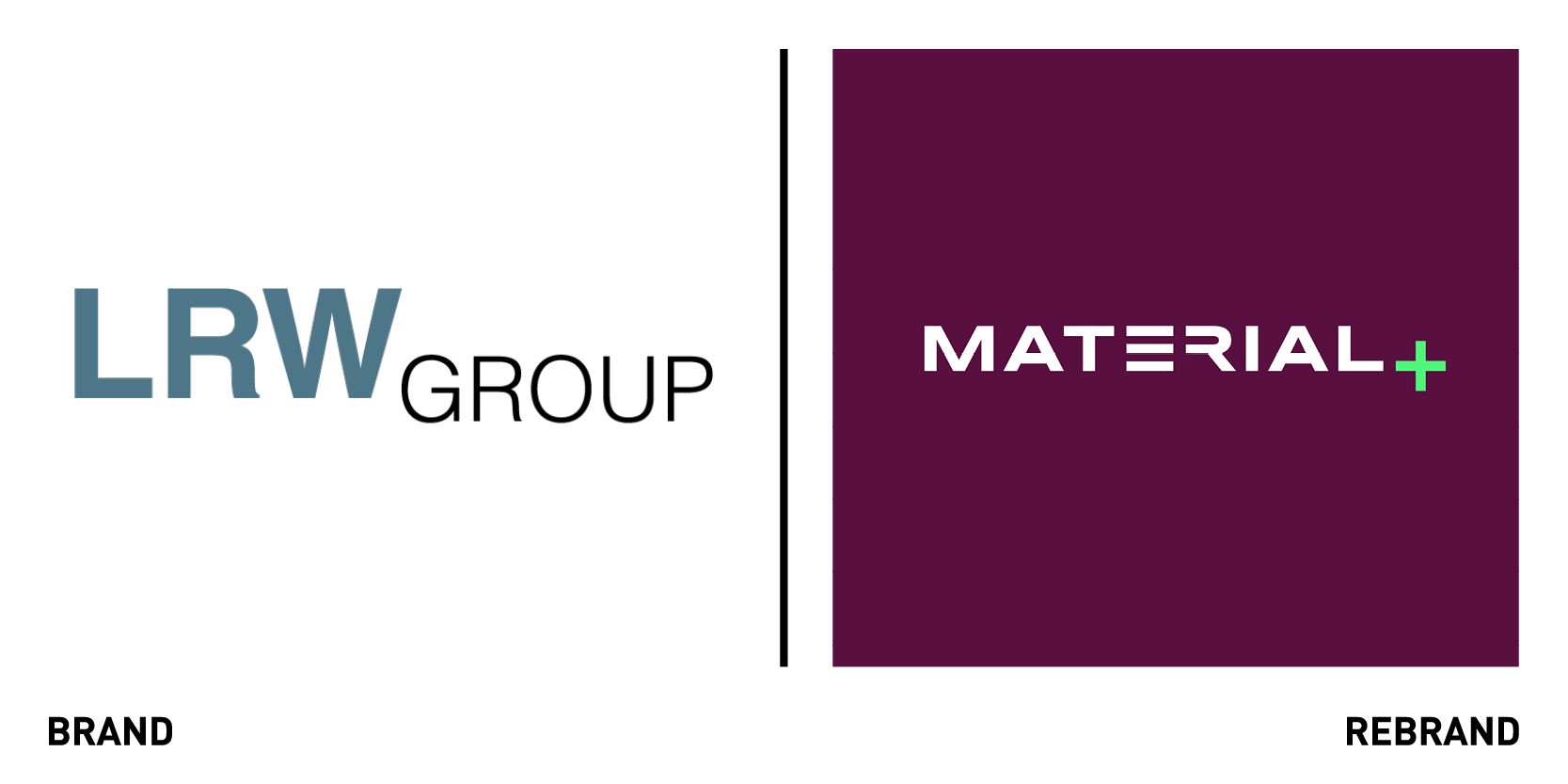
New York-based creative transformation consultancy co: collective worked with Los Angeles-based marketing services consultancy Lieberman Research West (LRW) to rebrand it as Material. After acquiring nine agencies in four years LRW Group decided to bring together its collection of agencies under one brand and name, Material, which was chose for its layered meaning, signifying something of importance and material as prime foundation from which things are made. Co:collective collaborated with more than 30 top-level stakeholders to unite the company under a new unifying purpose, design its new offering and create a new visual identity.
“Our mission was to deeply understand each agency individually: their story, what makes them unique, and what they're exceptional at. This meant speaking with dozens of team members, and even current and former clients (...) We found that what united these companies was their relentless pursuit of new true human understanding - a layer of intelligence much richer than data and even insight - in order to help brands deliver for them,” explains Jamie Hall, client engagement lead at co:collective
“In creating the wordmark we wanted to strip the letterforms down to their raw material leaving only what was necessary to read the word as the sum of these parts,” says creative lead at co:collective Courtney Bowditch.
Material has three distinct areas of expertise – Material Analytics, Material Intelligence and Material Experience.
Banijay
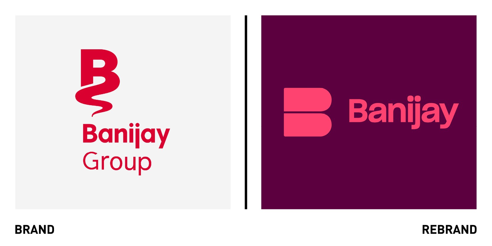
The world’s largest international content producer, Banijay, worked with independent global creative agency Moving Brands to unveil a new identity and website, following the significant acquisition of Endemol Shine Group. The new identity has been developed to reflect Banijay’s unique position post-acquisition; its high quality of production combined with its entrepreneurial, start-up spirit. Its new purpose was defined as ‘story making set free,’ which came to define the new brand, acknowledging that the collective success of it has been driven by exceptional stories from each company within the business. The ‘B’ monogram, combined with the celebration of the collective success, was used throughout the creative as a portal from which its audience could explore different labels and content which Banijay produces. Motion is the core essence of the new brand, as it reflects the idea of cross-genre programming and movement within the company’s identity.
“As Banijay had always prioritised supporting the creativity of its individual group companies - the Group identity had historically not been given much attention. The acquisition of Endemol Shine created a perfect opportunity to do this, and we are so pleased to have played a part in the next phase of their business,” says Jon Hewitt, creative director of Moving Brands.
King Arthur Baking Company
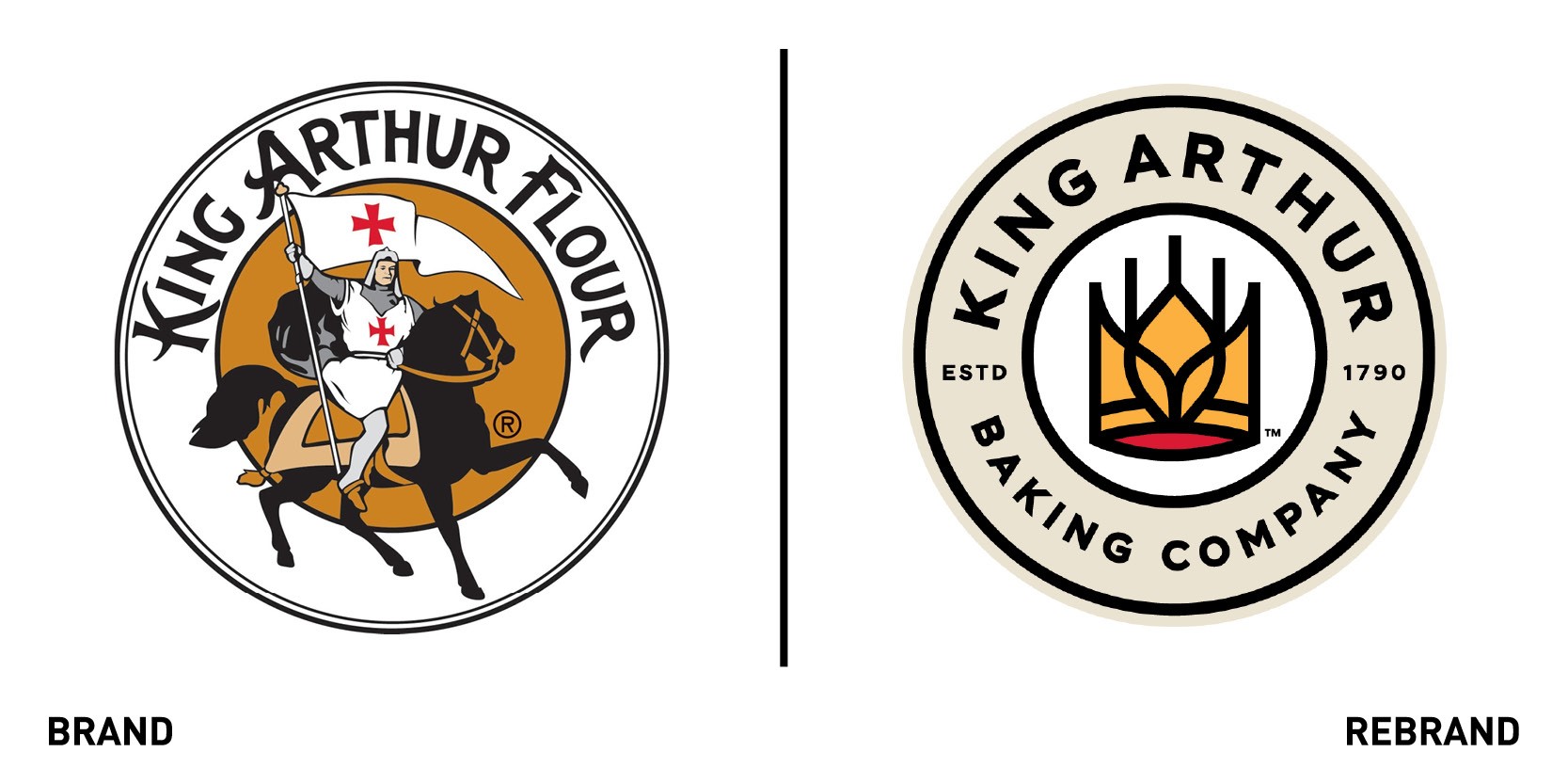
American supplier of flour, ingredients, cookbooks and baked goods The King Arthur Flour Company rebranded to become The King Arthur Baking Company. Minneapolis-based design studio Little worked on the new brand identity. The company assures that although the name has changed, the mission and commitment to spreading the joy of baking has not. The new name, however, encompasses all aspects of the brand, which has always been a baking one; in 1990 their Baker’s Catalogue included not only flour but also whisks and bowls. The brand quickly developed in providing tools like digital thermometers, to vanilla extract to different types of flours for specific baking, such as one for the baguette, and, later, a baking school. The rebrand is a way to spread its joy of baking through more avenues, including new upcoming products like a keto flour blend.
Regent's Place
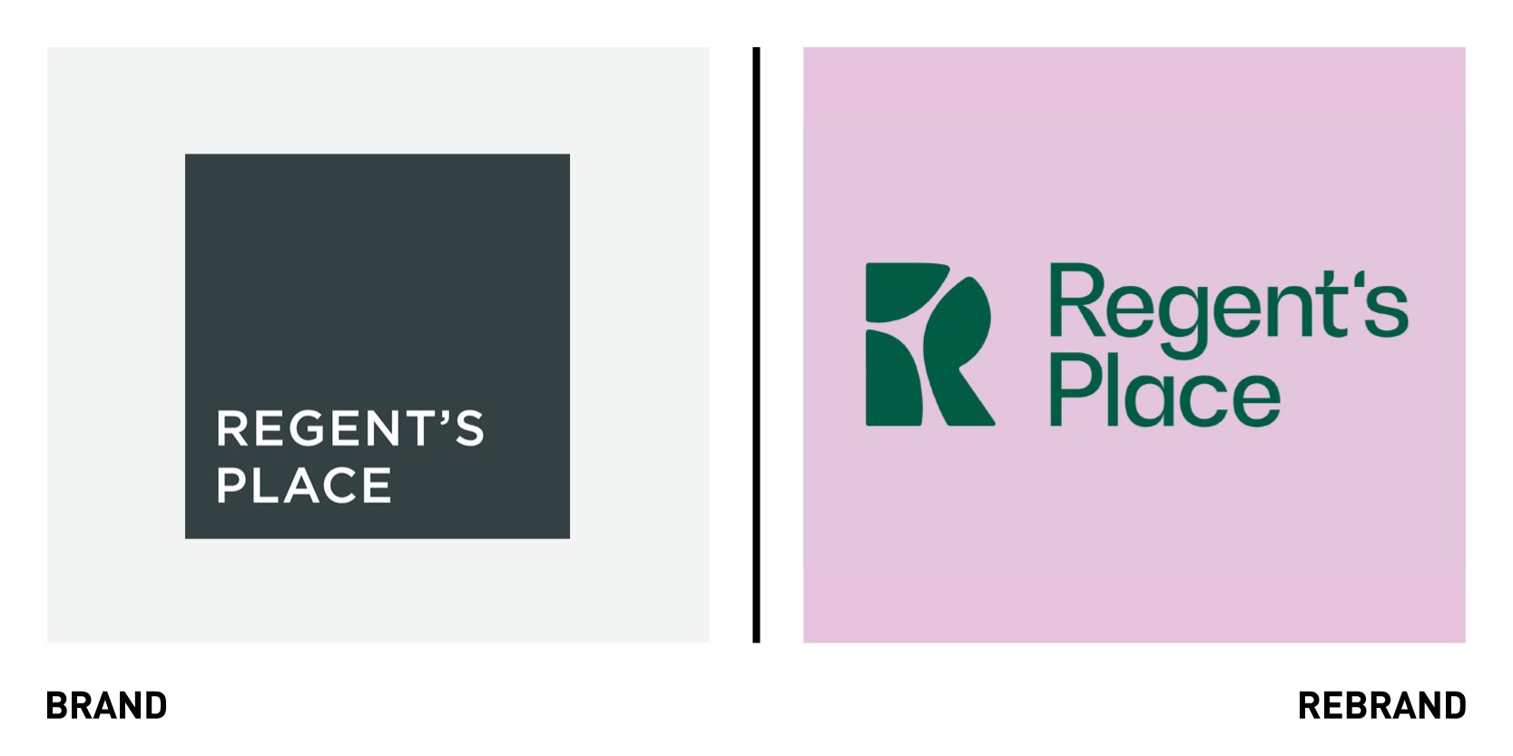
London-based brand and design consultancy DixonBaxi partnered with British Land to create a new brand identity for Regent’s Place, a pioneering destination in the heart of London where people and planet thrive. To define the authentic spirit of Regent’s Place, DixonBaxi embarked on a 10-week insight journey, where it engaged over 40 people across the business, gathered inputs from London’s Knowledge Quarter, key industry and local community leaders in an effort to create something more inclusive and people-focused. The olds brand’s corporate and functional look didn’t reflect Regent’s Place local heritage of progressiveness which led the agency to embrace the ethos of ‘responsible urbanism,’ positioning the Regent’s Place as a pioneering destination where people and planet rise. The logo was inspired by Regent’s Place at the intersection of three iconic districts: Knowledge Quarter, Camden and the West End. The three boroughs combine to make the ‘R’ symbol, which is created to be transparent and almost disappear, and used as a window to Regent’s Place and the community. Nature influences ever aspect of the design, from the organic lines to the natural colours, which allow fore a calming experience.
All brand choices promote ecological integrity, engagement and inclusive participation, including air purifying paint and signage totem from reclaimed wood around campus around the campus, and bamboo cut out business cards.
“The new Regent’s Place brand represents a significant transformation: a shift towards something more inclusive, responsible and human. A renewed, assured brand that speaks clearly and confidently in every context,” says Aporva Baxi, co-founder of DixonBaxi.


