#TransformTuesday: 21 July

Here is this week's selection of rebrands from around the world. For more from #TransformTuesday, follow @Transformsays on Twitter.
KSI
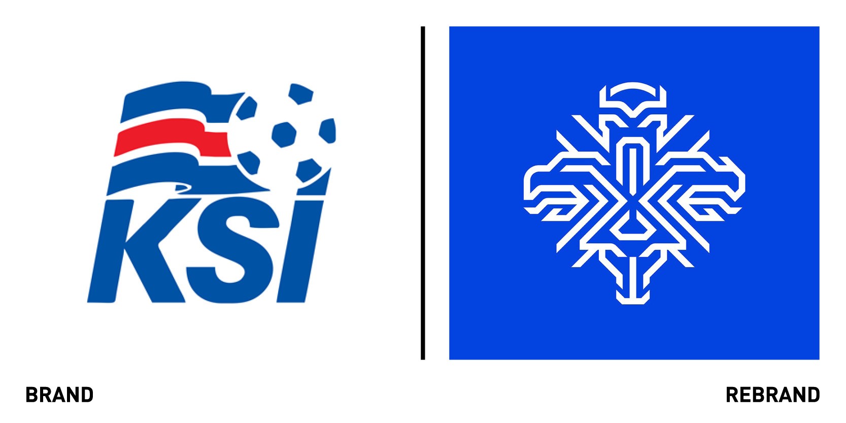
Iceland’s national football team association, KSI, worked with Icelandic creative agency Brandenburg to create a new visual identity that would celebrate team’s growing international recognition. The old logo, which was composed by the KSI, a ball and Icelandic flag, was used for both the association and the national team. However, as the association developed and the team’s achievements grew, it was hard for this one logo fulfill both roles and it became necessary to create one logo that that better encompassed the fundamental values of the team spirit. This became a symbol of unity, drawing on the strengths, history and fighting spirit. The guardian spirits in the new logo, a dragon, an eagle, a bull and a giant, protectors of Iceland since 1918, represent solidarity, strength, resolution and perseverance. The new visual identity is inspired by the country’s heritage and formative history, which interweaves Iceland’s guardian spirits in a modern way. Although it is founded on the previous coat of arms it stands alone as a distinctive symbol of Iceland’s national team. A bespoke typeface with unique lower-case letters, which draws inspiration from Icelandic crafts, was developed to strengthen the trademark.
Amstel
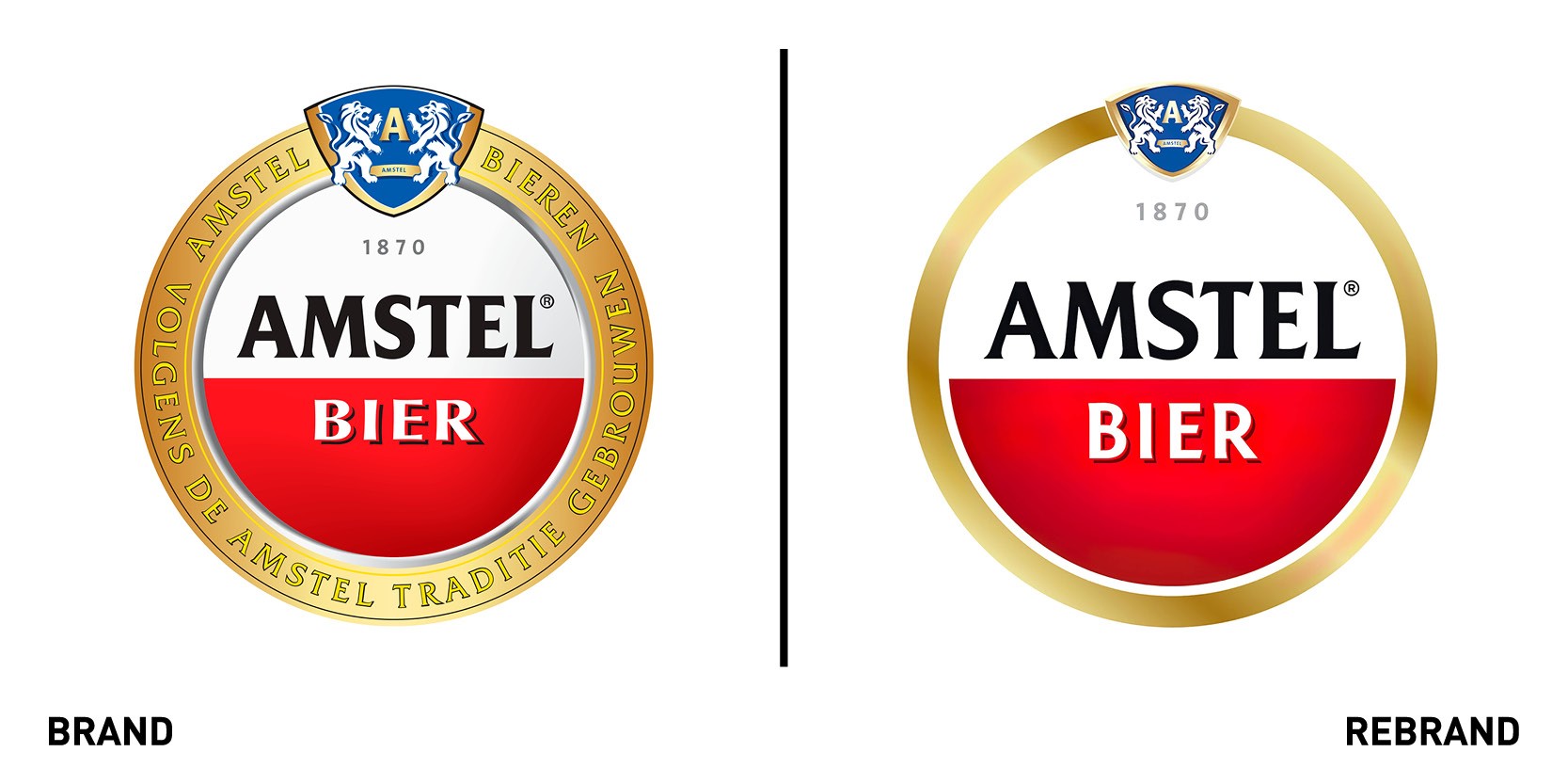
Strategic design consultancy Elmwood unveiled a new brand identity for Amsterdam-founded beer Amstel. The new design builds on the brand’s position as the world’s local beer, striking the balance between its global assets and its flexibility to fit the needs of 115 local markets. The requirements of different expressions of the brand to align with local needs resulted in a lack of global coherence in visual identity that devalued the brand. To help create a cohesive brand strategy, Elmwood London worked with Amstel to create the ‘I am Iconic’ platform: a global strategic framework with multiple iconic assets available for local markets to choose from in creating their own expressions of the Amstel identity. The consultancy focused on the brand’s iconic logo, a circle with a red and white split, and dialed up the shape and colour both on and off pack and then developed two master logo options to choose from. To enhance the local aspect of the brand, three credential stories were built: ‘Born from better beer,’ ‘Born in Amsterdam’ and ‘Born from Friendship.’ These were accompanied by a series of illustrations that celebrate the brewing process, the bridge on the Amstel river and the founders’ signatures to symbolise the respective stories.
“The new visual identity system developed by Elmwood London changed the game for Amstel. The combination of truly strong contemporary design assets and the ability to use them flexibly on and off-pack made local markets from all over the world enthusiastic. The system sells itself!” says Hike van Lieshout, global visual identity lead at Amstel.
Following the global Amstel rebrand, the brand chose to redesign its UK market, creating an identity that tells a clear story of togetherness. The assets were extended and elevated to work for both primary and secondary packaging
Cadbury Old Gold
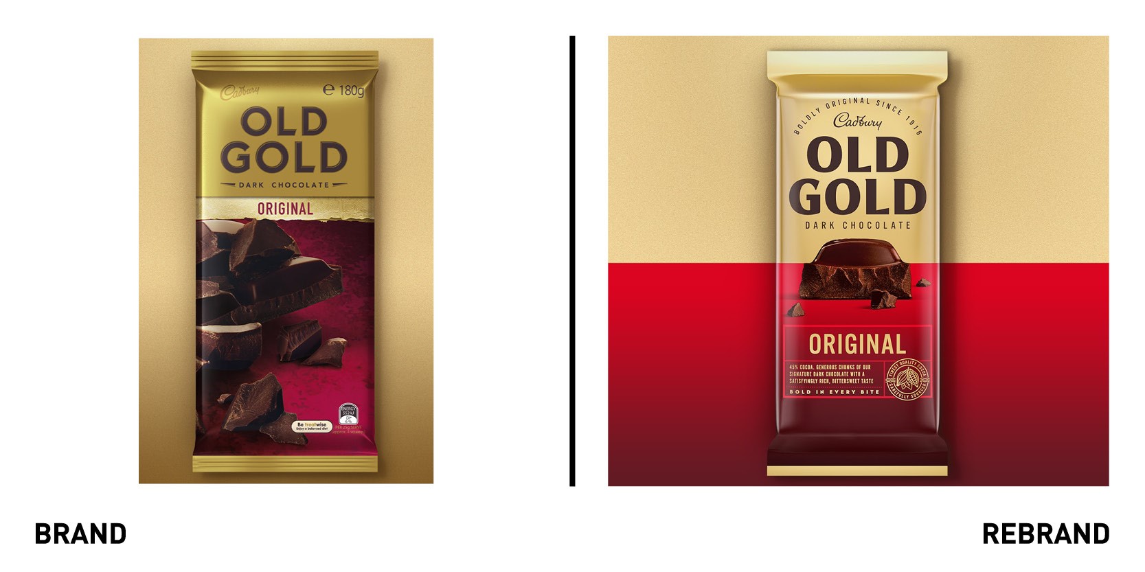
Mondelez International, one of the world’s largest snack companies, worked with global design agency Bulletproof to revitalize the Cadbury Old Gold brand identity to regain its iconic status, reconnect with it audience and gain relevance with younger generations. What was once an Australian classic, was failing to stand out amongst the dark chocolate category, which the younger generation now usually goes for and is more new and refined.
“We found our sweet spot in the positioning ‘Bold In Every Bite’, which celebrates the brand’s iconic chunk by placing it front and centre on pack and showing the abundance of ingredients in every piece. Shot-in house, we got up close and personal with each variant to find the perfect chunk,” says Nick Rees, global creative director at Bulletproof.
The new, hand drawn brand marque gives off clean and modern craft cues, making the new but without loosing sight of the original Old Gold that was known and loved. Therefore, the brand didn’t loose its gold, but rather was injected with a boldness to modernise and elevate it, delivering standout in store and attracting consumers’ attention.
“We added a touch of craft with a stamp and label system for the flavour descriptions. The gold stamp dials up the craft and heritage, driving home the cocoa credibility,” adds Rees. The rebrand also includes the addition of two new variants, caramel and cherry ripe, besides its five core flavors.
“Aussies and Kiwis have been enjoying Cadbury for more than 100 years, so we recognise the value of an amazing heritage brand like Old Gold. During these challenging times, people are turning to familiar brands they trust, so it was important to modernise Old Gold in a way that was true to the core characteristics of the brand,” says marketing director for Cadbury, Paul Chatfield.
Diaverum
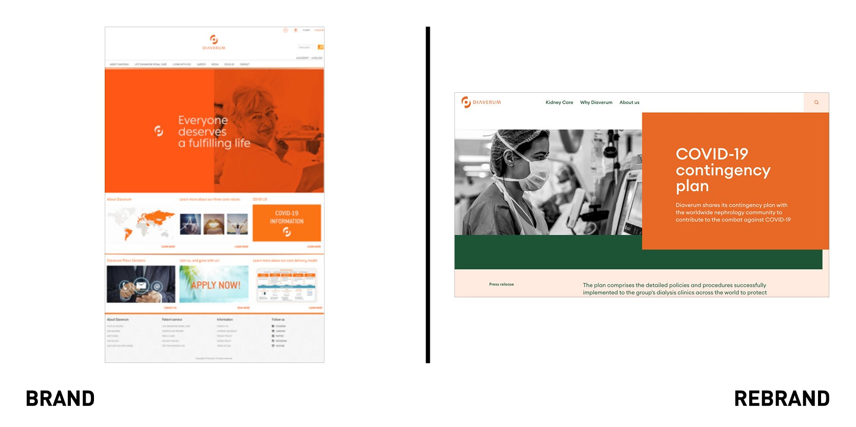
International renal care Diaverum partnered with with UK creative corporate communications agency MerchantCantos to create develop a digital transformation that would deliver a more seamless digital experience that would unite its clinics around the world. MerchantCantos worked on refreshing the visual identity to communicate their purpose and reveal an innovative, flexible business tailored to the customers ever-changing needs. The patient focused design, which combines a revived colour palette of greens and oranges with a modern font, has a warm and human tone that attracts patients, making them feel welcome.
‘‘Our bold new design puts people at the heart of Diaverum’s brand and represents the first of many exciting digital innovations to come,” says James McCobb, partner, digital, at MerchantCantos. Diaverum’s new website is organized around a global, modular and fully responsive design system that offers tailored content, providing a sense of unity to their 400+ clinics in Africa, Asia, Europe and Latina America.
“We are very proud of our new website, which is a true reflection of our patient-centred approach and our values, in digital form,” says CEO at Diaverum, Dimitris Moulavasilis. The new identity, which evokes compassion, emotion and a sense of care, reflects the focus of the project: empowering patients and elevating their voices within the industry.
Curry's PC World
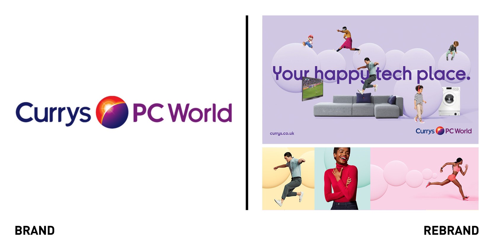
British electrical retailer Currys PC World collaborated with global creative agency FutureBrand to refresh its visual identity, rendering it bright and optimistic to reflect the company’s passion in helping everyone enjoy technology, and its core values of being modern, witty, and a smart cookie. The agency was inspired by the iconic globe in Curry PC World’s logo, which will remain the same, to develop a new ‘bright world’ for the brand. This entails a bold visual identity centered around colorful spheres and circles that express a sense of openness, optimism and an excitement about life and technology. The circular motif is found in all assets, including the new iconography, animation guidelines, photography, website and bespoke typeface, Currys Sans, created in collaboration with Colophon Foundry. At the core of the identity is a new strong and powerful purple while a complementary palette of pink, yellow, green and purple brings the ‘bright world’ to life.
"Currys PC World had accumulated a number of different legacy assets which had led to an inconsistent use of colours and visual language across different stores. Our challenge was to move Currys PC World away from its existing assets to a new visual identity which will consistently communicate the brand’s unique personality and consumer offer across all physical and digital touch-points,” says account director at FutureBrand Katie Revell.
FutureBrand has also developed an online guidance tool known as the Brand Hub, which includes all brand principles, assets and guidance in one place, allowing everyone to have the most up-to-date information.
“The bright world FutureBrand has created for us couldn’t have come at a better time as innovations such as ShopLive, where customers can speak to an in-store expert from the comfort of their own home, launches online and we welcome customers into our stores again,” adds Dan Rubel, customer communications and brand director at Currys PC World.
Playlister
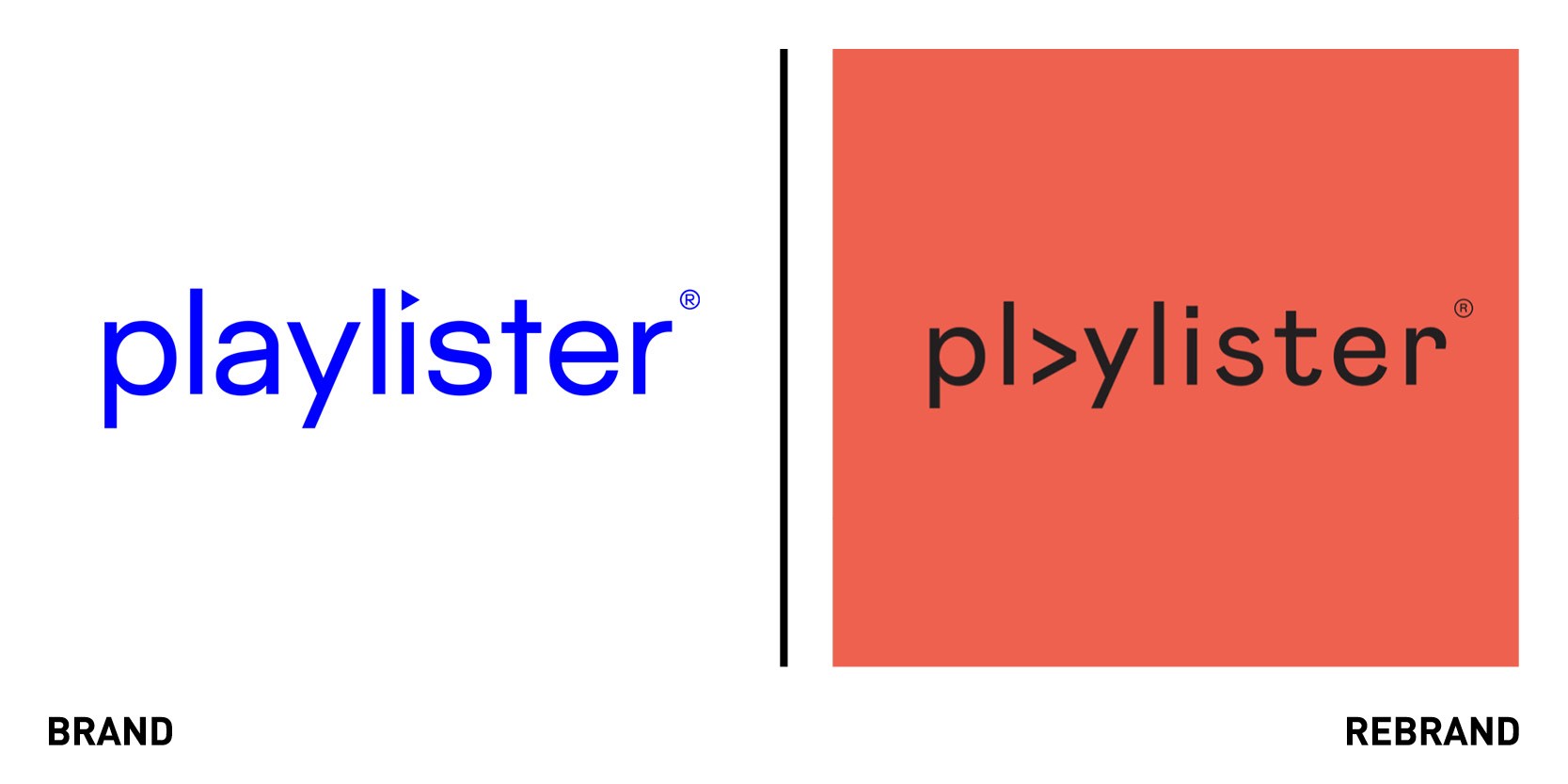
Playlister, which creates audio identities for the hospitality and fashion brands, worked with London-based design agency Studio Output to create a new visual identity that would reflect the layered, textural and hand-crafted nature of the service. The old identity was more aligned to a tech platform than a team of specialist tastemakers. Studio Output refreshed the previous logo mark, adding an understated colour palette, centered around pink, and a funky typography system. The new identity also includes a set of custom patterns and textures which, combined with the Playlister identity, can communicate different moods and styles across the website, proposal documents and social content, allowing so each execution would feel unique, while being held together by a consistent brand framework. The rebrands flexibility makes sure the assets can be used across different touchpoints and that it can be rolled out by the team with a simple set of guidelines and templates.Through the redesign, the company’s identity will now represent the craft and attention that goes into each Playlister project.


