#TransformTuesday: 17 November

Here is this week's selection of rebrands from around the world. For more from #TransformTuesday, follow @Transformsays on Twitter.
Clarkmcdowall
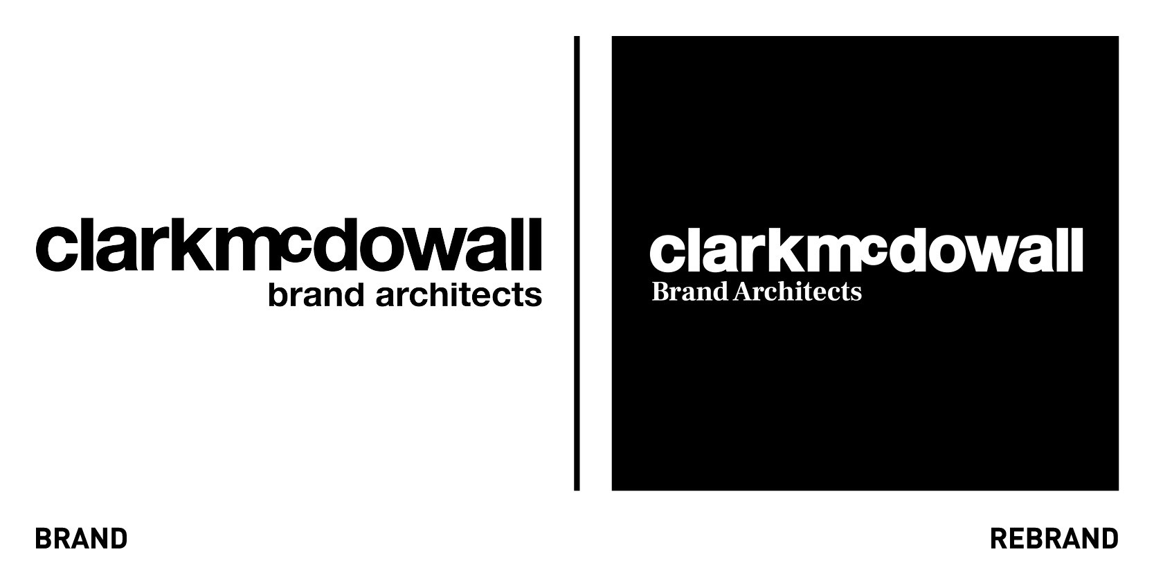
NYC branding agency Clarkmcdowall has rebranded and relaunched as the agency of the future. The aim of the new visual identity was to embody the core characteristics that make the agency unique: intelligence and imagination. The rebranded sought to bring together creative execution and strategy and by doing so, each could draw the best out of the other. The new visual identity also includes a new brand symbol, an organic riff on a classic shape reminiscent of a ball of clay that’s shaped by all who touch it, reflecting the agency’s process of approaching complex problems and inspire evolution. The rebrand was inspired by the people behind the brand and their roots in New York’s east village and by the hospitality industry in how to incorporate thoughtfulness into every detail.
Monash IVF
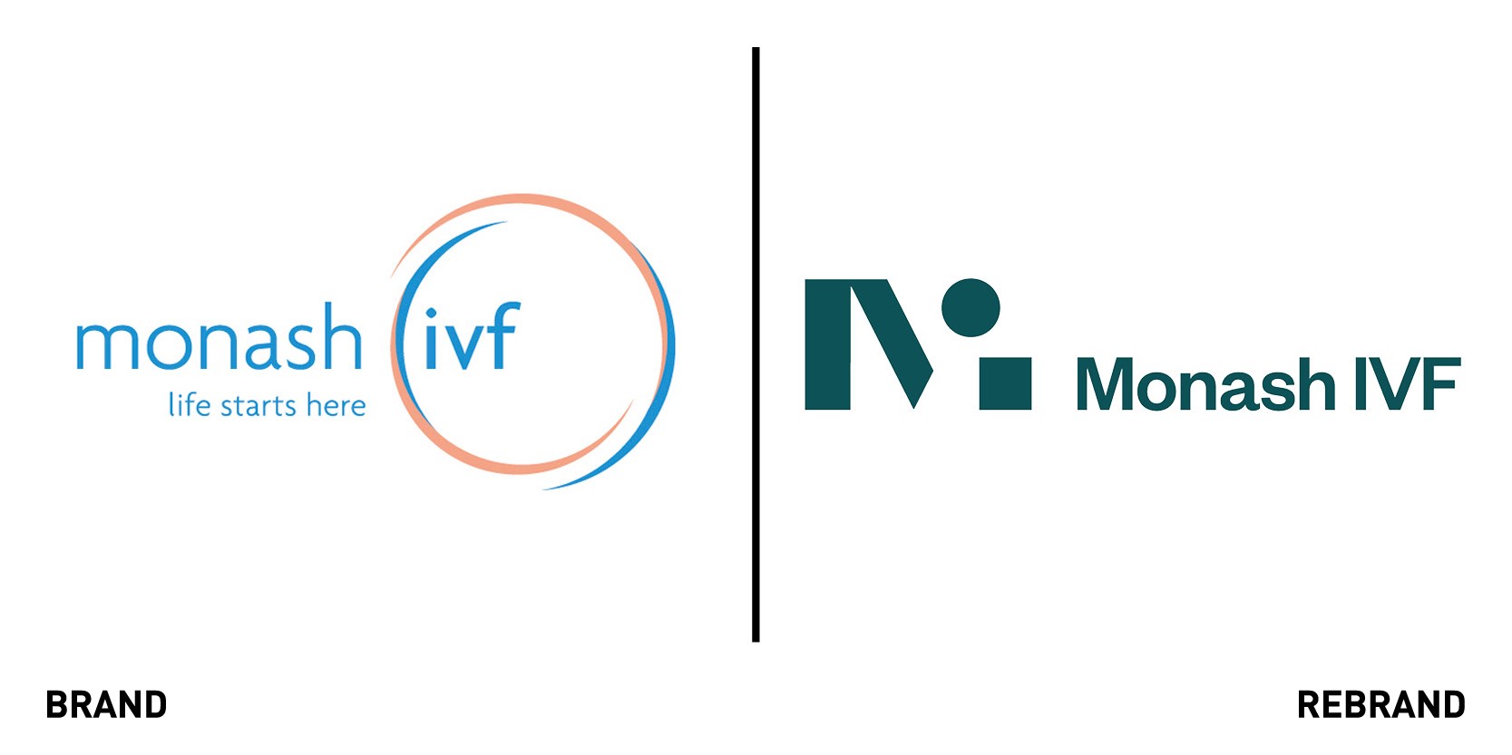
Monash IVF, pioneers of in vitro fertilisation in Australia, worked with design agency The Contenders to launch a rebrand that would create a more inclusive identity and reflect the changing assumptions about the role of reproduction (LGBTQ+ couples and singles) while maintaining the scientific credibility it has built over decades. The rebrand builds on its heritage as the pioneer of IVF treatment to tell a clear story about the role Monash IVF plays in shaping bold future of reproductive health. The brand architecture was consolidated to create a single-minded approach to communicating the brand. The new logo proudly displays a leading letter ‘M’ made of various shapes, which are representative of the different individuals Monash IF helps on their journey through reproductive health. Overall, the new brand identity combines scientific expertise with empathy and care.
Our new brand strategy hits the mark on all our requirements; it will differentiate us from our competitors, brings forward our pioneering legacy in a contemporary way, provides opportunity for diversification, and importantly, positions our business for further growth,” says chief marketing officer of Monash IVF.
Real Kombucha
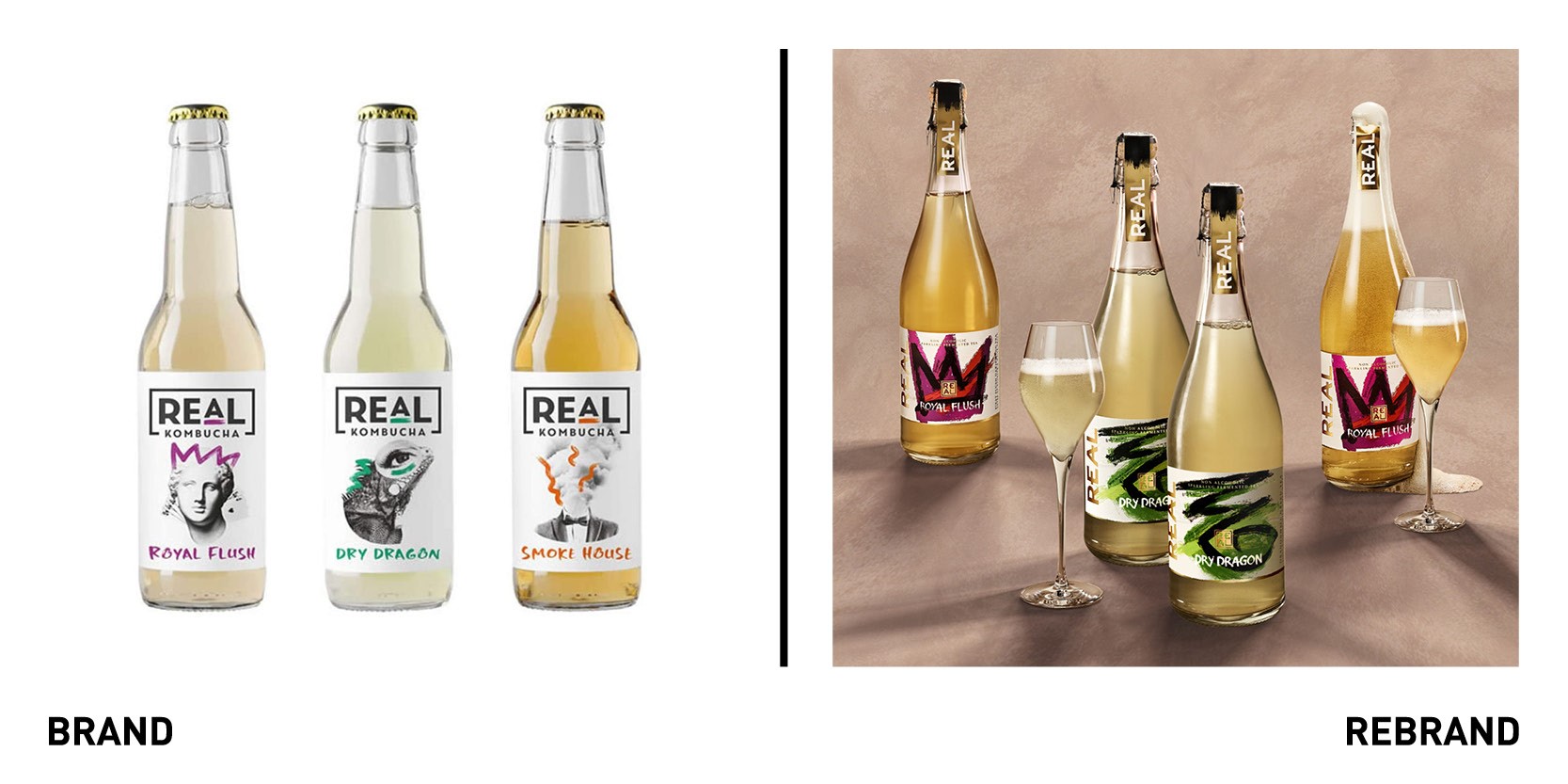
Real sparkling fermented tea worked with design agency Butterfly Cannon to launch a rebrand that would reflect the incremental growth the brand witnessed since its foundation in 2017. While the previous design had worked well for the start-up phase, it did not exemplify the level of sophistication of the 60+ Michelin star restaurants in which it now stocks. The aim of the rebrand was to balance the radical and disruptive nature of the brand with the refinement of its carefully crafted products. The design needed to be adaptable across the Real range, working in harmony with the newly introduced full-size Champagne bottle and in a more leading role with the smaller single-serve format. The core of the brand became progressive contemporary street art, inspired by founder David Begg’s love of art. The bottle labels became canvases, with each variant’s name and character articulated by a single stroke icon, such as the crown for Royal Flush. The packaging represented the bold, expressive and pioneering attitude of the brand that goes into making the sparkling fermented teas themselves. The new company logo is inspired by Japanese Inkans and Chinese Chops; artistic signature seals that pay respect to the origin of some of its teas and the individualist nature of the brand.
Riverside Studios
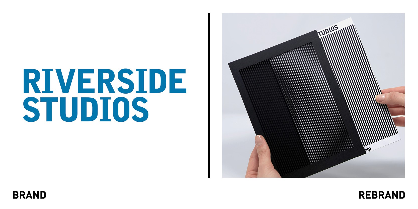
Global branding agency Superunion worked with art destination Riverside Studios in Hammersmith, London, to create a new and bold brand identity able to keep up with the experience of modern Londoners and the innovative fabric of the city. The new brand captures the Riverside iconic heritage for a new generation, by defining the idea for the brand as a place where creativity flows and there is a free-flowing confluence of arts and entertainment; a place that brings culture and communities together. The identity pays homage to Riverside's TV heritage and the flowing movement of the river, with a series of moiré patterns, reminiscent of the visual effect of television screens, created from two sets of vertical lines overlapping to create a distinctive effect. The brand is intentionally pared black, in black and white, with colour coming from the rich and diverse content of the studios. The patterns feature typography and are animated for the Riverside Studios’ cinema screen, designed to frame the diversity of content showcased on the screens. Even printed and environment communications are animated, for example, the patrons' members card comes in an acetate slipcase and as the card is pulled out from the case, the two sets of lines pass over each other to create the moiré effect.
Severstal
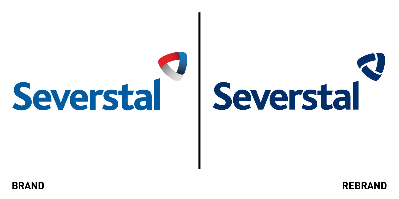
Global design agency Landor & Fitch worked with PAO Severstal, one of Russia’s largest metallurgical companies to launch a rebrand that presents the company as progressive and customer-centric to reflect its new business strategy. The agency updated the brand platform to bring it in line with the company’s goals and initiatives, created a design system and new visual assets that convey the value and character of the company and moved from branding of the company’s individual business divisions to branding its solutions, and products. The brand’s existing slogan ‘Achieve more together’ and its core idea have been giving new meaning, with the word ‘together’ now reflecting the inclusion not only of the company’s employees but also of its customers and partners. This is reflected in the brand’s mission of always supporting customers’ success and opening up to new opportunities. The mission statement encompasses the idea of customer-centricity, continuous development and the company’s desire to become the leader of the steel industry in the future. The existing Severstal logo has been simplified for ease of use and adapted to the digital environment.


