#TransformTuesday: 10 November

Here is this week's selection of rebrands from around the world. For more from #TransformTuesday, follow @Transformsays on Twitter.
Boke
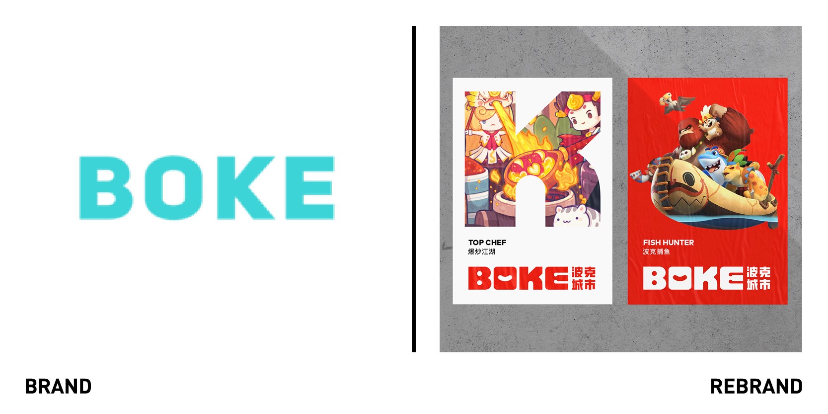
Global branding agency JWDK rebranded one of China’s leading developer of online games Boke. After ten years of increasing growth, Boke identified the need to uplift their corporate brand to an international level and to elevate its reputation within the saturated online gamin market. JWDK repositioned Boke as a ‘house of brands’ launching a new identity design that is both a mature gaming company yet still evokes a sense of warmth, fun and joy. The logo includes hand-crafted block letters ‘Boke’ along with the Chinese name 波克城市 (Boke City which derives from their first successful game “Poker City”). The rounded letter-forms are crafted into a simple block grid allowing each letter to shuffle into a different alignment for alternative logo formats. The negative shapes in the logo also hint to the gaming experience. The dots in the ‘B’ are like wide open eyes; the ‘O’ features a happy smile, and the ‘E’ reveals a pair of arms holding a mobile gaming device. The logo is bilingual to internationalise the brand whilst also connecting BOKE to its Chinese roots.The new, bold slogan ‘Be Wild, Be Free,’ is designed to encourage players to deliberate themselves from the boredom of reality and encourage staff to push themselves beyond their creative limits.
Crisp 'n Dry
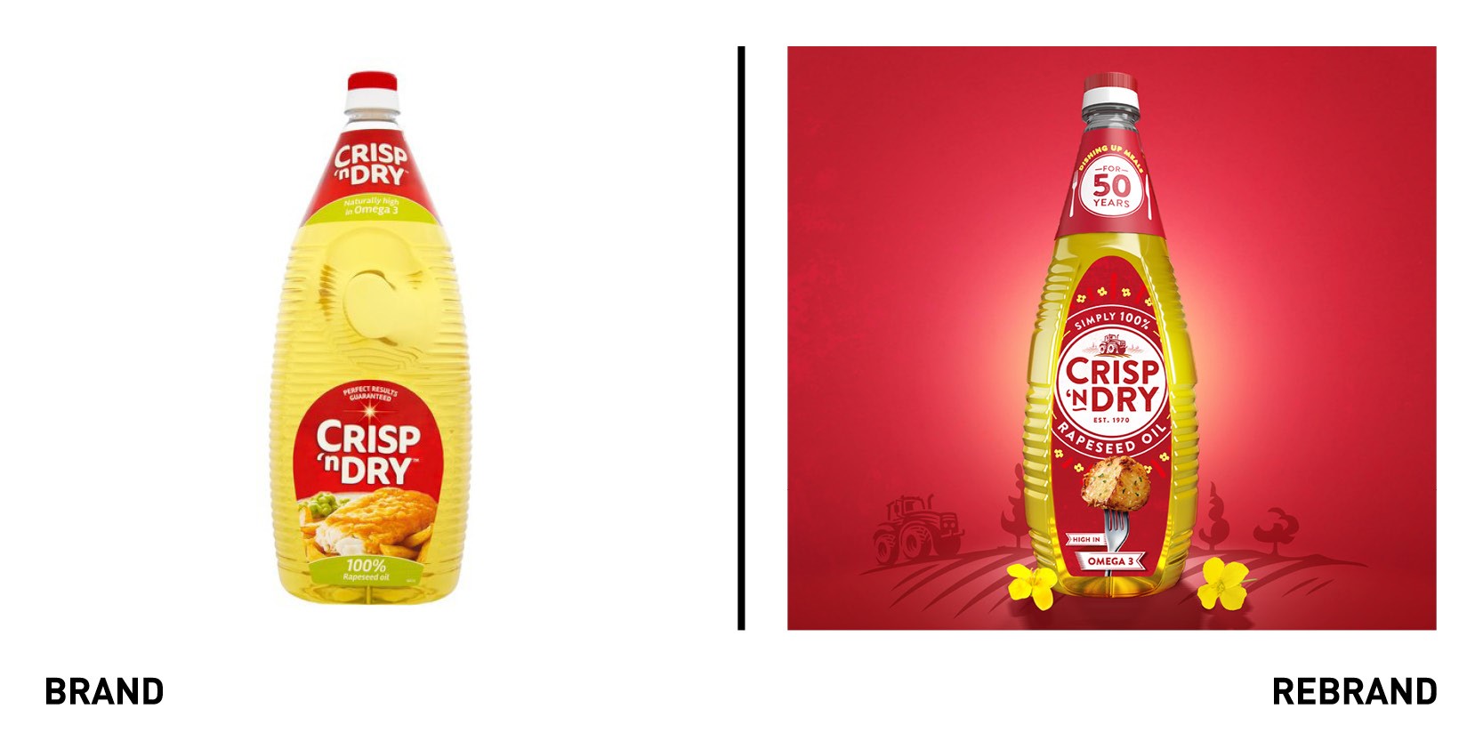
One of the UK’s number one cooking oil brand, Crisp ’n Dry launched a new visual identity with strategy and design by brand consultancy Brandon, which was tasked with creating a brand strategy that would break down barriers to purchase amongst non-customer in order to drive growth. Research showed the brand’s packaging w as not communicating the overall purpose as well as it could have done and therefore why it commanded a premium retail price versus its competition; Crisp ‘n Dry is 100% rapeseed oil – a benefit of which even many existing users were not aware. Many younger, non-consumers associated the oil with deep-fat-frying, viewing it as unhealthy when in reality it had lower saturated fat than other edible oils. The new positioning of ‘helping create crowd pleasers for generations’ plays on the idea that Crisp n Dry makes good food great and s peaks to the heart of the target audience who believes that a lot of what is important in life happens around the kitchen table. The brand’s new identity, with the addition of a tractor ploughing yellow rapeseed fields and flowers circling the name to bring the natural message up front, reflects the new messaging.
“It was important that we retained the brand’s number one distinctive brand asset – the iconic red. It’s always been associated with Crisp ’n Dry and it acts as a dependable signpost to the category, which, many shoppers find overwhelming. It also gives us some guaranteed colour blocking at fixture. A win, win. Additionally, to encourage use across a more versatile range of eating occasions we’ve introduced simpler and more iconic product photography that has healthier overtones,” says Steve Conchie, creative director at Brandon.
Meetupcall
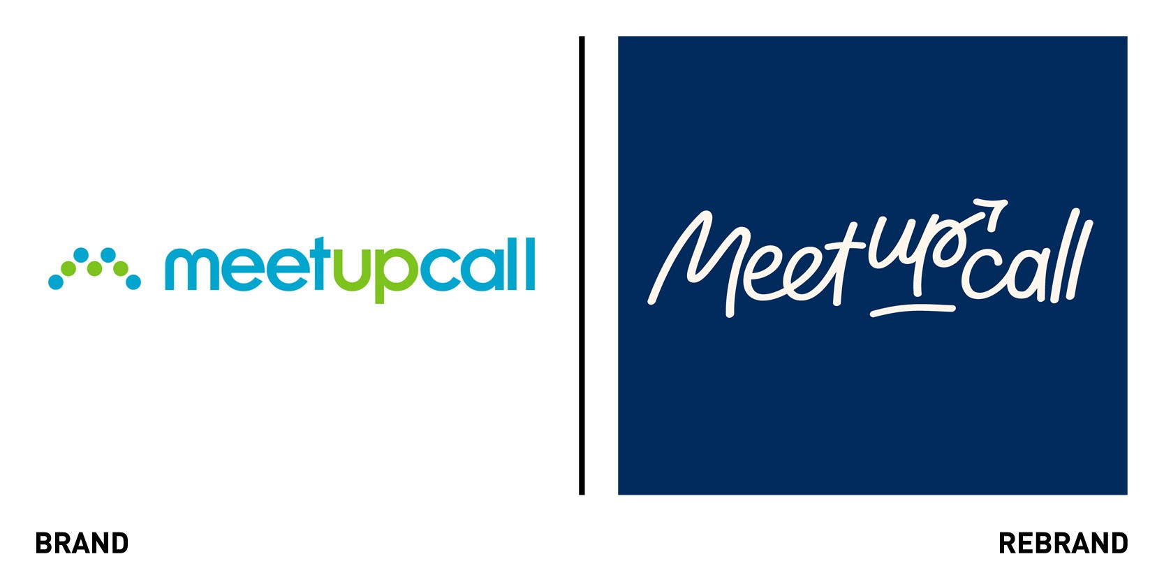
Manchester based brand-led design agency BGN launched a new positioning, brand identity and website for Meetupcall, the Yorkshire-based conference call and remote meetings provider. Faced with the pandemic and many companies requiring a remote meeting provider, Meetupcall recognised the need for a new brand strategy and design to differentiate the Meetupcall brand in an increasingly competitive market, against some of the largest video conferencing services such as Zoom and Teams. The brand purpose also needed to acquire longevity for the product to last in a post-Covid world. Insight found that personalisation of the platform was a feature many other major brands were lacking, so the new brand proposition was defined as ‘Remote meetings, your way.’ By morphing blocks of colour, and therefore hinting at hoe the product is customisable, the brand identity reflects the personalisation feature of the Meetupcall product, while remaining warm and friendly. The muted colour palette and handwritten logo gives the with the connotation of human touch. The arrows have a subtle but significant purpose with the identity, referring to the pursuit for improvement that the brand strives for and the positive impact Meetupcall can provide a business.
SGK
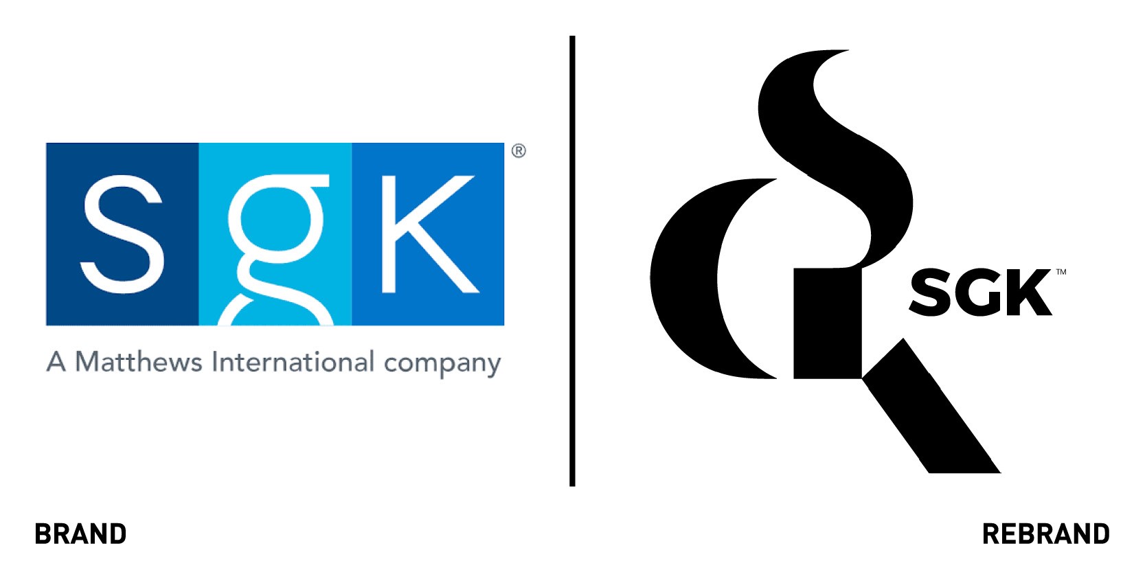
SGK, a division of Matthews International Corporation, unveiled an updated brand identity to reflect its repositioning as a global packaging and brand experience provider that simplifies marketing and amplifies brands. The company has united its brands around one mission and one vision, to give clients the seamless, global experience the market demands. The rebranding coincides with a far-reaching organisational re-design, encompassing changes to operating structure, technologies, processes and people, including performance and recruiting programs. The rebranding was also an opportunity to mobilise diverse talent and expertise along the packaging and brand experience development process while aligning the company’s operations with the new go-to-market strategy. The new visual identity elevates the brand’s position in the marketplace as a leader, while the strength of monogram acts as a lens through which to view the expertise brought to the marketplace.
“Our rebrand is not cosmetic. It is a better reflection of our ambitions as a business, our heritage, and the journey we are taking with our diverse global teams,” says Gary R. Kohl, president of SGK. “Our market research confirmed that aligning our portfolio of brands would allow the marketplace to more easily navigate our extraordinary service offering. Integrating the expertise of our creative and production brands has reframed our capabilities along a journey that begins with defining solutions for our clients and transforming brands,” adds senior vice president of market at SGK Mary Bartel.
Signal AI
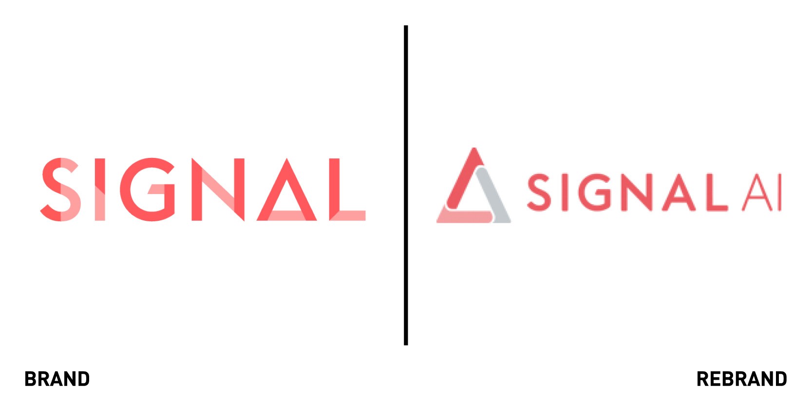
Signal AI, one of the leading companies turning the world’s data into knowledge through artificial intelligence, worked with UK-based agency Thursday to create a new website and logo. The new brand incorporates more emphasis on artificial intelligence, building on the company’s firm academic and research root. While the previous logo created a basis for the brand to begin conversations with its audience, it didn’t allow to build clarity around the brand, which was first and foremost reflected in not having ‘AI’ clearly shown in the logo. The new logo, which is more flexible and able to work in limited palettes, embodies the exciting future of the company and the promises it has made to customers of helping them make better decisions through AI technology. The website redesign had one, main aim: to move away from the often dull B2B design. In the new website the black-centric colour palette was banned, while personality and warmth was injected into the sterile look. The navigation of the site was simplified through a mage menu in the global navigation which allows visitor to clearly find what is relevant to them at a glance.
“It's this youthful energy that makes Signal AI an interesting and challenging brand in the market because not only are we always innovating with our technology, we are now showing we are more innovative with our design,” says John Brock, head of brand and creative. “Innovation and iteration are key company values at Signal AI, and this latest iteration of our brand and website, reflects the key growth we are experiencing as one of the world’s fastest growing AI companies, and is another milestone in our vision to enable better decision making through AI-powered insight,” adds David Benigson, CEO and founder of Signal AI.
Starlight Children's Foundation
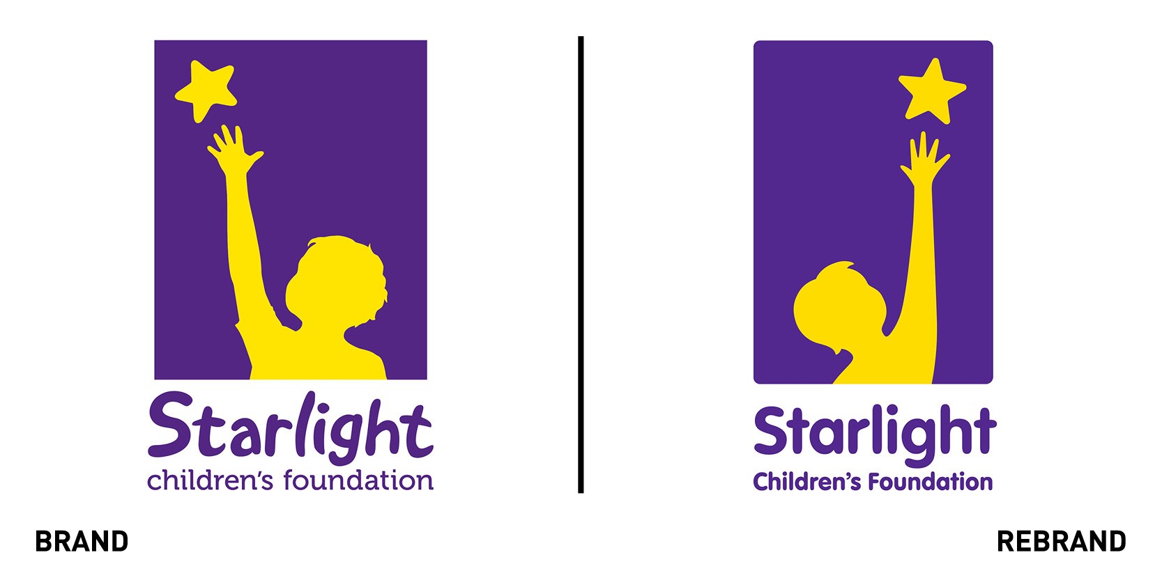
Design agency Hulsbosch created a pro-bono brand strategy and refreshed visual identity for Australian charity Starlight Children’s Foundation, which provides hospital wear, games, and deliveries to hospitalized children. The agency developed a purpose-driven brand and evolved visual identity based on the brand essence of ‘shine.’ While the star symbol, which has been part of the name since the Starlight’s inception, remains, the overall brand identity has been simplified for the digital age to help tell the charity’s stories in everyday environments. The primary colour palette of purple and yellow also remains the same, with purple symbolising the darkness children encounter in their lives and the yellow the light that brings back moments of happiness and allows kids to be themselves. However, Hulsbosch did create a new modern secondary colour palette and bold typeface for a range of platforms and media communications. It also designed simple yet imaginative illustration style, which inject fun into an otherwise abstract and challenging topic and issue.
“Like the light that emanates from a star, its shine is reliable and that is Starlight. Our branding now has renewed momentum and in these challen+ging times, it’s never been more important for us to have a strong, consistent brand,” says Louise Baxter, CEO of Starlight.
Wigan Warriors
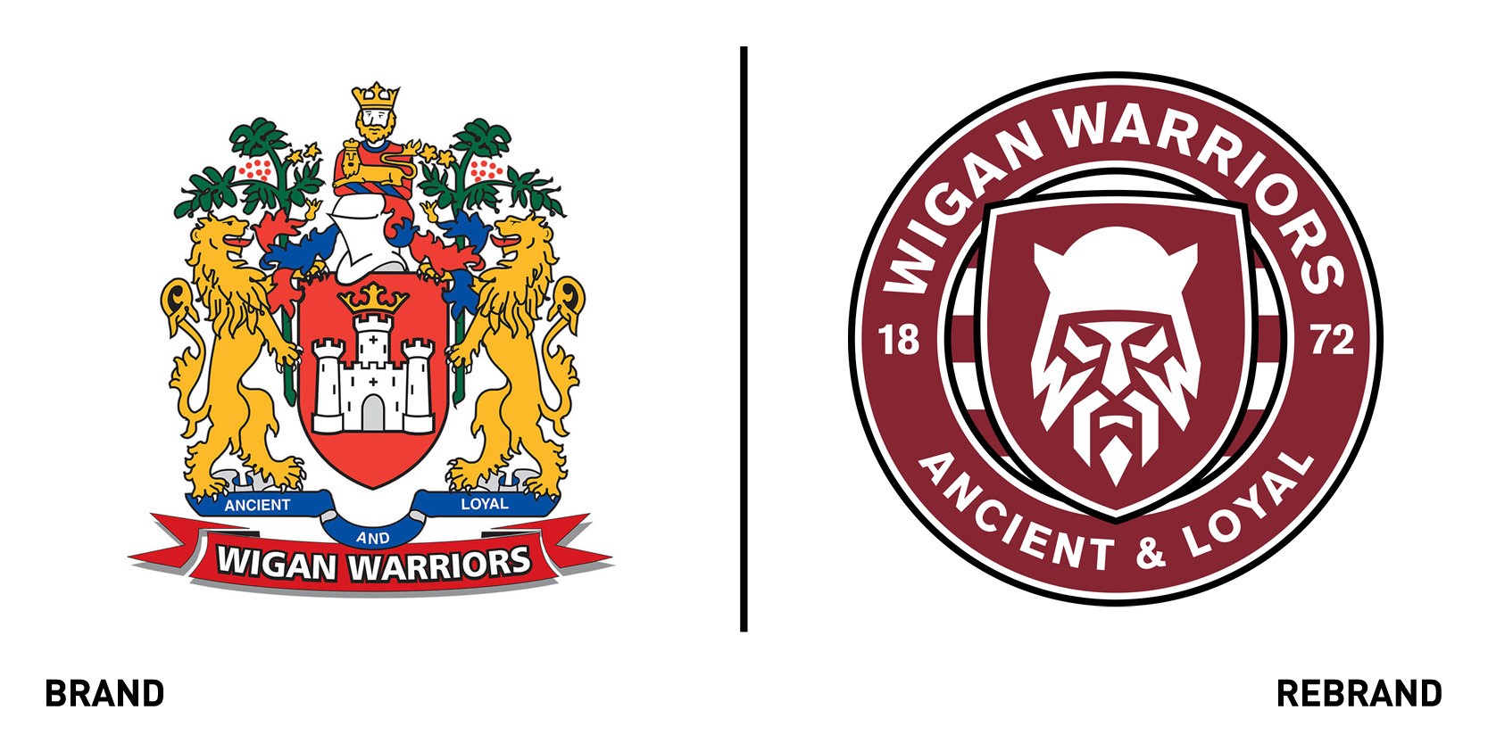
Creative agency Studio Nomad rebranded the identity of one of the most successful clubs in the history of British Rugby League, Wigan Warriors, in consultation with a specially formed fan group to enable the club to embrace its digitally savvy and broadcast friendly future. The message from the broadcast partners was clear: the sport had to adapt and burst out of its bubble to attract not only casual fans but also the next generation of loyal supporters who will fill stadiums and subscribe to pay TV, or in other words, bring profit. Therefore, the rebrand became part of the strategic journey to modernise the game and secure its long-term future in an increasingly techy world. The creation of the unique Warrior icon Brigante, the tribe that inhabited Wigan before and during the Roman era -also the name of the club fan group- known for their catchy outfits, excessive use of war paint and unique helmet design. Brigante, meaning prestige, power, honour and dignity, aims to capture the powerful expression of the warrior, with the club initials etched into the beard. The expression of the Brigante Warrior mirrors that of the warriors on the pitch, invoking fear into opponents. The current logo will become a heritage brand, used alongside the new crest as a symbol of quality and history.


