#NewBrandMonday: 30 November

Here are this week's selection of newly launched brands from around the world. For more from #NewBrandMonday, follow @Transformsays on Twitter.
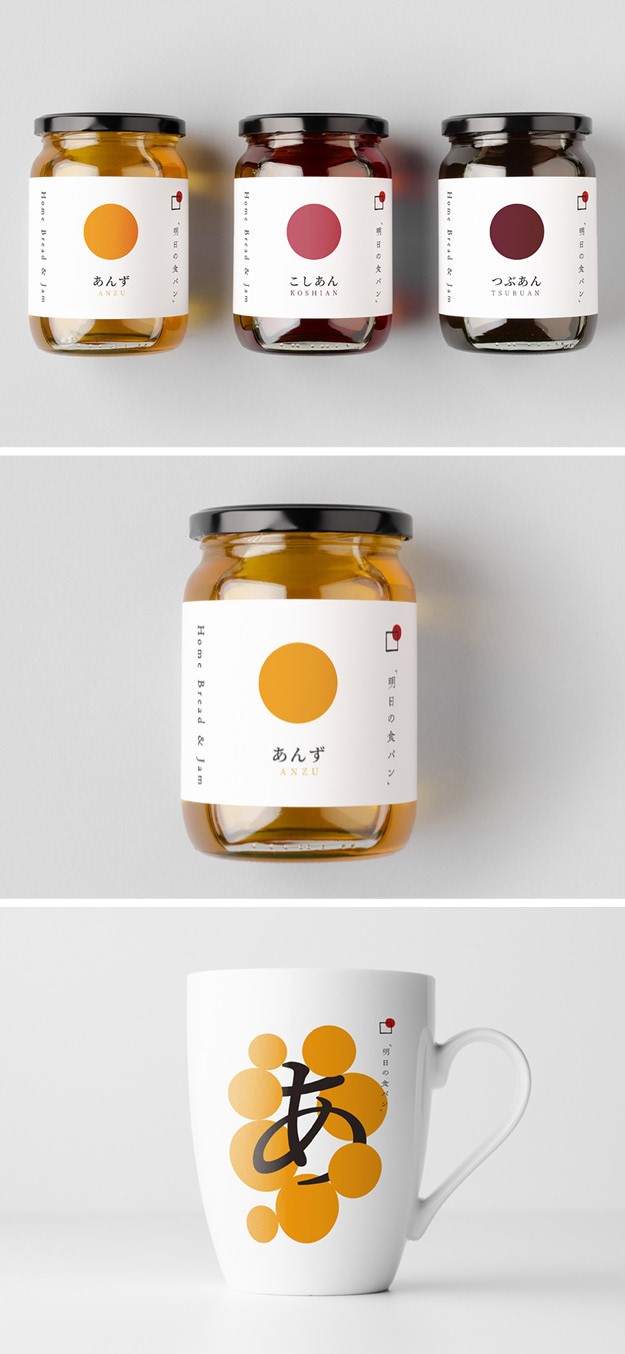
Ahistano Shokupan
Ahistano Shokupan, a Japanese brand focusing on making organic jam and bread using only top ingredients from Japan, worked with creative agency Stamp Works to create a simple, linear and authentic visual identity. Following the philosophy of the owner, which decide to master and perfect only one type of bread, the simple kind, Stamp Works designed a logo representing the rising sun of Japan. Being vital for all ingredients used in the jam, the sun was used as a design driver to unite all the different products while also allowing them to stand alone. The overall design is as simple and humble as the products themselves, reflecting the brand philosophy of wanting to make the best food. Each different jam flavour is identified on the packaging with a different colour sun, which allows for every product to stand-out on shelf and be easily recognisable.
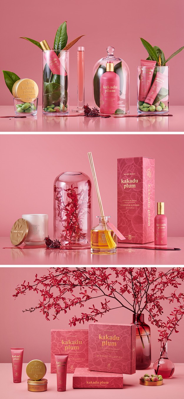
Kakadu Plum Bodycare
Australian body care and candle brand Maine Beach paired its botanical riches with Wild Rosella to create a uniquely Australian body care and fragrance collection, Kakadu Plum Bodycare. The collection is named after the fruit found only within the untamed bushland of Australia’s top end that makes up its primary ingredient. The Kakadu Plum, an indigenous remedy with skin revitalising nutrients, is made from 100% wild-harvested Kakadu plums sustainably sourced from bushlands in the Kimberley region. The aim of creative agency Harcus was to design a contemporary and authentic collection that would pay homage to its natural ingredients while also clearly demonstrating its day-to-day benefits. Harcus worked with renowned Australian artist Malaluba Gumana to create the artwork featured on the collection, which celebrates the artists maternal clan clan’s identity and heritage close to the Dhalwanju clan homeland at at Gängan Arnhem Land. The packaging, which uses a contemporary terracotta pink palette with gold foil highlights and embossing, is highly textural. The bottles and tubes of body care also come in the same colour palette and lush foil.
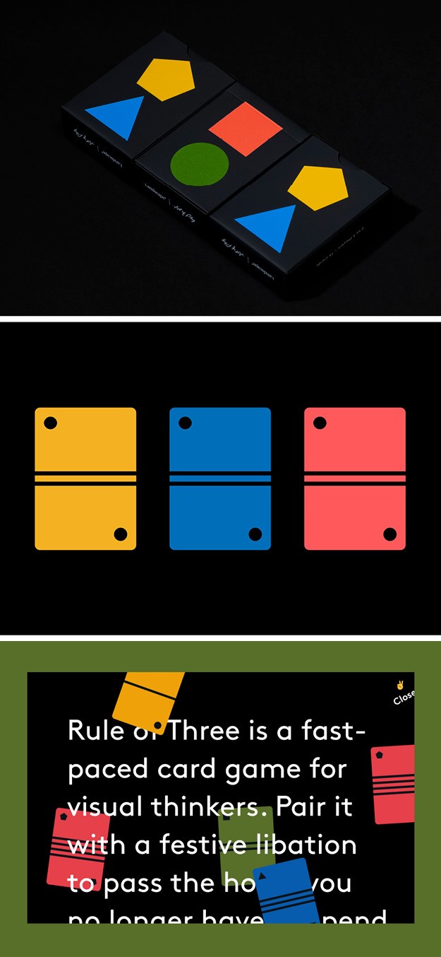
Rule of Three
Modern wonder emporium specialised in high-end playing cards Art of Play has released a new high-end card game, Rule of Three, in a creative collaboration with best selling children's author Adam Rubin and graphic design agency Landscape. Envisaged as both a strategic game and one for the whole family, the game has a gin-inspired style of play and rules easy enough for children to participate. The goal was for Rule of Three to look like a vibrant and bold design object more than a plaything. The result was a visual identity that is both fun and simple, bold and bright. Primary colours, a single typeface and shapes that are widely accessible expand the game’s appeal broadly. The fabrication of the cards and packaging offer a seductive tactile experience, as the storage box is soft to the touch and features printed and varnished shapes.
“A card game presents a particular set of design challenges to solve. For example, colours need to contrast well enough so that players can see the shapes clearly under dimly lit gaming light. In addition, when fanning out the cards in your hand, you need to be equipped to take stock of the character of all your cards. The symbols need to be both simple and distinct enough from one another to be discerned quickly,” says Adam Wiess, founder and creative director of Landscape.